
currencynerd
@t_currencynerd

What symbols does the trader recommend buying?
Purchase History
پیام های تریدر
Filter
Signal Type
currencynerd
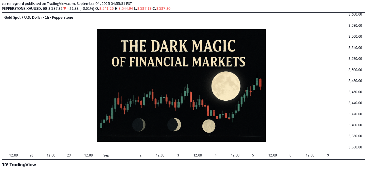
magic arts of finance The financial markets are often portrayed as cold, logical, and ruthlessly efficient. But let’s be honest sometimes they feel more like a scene out of a fantasy novel than a spreadsheet. Traders have long whispered about strange patterns, uncanny coincidences, and borderline mystical forces shaping price action. here as some of which i have come across : 🌕 Moon Phases and Market Moves ( sentiment ) It may sound crazy, but research papers and trader folklore alike suggest that full moons and new moons can influence investor sentiment. Some studies claim risk appetite increases around new moons, while full moons see investors turn cautious. Are we ruled by lunar cycles—or are we just night-trading zombies looking for meaning in the stars? 📊 Chart idea: Overlay the S&P 500 or Bitcoin with full moon/new moon markers—watch how eerily often turning points cluster around them. 🍂 The September Effect Statistically, September has been the worst month for equities for over 100 years. No one knows why maybe it’s tax adjustments, portfolio rebalancing, or just collective fear. Some traders avoid opening new positions in September altogether, calling it the “Market’s Bermuda Triangle.” chart above shows average monthly returns of U.S stocks and September being the worst performing month.. i recently did a publication on it : https://www.tradingview.com/chart/BTCUSD/rUrBRjpQ-september-effect-why-markets-seem-to-catch-a-cold-every-fall/ 🧙 The Magic of Numbers Ever heard of the “Rule of 7,” “Golden Ratios,” or Fibonacci retracements? These mystical-sounding formulas often align eerily well with market moves. Whether it’s real order-flow dynamics or just collective belief making it true, traders treat these numbers like sacred spells. Markets love Fibonacci retracements and extensions. Whether it’s 38.2%, 50%, or 61.8%, prices bounce and stall around these “magic ratios.” Do traders actually create the self-fulfilling prophecy by believing in it? Or is math really the language of the market gods? on the above chart image of CADCHF, i highlighted the trading day of 03 september 2025 and i took fib retracement from high to low of the day to give following day pivot points or important levels, see how price reacts on the 0.786 or 78.6% making the start of the most significant move for the current day from the fib level and the other notice the reaction on 0.618 or 61.8% is it perfect science or market voodoo? example 2 : bitcoin take the chart above: price climbed, touched the 23.6% retracement (the so-called 0.236 spell), and then began its sharp descent. To the uninitiated, this looks like coincidence. To Fibonacci devotees, it’s evidence that markets bend to the rhythm of sacred ratios. 23.6% → A quick rejection zone, where trend reversals often begin. 38.2% & 50% → Balance points, tested like checkpoints before continuation. 🍀 Lucky & Cursed Superstitions Some of the strangest trading floor beliefs include: 🔮 The Friday Curse Many traders avoid holding large positions over the weekend, especially in volatile markets like crypto or FX. The logic: markets can gap when they reopen on Monday due to news or events that happen while markets are closed. Over time, this caution has morphed into a superstition “bad things happen to open trades on Fridays.” Even if nothing mystical is going on, enough people believe it, so Friday liquidity sometimes dries up faster. 🙊 “Never Say Crash” Similar to how actors won’t say “Macbeth” in a theater, traders avoid saying “crash” out loud, especially in bullish markets. The superstition is that simply naming the disaster can “manifest” it. While rational minds know it’s just psychology, there is a kernel of truth: negative language can amplify fear and spread panic among traders effectively becoming a self-fulfilling prophecy. 🚫 Ticker Taboos Certain tickers or assets get reputations as cursed—think of infamous stocks that destroyed portfolios (Lehman Brothers in 2008, or meme stocks that wiped out retail traders). Some traders flat-out refuse to touch those names again, no matter how good the setup looks. It’s not unlike avoiding a blackjack table after losing your shirt there once it’s part memory, part superstition. 🧦 Trading Socks & Charms On trading floors (and now in home offices), you’ll find lucky ties, socks, pens, or even figurines. Traders treat them like talismans to bring good fortune during the session. Statistically, socks don’t move markets but the ritual helps build confidence, and psychology is half the battle in trading. (If you’ve ever put on your “interview shirt” before a big meeting, you understand the vibe.) 🏈 The Super Bowl Indicator This classic Wall Street superstition claims: NFC team wins → Stocks rise. AFC team wins → Stocks fall. It started because early correlations were spooky-accurate (like 90%+ for several decades). Of course, correlation is not causation, and the pattern eventually broke. Still, it gets dusted off every February as a lighthearted market omen. ☿️ Mercury Retrograde Astrology believers say Mercury retrograde messes with communication, travel, and technology. In trading, this gets blamed for weird market moves, glitches, or periods of irrational volatility. While pros don’t build strategies around star charts, it highlights an important truth: when markets move strangely and we can’t explain it, humans love to assign cosmic causes. which superstitions have you heard or come across? These superstitions blend psychology, history, and trader folklore. Even if they aren’t “real,” they influence behaviour and behaviour is what moves markets. put together by : Pako Phutietsile as currencynerd
currencynerd

📉 The September Effect chart example: average monthly returns of the S&P500 since 1928 Every year, as summer ends and September rolls in, traders brace themselves. Why? Because the “September Effect” is notorious for turning even the steadiest markets into a rollercoaster. Understanding this seasonal quirk can make the difference between a smooth ride and a portfolio wipeout. 📊 What Is the September Effect? The September Effect is the observed tendency of financial markets to underperform during September. Historically, it’s one of the worst months for equities, currencies, and even commodities. Some reasons behind it: Institutional Moves: Big players return from summer breaks, recalibrating portfolios. Expect sudden spikes in activity and volatility. Quarter-End Adjustments: September marks the end of Q3, often triggering rebalancing or profit-taking. Economic Releases: Important data (jobs, inflation, trade figures) often drop in September, leading to sharp market reactions. 🌍 How It Hits Global Markets The effect isn’t just local—it ripples across the globe: Equities: Indices like the S&P 500 and FTSE historically trend lower more often in September than other months. Currencies: Pairs involving USD, EUR, and JPY can swing wildly as traders reposition ahead of data releases. Commodities: Gold, oil, and other commodities may see sudden shifts based on sentiment, hedging, or macroeconomic expectations. 🔍 Navigating September Without Panic You don’t have to fear September—it just requires smarter strategies: Tight Risk Management: Stop-losses, hedging, and diversification are your best friends. Stay Updated: Economic reports, geopolitical events, and central bank actions can set the tone. Chart Smarts: Technical patterns and indicators can guide better entries and exits amid the volatility. above chart shows the historical average of major indicies.. The Takeaway The September Effect is real, but it’s not a doom prophecy. Recognizing it allows traders to plan, protect, and even profit from seasonal swings. The markets may shiver in September—but with the right strategy, your portfolio doesn’t have to. put together by : currencynerd
currencynerd

The Greatest Financial Minds Who Shaped the Trading Industry In trading, we often obsess over charts, entries, and exits, forgetting that the very foundation of our craft was built by great thinkers who saw beyond their time. These financial minds left behind legacies that continue to guide us every time we analyze a chart, hedge a risk, or speculate on a macro event. Let’s revisit some of these giants and unpack how they shaped the industry we trade in today. 1. Charles Dow – The Father of Technical Analysis Charles Dow wasn’t just a journalist; he was the architect of modern charting. By co-founding the Dow Jones & Company and creating the Dow Jones Industrial Average, he gave traders the first roadmap for analyzing price trends. His Dow Theory established concepts like market phases, primary vs. secondary trends, and the importance of volume. Without Dow, many of the indicators we use today would never exist. Impact: Every trader who draws a trendline, identifies a trend, or follows market cycles is echoing Dow’s work. Nerd Note: Dow didn’t just invent an index, he invented the idea of reading psychology through price. 2. Jesse Livermore – The Legendary Speculator Known as the "Boy Plunger," Jesse Livermore became one of the most famous traders of the early 20th century. He made (and lost) fortunes multiple times, most notably shorting the 1929 crash. His trading principles, cutting losses quickly, pyramiding into winners, and following the tape remain timeless. Impact: Livermore’s lessons on discipline and emotional control still serve as the blueprint for risk management today. Nerd Note: His trading diary might be 100 years old, but it still sounds like conversations on TradingView today. 3. John Maynard Keynes – The Economist Who Traded Keynes wasn’t just an economist who reshaped government policy; he was also an active trader. He pioneered the idea that markets are not always rational famously saying, “The market can stay irrational longer than you can stay solvent.” His insights on market psychology and long-term investment influenced both central banks and portfolio managers. Impact: Keynes helped bridge economics and market behavior, reminding traders to respect liquidity and irrationality. Nerd Note: Keynes wasn’t just about theories, he pioneered diversification and professional portfolio management. 4. Paul Tudor Jones – The Modern Macro Trader Paul Tudor Jones became legendary for predicting and profiting from the 1987 crash. His trading style blends technical analysis with global macro themes, proving that successful trading is both art and science. He also emphasized risk management, famously never risking more than a small percentage of capital on one trade. Impact: His approach paved the way for today’s macro hedge funds and continues to inspire traders balancing fundamentals with charts. Nerd Note: PTJ is proof that charts + macro = a lethal combo. 5. Richard Dennis – The Turtle Trader Experiment Richard Dennis believed that trading could be taught. To prove it, he trained a group of novices later called the Turtle Traders and turned them into millionaires using a simple trend-following system. This experiment became proof that discipline and systemization can outperform emotion and intuition. Impact: Dennis democratized trading, showing that rules-based strategies could be replicated and mastered. Nerd Note: If you think rules-based trading is “too mechanical,” Dennis showed why systems often outperform emotions. 6. George Soros – The Man Who Broke the Bank of England Soros etched his name in history by shorting the British pound in 1992, making over $1 billion in a single trade. But his real genius was in reflexivity theory the idea that market participants’ biases can influence fundamentals, creating feedback loops. Impact: Soros expanded how we think about market psychology and global macro risk-taking. Nerd Note: Soros reminds us that market psychology isn’t just noise it’s a driver. 7. Edward Thorp – The Quant Pioneer A math professor turned investor, Edward Thorp applied probability theory to both blackjack and the stock market. His book Beat the Dealer revolutionized casinos, while Beat the Market introduced quantitative trading strategies. He was one of the first to use options pricing models profitably before Black-Scholes became mainstream. Impact: Thorp laid the foundation for quantitative trading and hedge funds, influencing everything from algorithmic trading to derivatives pricing. Nerd Note: Thorp’s legacy is alive every time an algo executes a trade in milliseconds. Outro The trading industry wasn’t built overnight it stands on the shoulders of visionaries who combined intellect, courage, and sometimes sheer audacity. Whether you’re drawing lines on a chart, running a trading bot, or hedging a portfolio, you’re applying principles these financial minds helped craft. As traders, we don’t just inherit their ideas we adapt them, test them, and carry them forward into the markets of tomorrow. Nerd’s final Take: Trading is not just about screens and signals; it’s a living history. Every trade you take is part science, part psychology, and part homage to the legends who paved the way. Which of these financial giants do you think shaped trading the most and who should we as traders study harder today? put together by : Pako Phutietsile as currencynerd
currencynerd

Trendlines: The Most Misused Tool in Trading If I had a pip for every time a trader got faked out by a “trendline breakout,” I’d probably have more profits than most retail traders combined. Trendlines are one of the simplest, oldest, and most powerful tools in technical analysis yet they’re also one of the most misused. Most traders rely on what they’ve been taught in books, courses, or quick YouTube tutorials without putting in the hours of backtesting and screen time. And as every trader eventually learns: theory is a different game than practice. A book may say: Buy the breakout of a bearish trendline. But in practice? Price fakes out, you get stopped, and frustration builds. Or: Sell at the touch of a bearish trendline. Then price rallies and breaks the line. Again, stopped out. The problem? Markets love to trap traders here. False breakouts, wicks, and algo-driven liquidity hunts chew up traders who rely only on “trendline piercing.” If that’s your main strategy, you’re not trading the market, the market is trading you. But here’s the truth: trendlines aren’t the problem. The way traders use them is. This doesn’t mean the trendline is invalid. It means the application is shallow. For me, trendlines are non-negotiable when analysing. But I don’t take trades just because of a line. I use them in specific, tested ways that give structure to my trading and reduce false signals. Here are the two core methods I use trendlines in my trading: 1. Trendlines as a Measure of Momentum Momentum is the speed of price, not just the price itself. And trendlines can act as leading indicators of momentum shifts. For example: A break of a bullish trendline doesn’t instantly mean “sell.” It means momentum has shifted from bullish to bearish. That’s my cue to look for sell setups that align with my strategy. As long as price respects a bullish trendline, it signals buyers are in control, and I look for buy setups. Vice versa for bearish lines. Think of trendline breaks not as signals but as context for setups. They tell you where the wind is blowing, not when to set sail. For me, a trendline break means nothing unless a full OHCL candle (Open, High, Close, Low) forms entirely above or below the line. Why? Because a wick through a trendline is just noise, it’s the market testing liquidity, not shifting momentum. A confirmed close beyond the trendline signals that the crowd has moved, and the trend’s character is changing. This approach drastically reduces false signals. Instead of jumping at the first poke through the line, I wait for commitment. Think of it like waiting for the market to sign the contract rather than just flirt with the idea. chart example : 2. Trendlines as Dynamic Support & Resistance The second use is less about breakouts and more about reaction levels. A clean, well-respected trendline acts like a dynamic S/R zone, guiding how price reacts when tested. In uptrends, I look for bounces off the rising trendline as opportunities to join the momentum. In downtrends, I treat the falling trendline as overhead resistance a zone to fade rallies or time entries. What makes trendlines powerful here is context: they’re not static like horizontal levels but move with the market’s rhythm adapting as price makes new highs or lows. When combined with volume, candlestick structure, or confluence with horizontals, they create highly reliable zones. Yes, false breaks happen but this is where order flow, confluence, and top-down analysis come in. The more aligned factors you stack with a trendline, the higher the probability of a valid setup. chart example : the other great thing about this is that the law for support and resistance also applies here where previous support acts as resistance and vice versa chart example : nerdy conclusion : trendlines alone won’t make you money. They aren’t buy or sell signals by themselves. But used correctly, they’re an incredibly powerful map of momentum and dynamic structure. Most importantly, don’t throw them out just because a few breakouts failed. That’s not the trendline’s fault, it’s the method. The smarter nerdy approach is: Wait for full OHCL confirmation beyond the line before calling it a momentum shift. Use trendlines as dynamic support/resistance to trade with structure, not noise. put together by : Pako Phutietsile as currencynerd courtesy of : TradingView
currencynerd

The History and Origin of Technical Analysis Every chart we study today. Every candlestick, moving average, or RSI indicator is built on centuries of market wisdom. While many believe technical analysis began with Charles Dow in the 1800s, its origins reach much further back, to Amsterdam’s bustling spice markets in the 1600s and Japan’s rice exchanges in the 1700s. Let’s take a journey through time and see how technical analysis evolved into the powerful tool traders and investors use today. 17th Century: The First Signs of Charting 1. Dutch East India Company Traders (1602) The Dutch East India Company, established in Amsterdam in 1602, became the first publicly traded company. Its shares were bought and sold on the world’s first stock exchange, the Amsterdam Stock Exchange. Early traders began tracking price fluctuations in simple graphical forms — the very first steps toward technical analysis. 2. Joseph de la Vega (1650–1692) A Spanish diamond merchant and philosopher, Joseph de la Vega, authored Confusión de Confusiones (1688), the earliest known book on stock markets. He described investor behavior, speculative patterns, and even outlined concepts resembling modern puts, calls, and pools. His insights captured both the psychology of markets and the primitive beginnings of technical analysis. 18th Century: Japan’s Candlestick Revolution Homma Munehisa (1724–1803) In Osaka’s Dōjima Rice Exchange, Japanese rice merchant Homma Munehisa created what remains one of the most widely used charting methods in history: the Japanese Candlestick (then called Sakata Charts). His book The Fountain of Gold – The Three Monkey Record of Money detailed not only price charts but also market psychology, emotions, and crowd behavior. Today, candlestick patterns remain a cornerstone of technical analysis worldwide. Late 19th & Early 20th Century: The Modern Foundations Charles Dow (1851–1902) Often called the father of modern technical analysis, Charles Dow co-founded Dow Jones & Company and The Wall Street Journal in 1889. His market observations led to: The Dow Jones Industrial Average and Transportation Average The Dow Theory, which identified three types of trends: primary, secondary, and minor. Dow believed markets reflect the overall health of the economy, and his work inspired generations of analysts, including William Hamilton, Robert Rhea, George Schaefer, and Richard Russell. Ralph Nelson Elliott (1871–1948) Building on Dow’s ideas, Elliott studied 75 years of stock market data and developed the Elliott Wave Theory, arguing that markets move in recurring wave patterns driven by crowd psychology. In March 1935, he famously predicted a market bottom and the Dow Jones indeed hit its lowest point the following day, cementing his theory’s credibility. 20th Century: The Rise of Indicators The computer era supercharged technical analysis. Mathematically driven technical indicators were developed to analyze price, volume, and momentum on a scale that manual charting could never achieve. Example: RSI (Relative Strength Index) Developed by J. Welles Wilder Jr. in 1978, RSI measures the speed and magnitude of price changes on a scale of 0–100. Above 70 = Overbought (potential sell signal) Below 30 = Oversold (potential buy signal) Other popular indicators soon followed, such as Moving Averages, MACD, and Bollinger Bands, giving traders an expanding toolbox to forecast market movements. 21st Century: From Charts to Algorithms and AI Today, technical analysis has evolved far beyond hand-drawn charts: Algorithmic Trading: Automated systems use indicators and strategies to execute trades at lightning speed. AI Trading Bots: Artificial intelligence combines both technical and fundamental analysis, processing massive datasets to generate signals and even execute trades. Platforms like TradingView: Empower traders worldwide to build custom indicators, test strategies and share insights, democratizing access to advanced market tools. nerdy thoughts From Amsterdam’s first stock traders to Osaka’s candlestick pioneers, from Charles Dow’s theories to AI-powered trading bots, technical analysis has always been about one thing: decoding price to understand human behavior in markets. It’s a discipline born from centuries of observation, innovation, and adaptation, one that continues to evolve every day. “Life is a moving, breathing thing. We have to be willing to constantly evolve. Perfection is constant transformation.” put together by: Pako Phutietsile ( currencynerd ) courtesy of : TradingView this is inspired by a publication i once posted this is the revamped edition...
currencynerd

Are We Nearing a Macro Turning Point? Markets may look chaotic on the surface, but zoom out far enough and a rhythm begins to emerge. For Bitcoin and the broader crypto market, one of the most compelling patterns traders track is the 1,064-day cycle, a rough cadence of boom and bust that has repeated across multiple market eras. With October 2025 approaching, many analysts are asking: Is another turning point on the horizon? Why 1,064 Days? The number isn’t arbitrary. Crypto markets, especially Bitcoin, have displayed a recurring rhythm tied loosely to halvings, liquidity cycles, and investor psychology. Roughly every 1,064 days (about 2.9 years), Bitcoin seems to align with a macro peak or trough. Cycle 1 (2011–2014): BTC surged from a few dollars to over $1,000 before collapsing in late 2013. Cycle 2 (2014–2017): The next expansion drove prices to $20,000 by December 2017 — almost exactly 1,064 days later. Cycle 3 (2018–2021): From the 2018 bear bottom, Bitcoin reached $69,000 in November 2021 — again within the 1,064-day window. The cycle doesn’t work like clockwork, but the cadence is eerily consistent, suggesting that investor flows, halvings, and liquidity injections may move in long, repeating arcs. Mapping Today’s Position If we anchor the most recent cycle to the November 2021 peak, the 1,064-day marker points us toward October 2025. This timeline aligns uncomfortably well with two forces: Halving Lag Effect – Historically, the real bull accelerations occur 12–18 months after a halving event (the next one being April 2024). That would put late 2025 squarely in the “froth” zone. Liquidity Rotation – Global central banks are currently balancing inflation with growth concerns. By late 2025, markets may expect easing, a perfect storm for risk-on assets like crypto. What the Charts Suggest? Looking at long-term Bitcoin charts, cycle expansions follow a similar arc: A steep bull phase fueled by retail and institutional adoption. A distribution top marked by extreme leverage, retail euphoria, and inflows into speculative altcoins. A macro correction that wipes out 70–85% of value before a new base forms. If history rhymes, the 2025 cycle top could be the most significant yet, not just in terms of price, but in market maturity. Institutional ETFs, regulatory frameworks, and global adoption add layers of credibility that were absent in past cycles. Why Traders Should Care Cycle mapping is not about prediction with surgical precision, it’s about framing risk and opportunity. For long-term investors: Understanding that late 2025 could coincide with a major top helps avoid FOMO and plan exits with discipline. For swing traders: These cycles offer context for positioning. Bull legs tend to accelerate in the 6–12 months before the cycle peak. For macro thinkers: If crypto follows this cycle, it could front-run global liquidity shifts, making it a leading indicator for risk appetite. nerdy thoughts : The Clock Is Ticking The 1,064-day cycle isn’t prophecy. But its consistency across three full eras of crypto history makes it hard to dismiss. As October 2025 approaches, traders would do well to watch for echoes of past patterns: accelerating inflows, leverage buildup, and sentiment peaking. Because in crypto, time doesn’t just pass, it compounds into cycles. And those cycles often whisper what comes next. put together by: currencynerd courtesy of : TradingView
currencynerd

Bitcoin didn’t just wake up and choose violence. It chose velocity. As BTC blasts through the six-figure ceiling and fiddles $120k with laser precision, everyone’s pointing to “the halving” like it’s some magical switch. But let's be real, Bitcoin bull runs don’t run on fairy dust and hope. They run on liquidity, macro dislocations, structural demand shifts, and a pinch of regulatory chaos. Here’s the nerdy breakdown of what’s really driving the Bitcoin Rocketship (and why this one’s different): 1. The Halving Effect (Not Just the Halving) Yes, the April 2024 halving slashed miner rewards from 6.25 to 3.125 BTC. But this time, the reflexivity is louder. Miners now have to sell less, and buyers (especially ETFs) have to beg for more. Miners = Reduced Sell Pressure. ETFs = Constant Buy Pressure. That’s a one-way order book squeeze. Simple math, but powerful dynamics. 2. ETF Flows: The "Spot" That Launched a Thousand Rallies When the SEC finally gave the green light to Bitcoin spot ETFs, TradFi didn’t walk in—they stormed in. Think BlackRock, Fidelity, and friends becoming daily buyers. It's not retail FOMO anymore, it's Wall Street with billions in dry powder doing dollar-cost averaging with institutional consistency. 🧠 Nerd Note: The top 5 U.S. spot ETFs alone are now hoarding more BTC than MicroStrategy. 3. Dollar Liquidity is Leaking Again Despite Fed jawboning, real rates are still under pressure and global liquidity is quietly creeping back. Look at the TGA drawdowns, reverse repo usage, and China’s stealth QE. Bitcoin, being the apex predator of liquidity, smells it from a mile away. “In a world flooded with fiat, Bitcoin doesn’t float. It flies.” 4. Sovereigns Are Quietly Watching El Salvador lit the match. Now, Argentina, Turkey, and even Gulf countries are tiptoeing toward a Bitcoin pivot, hedging USD exposure without broadcasting it to CNN. Central banks don’t need to love BTC to stack it. They just need to fear the dollar system enough. 5. Scarcity Narrative Goes 3D With 99% of BTC supply already mined and over 70% HODLed for over 6 months, every new buyer is bidding for a smaller slice of the pie. ETFs and institutions are trying to drink from a faucet that only drips. This is not a market with elastic supply. This is financial physics with a scarcity twist. 6. Market Microstructure is Fragile AF Order books are thin. Real liquidity is fragmented. And the sell-side has PTSD from getting blown out at $70k. This creates a “skateboard-on-a-freeway” scenario, when a few billion in inflows hit, prices don’t just rise. They gap. Nerdy Bonus: The Memecoin Effect (No, Really) The memecoin mania on Solana, Base, and Ethereum has been injecting dopamine into degens—and their profits are increasingly flowing into the OG digital gold. It’s the 2021 cycle all over again, just with more liquidity bridges and fewer inhibitions. Nerdy Insight: The Bull Run Has Layers What’s driving BTC to $120,000 isn’t a single headline. It’s a stacked convergence of macro, structure, psychology, and coded scarcity. Bitcoin isn’t “going up” just because of hope or halving hype. It’s going up because it’s the cleanest asset in a dirty system, and now both retail and institutions agree. Still shorting? That’s not “fading the crowd.” That’s fighting thermodynamics. Stay nerdy, stay sharp. put together by : currencynerd as Pako Phutietsile
currencynerd

stablecoins were once the rebels of finance—anchored to fiat yet untethered from traditional banking laws, but the tides are turning. Across major economies, lawmakers are drawing up legal frameworks that place stablecoins inside the banking sector rather than outside of it. This shift could be the most pivotal regulatory development since Bitcoin was born. But what does this really mean for traders, investors, and markets? In this TradingView blog we’ll unpack the new laws on stablecoins entering the banking realm, and what their ripple effect might look like, using past regulatory shifts as a lens to foresee market behavior. 🧾 Section 1: What the New Stablecoin Laws Say Many regions—especially the EU, UK, Japan, and the US—are moving toward a model where stablecoin issuers must register as banks or hold full banking licenses, or at minimum, comply with banking-like oversight. Key pillars of these laws include: Full reserve requirements (1:1 backing in liquid assets) Audited transparency on reserves and redemptions KYC/AML compliance for users and issuers Supervision by central banks or financial regulators In the US, the House Financial Services Committee recently advanced a bill that would make the Fed the ultimate overseer of dollar-backed stablecoins. In the EU, MiCA (Markets in Crypto-Assets) requires issuers of e-money tokens to be regulated financial institutions. Japan now allows banks and trust companies to issue stablecoins under strict regulations. 💥 Section 2: Why This Is a Big Deal Bringing stablecoins into the banking system could change how liquidity flows, how DeFi operates, and how capital moves across borders. Potential market impacts: Increased trust = more institutional money entering stablecoins and crypto markets. DeFi restrictions = protocols may face scrutiny if they allow unverified stablecoin usage. Flight from algorithmic or offshore stables to regulated, bank-issued stablecoins (e.g., USDC, PYUSD). On-chain surveillance increases, potentially limiting pseudonymous finance. Think of it as crypto’s "Too Big To Ignore" moment—where stablecoins become infrastructure, not outlaws. 📉 Section 3: Past Laws That Shaped Crypto Markets Let’s examine how previous regulations have affected crypto markets—offering clues about what to expect. 🧱 1. China’s Crypto Ban (2017–2021) Kicked off a massive market crash in 2018. Pushed mining and trading activity overseas, especially to the US and Southeast Asia. Resulted in more global decentralization, ironically strengthening Bitcoin’s resilience. 🪙 2. SEC Lawsuits Against XRP & ICO Projects Ripple’s XRP lawsuit caused delistings and volatility. Set a precedent for how tokens are treated under securities law. Resulted in more structured token launches (via SAFEs, Reg D, etc.). 🧮 3. MiCA Regulation in Europe (2023 Onward) Provided regulatory clarity, prompting institutions to engage more with regulated entities. Boosted legitimacy of Euro-backed stablecoins like EURS and Circle’s Euro Coin. Sparked a race among exchanges to gain EU registration (e.g., Binance France, Coinbase Ireland). Each of these regulatory waves caused temporary volatility, followed by long-term growth—as clarity invited capital. 📊 Section 4: The Possible Scenarios for the Market Here’s how things might play out as stablecoin laws become mainstream: Golden Path-Regulated stablecoins coexist with DeFi; innovation meets compliance - Bullish for crypto adoption and capital inflows. Walled Garden-Only bank-issued stablecoins are allowed; DeFi stifled -Neutral or bearish short-term, bullish long-term. Backlash-Overregulation pushes stables offshore or into non-compliant zones - Bearish, liquidity fragmentation returns. 🔍 Nerdy Conclusion: Stablecoins are no longer just tools for traders—they’re becoming the backbone of digital finance. Their formal entrance into banking law marks a turning point that traders must understand. While regulation has historically caused short-term fear, it often leads to long-term maturity in crypto markets. The stablecoin laws now in motion could unlock the next chapter of institutional adoption, cross-border finance, and perhaps, the integration of crypto into the real-world economy at scale. 💡 Nerdy Thought: When a technology becomes systemically important, it stops being ignored—it gets integrated. Stablecoins have reached that level. put together by : currencynerd as Pako Phutietsile
currencynerd

In the world of trading, technical analysis often gets the spotlight—candlesticks, moving averages, and indicators. But beneath every price movement lies a deeper current: macroeconomic forces. These forces shape the environment in which all trades happen. Great traders don’t just react to price—they understand the context behind it. That context is found in macro charts: the financial “weather maps” of markets. These charts reveal whether capital is flowing toward risk or safety, whether inflation is heating up or cooling down, and whether liquidity is expanding or shrinking. In this post, we’ll explore 10 macro charts that can elevate your edge, backed by proven examples of how they’ve helped traders stay on the right side of the market. These aren't just charts—they’re market truths in visual form. 1️⃣ DXY – U.S. Dollar Index Why it matters: The U.S. dollar affects everything: commodities, stocks, global trade, and especially forex. The DXY measures its strength against major currencies. 📉 Chart Reference: In 2022, DXY surged past 110 due to aggressive Fed rate hikes. This crushed EURUSD, pressured gold, and triggered a global risk-off move. Traders who tracked DXY rode USD strength across the board. 💡 Use it to: Confirm trends in FX and commodities. Strong DXY = bearish pressure on gold and risk assets. 2️⃣ US10Y – 10-Year Treasury Yield Why it matters: This is the benchmark for interest rates and inflation expectations. It guides borrowing costs, equity valuations, and safe-haven flows. 📉 Chart Reference: In 2023, the 10Y spiked from 3.5% to nearly 5%, leading to weakness in growth stocks and boosting USD/JPY. Bond traders saw it first—equities followed. 💡 Use it to: Anticipate moves in growth vs. value stocks, and confirm macro themes like inflation or deflation. 3️⃣ Fed Dot Plot Why it matters: This is the Fed’s forward guidance in visual form. Each dot shows where a policymaker expects interest rates to be in the future. 📉 Chart Reference: In Dec 2021, the dot plot signaled a faster pace of hikes than the market expected. Those who caught the shift front-ran the USD rally and equity correction in early 2022. 💡 Use it to: Predict future rate policy and align your macro bias with the Fed's path. 4️⃣ M2 Money Supply (US) Why it matters: This chart tracks the amount of money in the system. More liquidity = fuel for risk. Less = tightening conditions. 📉 Chart Reference: After COVID hit, M2 exploded, leading to a major bull run in stocks and crypto. When M2 began contracting in 2022, asset prices peaked and reversed. 💡 Use it to: Gauge macro liquidity conditions. Expansion is bullish; contraction is dangerous. 5️⃣ Copper/Gold Ratio Why it matters: Copper is a growth metal; gold is a fear hedge. Their ratio acts as a risk-on/risk-off indicator. 📉 Chart Reference: In 2021, the copper/gold ratio surged—signaling growth and optimism. This preceded strong gains in cyclical equities and commodity currencies like AUD and CAD. 💡 Use it to: Confirm risk sentiment and lead equity or FX trends. 6️⃣ VIX – Volatility Index Why it matters: VIX tracks expected volatility in the S&P 500. It's often called the "fear index." 📉Chart Reference : In March 2020, VIX spiked to nearly 90 as COVID panic set in. This extreme fear was followed by one of the greatest buying opportunities of the decade. 💡 Use it to: Time entries and exits. High VIX = fear = possible reversal. Low VIX = complacency = caution. 7️⃣ Real Yields (10Y TIPS - CPI) Why it matters: Shows the inflation-adjusted return on bonds. Real yields affect gold, tech, and risk appetite. 📉Chart Reference : In 2022, real yields went from deeply negative to positive—crushing gold and high-growth stocks. 💡 Use it to: Confirm direction in gold, NASDAQ, and broad macro trends. 8️⃣ Oil Prices (WTI or Brent) Why it matters: Oil is both a growth and inflation input. Rising prices mean higher costs and often precede policy tightening. 📉Chart Reference : Oil’s rally in early 2022 foreshadowed CPI spikes and led central banks to turn hawkish. Traders who tracked it saw inflation risks building early. 💡 Use it to: Forecast inflation, assess energy-related equities, and understand global demand. 9️⃣ Global PMIs (Purchasing Managers’ Indexes) Why it matters: Leading indicator of economic health. PMIs above 50 = expansion. Below 50 = contraction. 📉 Chart Reference: In 2023, China’s PMI consistently printed below 50—signaling manufacturing weakness and global demand concerns. This helped traders avoid overexposure to emerging markets. 💡 Use it to: Gauge growth momentum globally and regionally. 🔟 SPX vs. Equal-Weighted SPX (Breadth Divergence) Why it matters: Shows whether the S&P 500 rally is broad-based or just driven by a few megacaps. 📉Chart Reference : In early 2024, the index made new highs—but the equal-weighted version lagged badly. That divergence warned traders of a fragile rally. 💡 Use it to: Detect weakness beneath the surface and avoid false confidence in rallies. 🧠 Nerdy Tip: Macro Is the Invisible Hand These charts don’t give you trade entries—but they give you conviction, timing, and perspective. When you combine macro context with technical setups, you trade in sync with the market’s deeper rhythm. So before you place your next trade, ask yourself: What are yields doing? Is liquidity expanding or drying up? Is risk appetite rising or falling? put together by : currencynerd as Pako Phutietsile
currencynerd

"Watch what they do, but also how they say it." In the high-stakes world of central banking, few things move markets like the subtle wording of a Fed statement, But beyond the headlines and soundbites, one market absorbs this information faster—and with greater clarity—than almost any other: the bond market. 💬 What Is "Fed Speak"? "Fed speak" refers to the nuanced and often deliberately vague language used by U.S. Federal Reserve officials when communicating policy expectations. It includes: FOMC statements Dot plot projections Press conferences Individual speeches from Fed officials nerdy tip: the Fed aims to influence expectations without committing to specific outcomes, maintaining flexibility while steering market psychology. 📈 The Bond Market as a Decoder The bond market, particularly the U.S. Treasury market, is where real-time interpretation of Fed policy plays out. Here's how it typically reacts: 1. Short-Term Yields (2Y, 3M) = Fed Expectation Barometer These are the most sensitive to near-term interest rate expectations. If the Fed sounds hawkish (more rate hikes), short-term yields jump. If dovish (hinting cuts), they fall. At the May 7, 2025 FOMC meeting, the 2-year Treasury yield (US02Y) experienced a modest but clear reaction: Just before the release, yields were hovering around 3.79%. In the first hour following the 2:00 PM ET (20:00 UTC+2) statement, the yield ticked up by approximately +8 basis points, temporarily reaching about 3.87%. Later that day, it eased back to around 3.79%, ending the day roughly unchanged—a sharp, immediate spike followed by a reversion. 2. Long-Term Yields (10Y, 30Y) = Growth + Inflation Expectations Longer-dated yields reflect how the market sees the economy unfolding over time. After a Fed speech: Rising long-term yields = stronger growth/inflation expected Falling yields = fears of recession, disinflation, or policy over-tightening 3. The Yield Curve = Market's Policy Verdict One of the best tools to read the bond market's verdict is the yield curve—specifically, the spread between 10Y and 2Y yields. Steepening curve → Market thinks growth is picking up (Fed may be behind the curve) Flattening or Inversion → Market believes the Fed is too aggressive, risking a slowdown or recession 📉 Example: After Jerome Powell’s hawkish Jackson Hole speech in 2022, the 2Y-10Y spread inverted deeply—markets were pricing in recession risks despite a strong Fed tone. 🧠 Why Traders Must Watch Bonds After Fed Speak 🪙 FX Traders: Higher yields = stronger USD (carry trade advantage) Falling yields = weaker USD (lower return for holding) 📈 Equity Traders: Rising yields = pressure on tech/growth stocks (higher discount rates) Falling yields = relief rally in risk assets 📊 Macro Traders: The MOVE Index (bond volatility) often spikes around FOMC events Forward guidance shifts = big rotation opportunities (e.g., bonds > gold > dollar) (BONUS NERDY TIP) 🔍 How to Analyze Fed Speak Through Bonds ✅ Step 1: Watch the 2Y Yield First responder to new rate expectations. ✅ Step 2: Check the Fed Funds Futures Compare market pricing pre- and post-statement. ✅ Step 3: Look at Yield Curve Movement Steepening or inversion? That’s the market’s macro take. ✅ Step 4: Track TLT or 10Y Yield on Your Chart Bond ETFs or Treasury yields reveal sentiment instantly. 🧭 Final Nerdy Thought : Bonds React First, Talk Later When the Fed speaks, don't just read the words. Read the yields. The bond market is often the first to interpret what the Fed really means—and the first to price in what comes next. So next FOMC meeting, instead of watching only Powell’s facial expressions or CNBC pundits, open a chart of the 2Y and 10Y. That’s where the smart money’s listening. put together by : currencynerd as Pako Phutietsile courtesy of : TradingView
Disclaimer
Any content and materials included in Sahmeto's website and official communication channels are a compilation of personal opinions and analyses and are not binding. They do not constitute any recommendation for buying, selling, entering or exiting the stock market and cryptocurrency market. Also, all news and analyses included in the website and channels are merely republished information from official and unofficial domestic and foreign sources, and it is obvious that users of the said content are responsible for following up and ensuring the authenticity and accuracy of the materials. Therefore, while disclaiming responsibility, it is declared that the responsibility for any decision-making, action, and potential profit and loss in the capital market and cryptocurrency market lies with the trader.