WhiteBIT
@t_WhiteBIT

What symbols does the trader recommend buying?
Purchase History
پیام های تریدر
Filter
خبر بزرگ: کوین WBT به 5 شاخص اصلی ارز دیجیتال S&P داو جونز راه یافت!
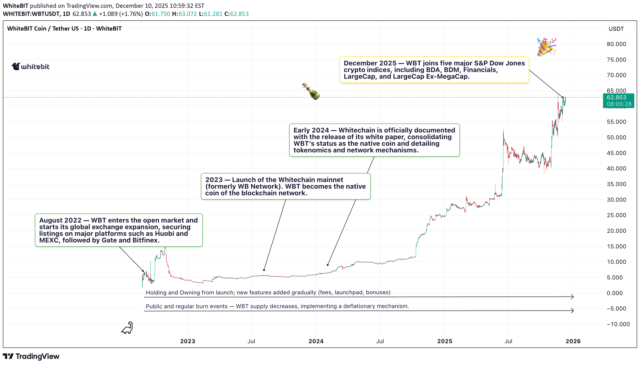
The native token of WhiteBIT, WBT, has been officially added to five major cryptocurrency indices maintained by S&P Dow Jones Indices (S&P DJI) — a clear milestone in its evolution from exchange-utility coin to a recognized digital asset with institutional relevance. What Happened? As of early December 2025, WBT has been included in: S&P Cryptocurrency Broad Digital Market Index (BDM); S&P Cryptocurrency Broad Digital Asset Index (BDA); S&P Cryptocurrency Financials Index; S&P Cryptocurrency LargeCap Index; S&P Cryptocurrency LargeCap Ex-MegaCap Index. To gain placement, WBT had to satisfy S&P’s institutional-grade criteria, including: sustained multi-quarter liquidity, stable market capitalization, transparent pricing, governance and risk-control standards — a strong validation for WBT’s maturity as an asset. Why It Matters? Institutional Recognition: Inclusion in S&P indices puts WBT on the radar of investment funds, ETF or ETN issuers, and institutional investors — a major shift from its origins as a utility token tied to exchange perks; Benchmark Visibility: As part of benchmark indices, WBT will now be tracked alongside top-level digital assets, which could lead to its use in structured products and long-term diversified portfolios; Market Confidence: The index-inclusion comes after WBT recently hit a record high (~ US$ 62.96 in November 2025), signaling that the asset has demonstrated enough stability and demand to meet global institutional standards. What This Means for WBT’s Fundamental Story? WBT is transforming its narrative: from being “just an exchange token” to becoming part of global digital-asset infrastructure. The S&P nod suggests a growing acceptance of infrastructure-linked coins (exchange tokens) as legitimate, investable assets — not only for retail but increasingly for professional investors and funds. For traders and investors, this translates to a potentially more stable long-term proposition: WBT’s inclusion in institutional benchmarks could mean deeper liquidity, better price discovery, and higher readiness for integration into index-tracking instruments (ETFs/ETNs). WBT’s entry into five major S&P Dow Jones cryptocurrency indices marks a watershed moment — not just for WhiteBIT, but for the broader shift in how exchange-issued tokens are perceived by institutional finance. With this recognition, WBT is no longer just a utility token — it is now part of the global digital asset benchmark ecosystem! Not a trading signal, not financial advice — we’re simply sharing a solid fundamental milestone. Sometimes news is just news 😌
راز اندیکاتور فراکتال بیل ویلیامز: استراتژی ورود و خروج حرفهای!
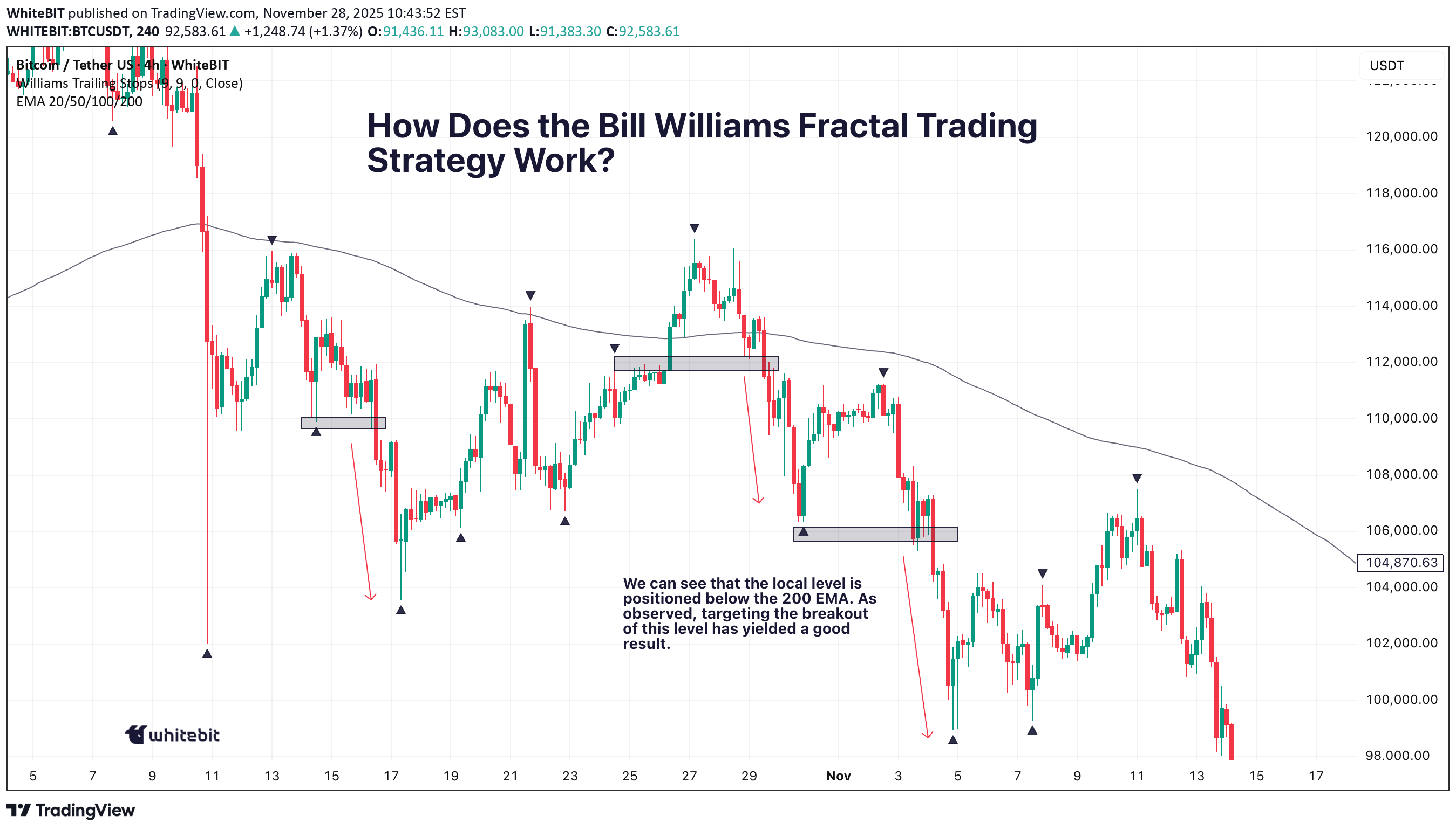
We all know the market doesn’t always play nice, but the Bill Williams Fractal Indicator can help you read between the lines. If you're focused on fine-tuning your entries and exits, let’s break down how fractals can be a useful tool in your strategy. What is the Bill Williams Fractal Indicator? At its core, the Bill Williams Fractal Indicator is a technical analysis tool that identifies potential reversal points in the market. This indicator is based on the fractal definition by Bill Williams, who described fractals as price patterns that can be used to predict potential shifts in price direction. In simple terms, a fractal pattern consists of five consecutive bars or candlesticks on a chart. The middle bar of this pattern represents a local peak or trough, while the two bars on either side of it are smaller. A bullish fractal occurs when the middle bar is a higher high than the surrounding bars, and a bearish fractal appears when the middle bar is a lower low. Bill Williams Fractal Definition The Bill Williams Fractal is defined by a sequence of five consecutive bars. The middle bar represents the peak (for bearish fractals) or trough (for bullish fractals), surrounded by smaller bars on both sides. When price breaks the high (for bearish fractals) or low (for bullish fractals) of this central bar, it signals a potential breakout. How Does the Bill Williams Fractal Trading Strategy Work? The Bill Williams Fractal Strategy is a proven approach in crypto trading. Whether you're a beginner or an experienced trader, using the fractal strategy can provide valuable insights into potential market reversals and breakouts. By combining the Bill Williams Fractal Indicator with effective risk management, you can improve your trading edge. A common method is to use the 200 EMA to gauge the overall trend. If the price is below the 200 EMA, traders tend to focus on lower fractals and look for short opportunities, while if the price is above the 200 EMA, they focus on upper fractals and consider long trades. However, always remember to confirm the breakout of local levels for greater reliability in your trades. Master the Bill Williams Fractal Strategy The Bill Williams Fractal Strategy is a well-established method in crypto trading. Whether you're just starting out or you're an experienced trader, incorporating the fractal strategy can provide useful insights into potential market reversals and breakouts. By combining the Bill Williams Fractal Indicator with a solid risk management plan, you can enhance your trading approach. That said, remember that no strategy guarantees success. Fractal trading isn't about predicting the market with absolute certainty — it's about managing your entries and exits with precision and maintaining discipline. Always make sure to think critically and adapt to market conditions. So, when you spot a Bill Williams Fractal on your chart, use it as a guide, but always trust your analysis and approach. Happy trading!
شکار نهنگها: راز نقدینگی و تلههای بازار که نباید در آنها گیر کنید!
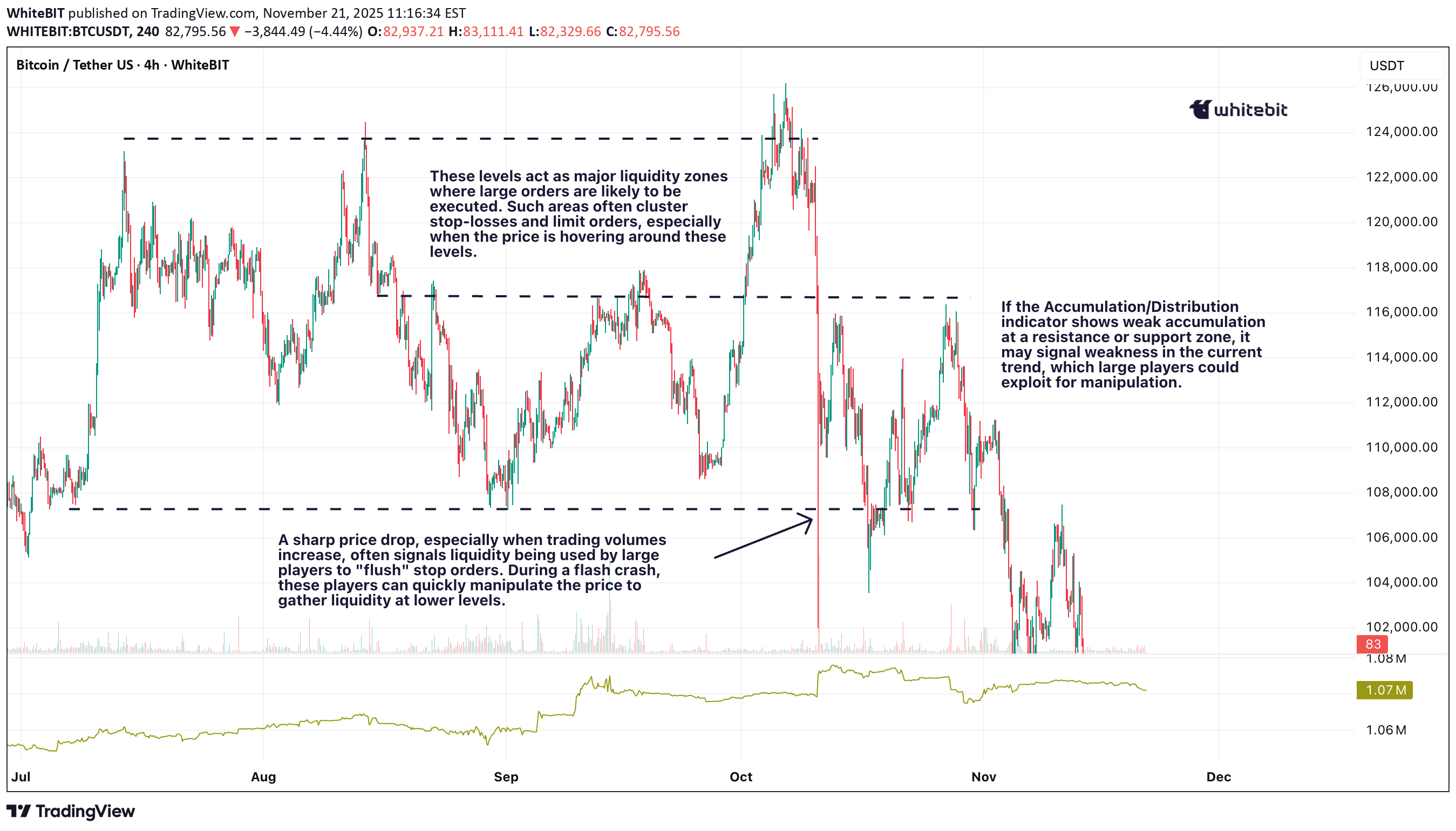
Ever wonder why prices always seem to drop just below your stop loss before bouncing back? It’s not bad luck; it’s liquidity in action. The big players are prowling, hunting for stops, and if you don't understand where they’re lurking, you might just be their next target. Liquidity definition refers to how easily an asset can be bought or sold without significantly affecting its price, and in the world of crypto, this dynamic can make or break your trade. Let’s dig into how these whales work the market and how you can avoid becoming their prey. What is Liquidity? Liquidity meaning refers to how easily an asset can be bought or sold without affecting its price. In the context of crypto, it's crucial to know that high liquidity means less slippage, while low liquidity can lead to sharp price moves. Market liquidity is essential for smooth trading, but it also creates opportunities for big players to manipulate price action by targeting stop losses. Liquidity Risk and Big Players Liquidity risk arises when there's not enough liquidity to execute trades efficiently, especially during volatile periods. Big players exploit these conditions by pushing prices through key support and resistance levels, triggering stop orders and capturing liquidity. This is why it’s vital to be aware of where liquidity is concentrated — big players often target areas with many stop losses, trapping retail traders in the process. Tools to Analyze Liquidity Volume Indicators: Use tools like Accumulation/Distribution or On-Balance Volume (OBV) to spot surges in volume that may indicate manipulation or big players entering the market. Bitcoin Liquidity Heatmap: A Bitcoin liquidity heatmap shows where large buy and sell orders are placed, helping you avoid areas where liquidity is likely to be targeted by whales. Liquidity Ratio Formula: Another great tool which helps measure market depth and liquidity. You can calculate it as: A higher ratio indicates that there is more buying pressure, suggesting the market is more liquid and less prone to manipulation. On the other hand, a lower ratio signals more sell orders, which could expose you to increased liquidity risk and higher chances of price manipulation by big players. Price Action: Watch for candlestick patterns like pin bars or engulfing candles near key support or resistance levels to anticipate price reversals after stop hunts. Conclusion While tools like volume indicators and Bitcoin liquidity heatmaps can help, always stay vigilant. Use wider stop losses to avoid getting trapped at key levels, and stay cautious during periods of low liquidity when whales are most active. This article isn’t trading advice — always DYOR and trade responsibly.
راز موجهای صعودی بازار: چگونه از فازهای "علامتگذاری" تا "شتاب" سود ببرید؟
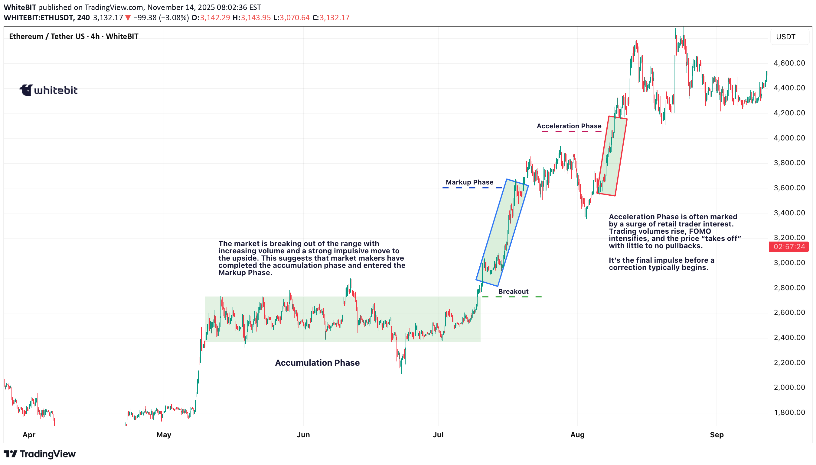
Every strong rally begins with a period of quiet buildup. The price moves sideways, creating a base, while smart money quietly accumulates. Then, at a certain point, something shifts. The Markup Phase begins, and soon after, the market enters the Acceleration Phase — a fast-paced, FOMO-driven surge that catches everyone’s attention. Understanding these phases is key to riding the wave before it crashes. How to Trade the Markup and Acceleration Phases? During the Markup Phase, many traders look for opportunities to enter positions gradually, avoiding the temptation to chase after the rapid price movement. A more strategic approach is to scale in on retests of breakout zones or key support levels, which can provide better entry points with lower risk. As the market moves into the Acceleration Phase, the price tends to surge rapidly, often with little to no pullback. At this stage, it's crucial to protect profits and manage risk. Traders often trail stop-loss orders to lock in gains or take partial profits as the price continues to climb. Parabolic moves are thrilling, but they don't last forever — it's important to stay alert and ready for a reversal or correction when the momentum starts to fade. 🔑 Key Indicators to Watch During the markup phase, technical signals can help confirm that the move is real. Look for: Rising volume — confirms genuine interest behind the breakout; Higher highs and higher lows — a clear sign of trend formation; Moving averages (20/50-day) — the price staying above these lines often signals trend strength; RSI and MACD — momentum indicators showing acceleration or potential exhaustion; Open interest and funding rates — rising figures suggest growing trader participation and leverage. As the rally gains traction, the market enters the Acceleration Phase. This is where hype replaces logic — the charts go parabolic, social media buzzes, and new traders rush in driven by FOMO. Price action becomes almost vertical, and corrections get instantly bought up. Typical signs of this stage include overbought RSI, spiking volumes, and extreme funding rates — all pointing to overheated market sentiment. Find out what drives the market in our article here . 🪤Common Traps to Avoid The biggest mistake traders make during these phases is confusing momentum with sustainability. Entering too late, ignoring overheated sentiment, or overleveraging during acceleration can quickly turn profits into losses. Always check whether volume supports the move and watch for sudden spikes in funding rates — they often signal that the trend is near exhaustion. 🏁Final Thoughts Understanding where the market stands in this cycle helps traders make smarter decisions. The markup and acceleration phases can bring big opportunities, but also major risks for those entering too late. Always rely on your own analysis and use proper risk management. The market doesn’t reward emotions; it rewards patience and discipline.
راز معکوس شدن روند بازار: ستاره صبح و ستاره عصر در یک نگاه!
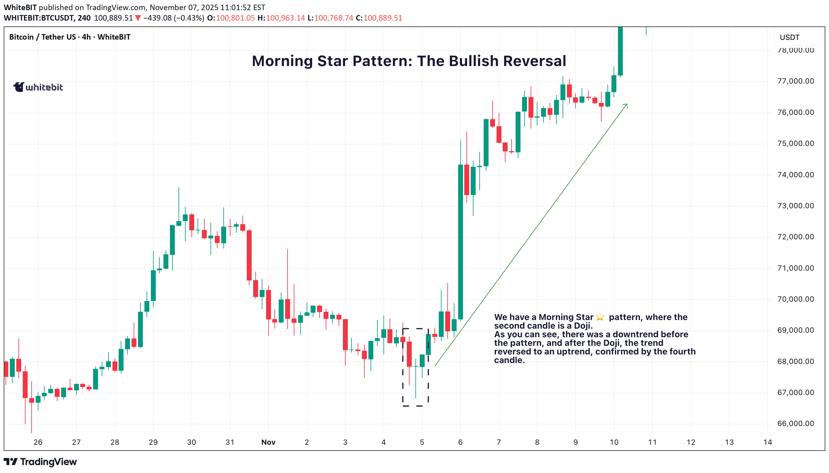
So, you're trying to nail those trend reversals? The Morning and Evening Star patterns are perfect for that. They show up right when the market’s about to shift, giving you a chance to get in before the move really takes off. Let’s break down how these setups work and why they’re such solid tools for traders like you. 🌅 Morning Star Pattern: The Bullish Reversal The Morning Star pattern is one of the best ways to catch a trend reversal from bearish to bullish. It usually pops up after a downtrend, signaling that the market is about to make a move to the upside. It’s made up of three candles: A long red candle that shows the market’s been selling off. A small candle, often a Doji, that indicates indecision or a pause in the downtrend. A big green candle that confirms the shift, showing buyers are taking control. When you spot a Morning Star candlestick pattern, it’s a strong indication that the downtrend might be over and the bulls could be taking over. The third candle plays a crucial role here, confirming that the trend is likely reversing. 🌇 Evening Star Pattern: The Bearish Reversal On the flip side, the Evening Star pattern is the bearish cousin of the Morning Star. It shows up after an uptrend and signals that the market is ready to start heading down. It also consists of three candles: A long green candle that continues the uptrend. A small candle, again often a Doji, that suggests the market’s losing momentum. A big red candle that confirms the reversal, showing sellers are stepping in. When you see the Evening Star candlestick pattern, it tells you that the market could be shifting from bullish to bearish. The third candle confirms that the reversal might be taking place. 💡 Trading the Star Patterns Both the Morning Star trading pattern and Evening Star patterns are great for spotting potential trend reversals, but they shouldn't be relied on as the only signal. To increase the reliability of these patterns, consider confirming them with other indicators like RSI (Relative Strength Index) , MACD (Moving Average Convergence Divergence) , or volume analysis. For example, if a Morning Star pattern candlestick appears and is followed by increasing volume, it adds strength to the reversal signal. Similarly, if the Evening Star shows up with an overbought RSI, it could provide further confirmation that the market is due for a pullback. By using these additional tools, you can have more confidence in your analysis and make better-informed decisions. 📈 Why These Patterns Matter The Morning Star and Evening Star patterns are powerful tools for identifying potential trend reversals. They give traders a visual cue that a market shift could be on the horizon, helping to spot potential turning points. However, it’s crucial to make your trading decisions based on a combination of factors and not rely solely on these patterns. Always make sure to consider the broader market context and other technical indicators before acting on any pattern.
شکاف ارزش منصفانه (FVG): راز معاملاتی که نباید نادیده بگیرید
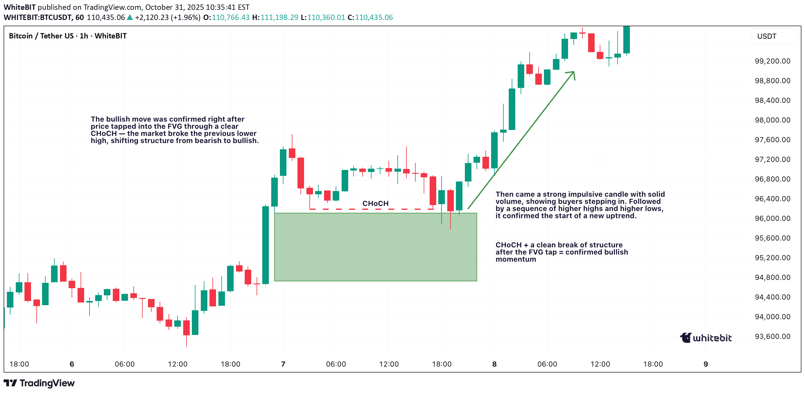
Ever scrolled through a chart and spotted a weird empty space in the candles — like the market just skipped a beat? That’s a Fair Value Gap (FVG). It’s one of those subtle price imbalances smart traders love to hunt for. Understanding how these gaps form and how price reacts around them can seriously level up your chart-reading game. What Is a Fair Value Gap in Trading? A Fair Value Gap happens when there’s a sudden surge in buying or selling pressure that causes price to move so fast, it doesn’t fully balance out between buyers and sellers. In simple terms, it’s an imbalance — a zone where the market skipped over potential orders. When you hear traders talking about FVG in trading, they’re referring to those little pockets of unfilled liquidity left behind during strong moves. So, what is FVG in trading, and why does it matter? Because price often comes back to those areas later to “rebalance” — filling the gap before continuing in the original direction. That’s the core logic behind Fair Value Gap trading. Bullish and Bearish FVGs There are two main types of Fair Value Gaps — bullish and bearish: Bullish Fair Value Gap (bullish FVG): Forms during a strong upward move, when aggressive buyers push price higher, leaving a void below. Price might later dip back into that zone before continuing upward. Bearish Fair Value Gap (bearish FVG): Forms in a sell-off, when sellers dominate and the market drops quickly, skipping over potential buy orders. Later, price often retraces upward to “fill” that gap. Both can act as magnets for liquidity — areas where smart money likes to re-enter the market. Fair Value Gap Example Let’s say Bitcoin jumps from $110,000 to $120,000 in a single bullish candle, with almost no trading in between. That sudden move leaves a Fair Value Gap — the zone between the candle’s high and low where little to no trading took place. If the market later pulls back to that range and finds support before bouncing, you’ve just witnessed a textbook Fair Value Gap example in action. Using a Fair Value Gap Indicator You can spot these zones manually by looking for three-candle structures — one candle that “leaves the gap” and two surrounding it that don’t overlap. But if you prefer automation, you can use a Fair Value Gap indicators: Fair Value Gap Trading Strategies Fair Value Gap trading isn’t about chasing price — it’s about waiting for the market to come back to you. Within Smart Money Concepts, traders often combine FVGs with CHoCH (Change of Character) to confirm a potential shift in structure before entering. A common approach is to mark recent FVGs, identify the broader trend, and wait for price to revisit a gap in line with that trend. In a bullish trend , traders look for bullish FVGs below current price as potential demand zones — ideally after a CHoCH confirms that buyers are stepping back in. In a bearish trend , they watch for bearish FVGs above current price as potential supply zones, again validated by a CHoCH showing a shift in control. Still, it’s important to remember — these setups are not guarantees. The market doesn’t owe you a fill. Use FVGs and CHoCH as part of the Smart Money framework, not as standalone signals. Always manage risk and make your own trading decisions based on your personal strategy and comfort level. Final Thoughts So, what is a Fair Value Gap really? It’s not magic — just the market showing where it moved too fast. Learning to read Fair Value Gaps gives you insight into liquidity, momentum, and potential reversals. Whether you use a Fair Value Gap indicator or mark them by hand, mastering FVG in trading can give you a serious edge in spotting high-probability zones. Just keep in mind — no indicator or setup replaces good judgment. Observe, adapt, and let the charts speak for themselves.
MACD: Sadece Kesişmeler Değil! Momentumun Gizli Sinyallerini Keşfedin
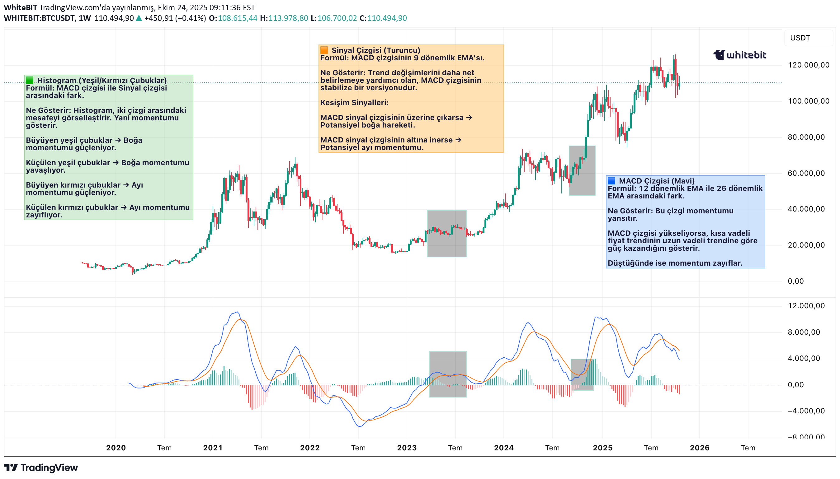
Selam, tüccarlar! 🔥 MACD (Hareketli Ortalama Yakınsama Iraksama) göstergesi, teknik analizde en çok güvenilen araçlardan biridir, ancak genellikle en fazla basite indirgenenlerden biridir. Birçok tüccar sinyal hattı kesişimlerine odaklansa da, MACD'nin gerçek gücü piyasa momentumu, trend gücündeki ince değişimler ve potansiyel dönüşlerin erken işaretlerini görselleştirme yeteneğinde yatar. Haftalık BTC/USDT grafiğini kullanarak MACD'nin davranış biçimlerini birlikte inceleyelim ✍🏻. 🔧 Mekaniklerini Anlamak Temelde MACD, genellikle 12 dönemlik EMA ve 26 dönemlik EMA olarak gösterilen iki üssel hareketli ortalama (Exponential Moving Average - EMA) arasındaki farktır. Sonuç, MACD hattını (mavi) oluşturur. Turuncu çizgi, MACD hattının 9 dönemlik Üssel Hareketli Ortalamasını (EMA) temsil eder ve genellikle sinyal hattı olarak adlandırılır. Histogram, bu ikisi arasındaki mesafeyi yansıtır ve momentumu ne zaman güçlendiğini veya zayıfladığını görselleştirmeye yardımcı olur. 📊 Uygulamada MACD: Haftalık BTC Grafiği İncelemesi BTC/USDT haftalık grafiğine baktığımızda birkaç önemli MACD davranışı öne çıkıyor: 2023 Başındaki Boğasal Hızlanma 2023'ün başında MACD sinyal hattının üzerine çıktı ve histogramda sert bir artış buna eşlik etti. Bu da fiyatın 2022 diplerinden toparlanmaya başlamasıyla birlikte güçlü pozitif momentumu işaret etti. Histogramın genişlemesi, kısa ve uzun vadeli EMA'lar arasındaki farkın arttığını doğruladığından dolayı, bu durum trend hızlanmasının klasik bir işaretidir. 2023 Sonundaki Zirve Momentum 2023'ün sonlarına doğru, MACD hattı zirve yaptı ve histogram da maksimum yüksekliğe ulaştı. Bu yalnızca gücün bir teyidi değil, aynı zamanda momentumun zirveye ulaşmış olabileceğine dair bir işaretti. Fiyat hafifçe yükselmeye devam etse de, MACD eğrisi düzleşmeye başladı ve bu da trend gücünde potansiyel bir tükenmenin erken uyarısıydı. 2025 1. Çeyrekteki Ayı Yakınsaması 2025'in başlarında MACD hattı aşağı döndü ve sonunda sinyal hattının altına indi, histogram kırmızıya döndü. Bu, ani bir tersine dönüşten ziyade boğa momentumunda bir soğumayı yansıttı. Dikkat çekici olan, fiyatın keskin bir şekilde çökmediği, bunun yerine bir geri çekilme aşamasına girdiğidir - bu da MACD'nin fiyat görünür şekilde tepki vermeden önce momentumun yumuşadığını nasıl gösterebileceğini ortaya koyar. 📌 Bu Bize Ne Anlatıyor? Bu haftalık BTC grafiğindeki MACD göstergesi, momentumun genellikle trend kırılmadan önce nasıl değiştiğini gösteriyor. Her bir kesişim, ıraksama veya histogram değişikliği bir garanti değil, daha yakından dikkat edilmesi için bir ipucudur. Ana çıkarımlar: Güçlü Histogram Genişlemesi = Mevcut Hareket İçin Güven. MACD Zirvesi Ancak Fiyatın Yeni Zirveler Yapmaması = Potansiyel Iraksama. Küçülen Histogram + Yakınsayan Çizgiler = Momentumun Duraklaması. 🧠 Son Düşünce MACD yalnızca "kesişince al" veya "kırmızı çubuklarda sat" demek değildir. Fiyatın yüzeyin altında nasıl geliştiğini gösteren bir anlatı aracıdır. Haftalık grafik gibi daha yüksek zaman dilimlerinde, fiyat hareketlerinde görünür hale gelmeden çok önce makro momentum değişimlerini potansiyel olarak vurgulayabilir.
الگو شمع دوجی: راز کلیدی تشخیص چرخشهای بزرگ بازار
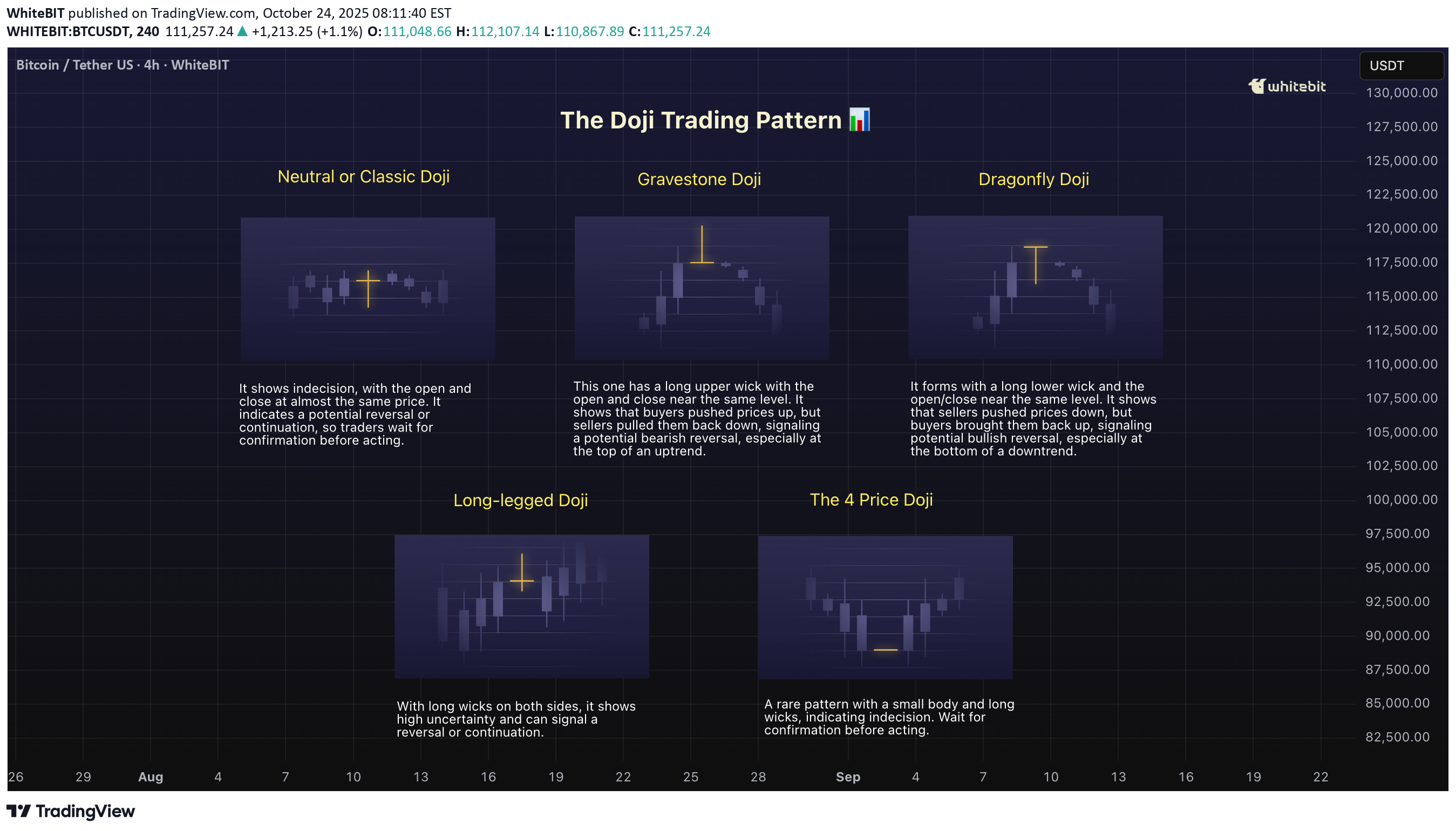
Alright, let’s break down the Doji candlestick pattern. If you're trading crypto, you've probably bumped into this little guy at some point. It’s not a wild trendsetter on its own, but it definitely has something to say about the market’s mood 🤔. The Doji is one of those candlestick patterns you’ll want to pay attention to if you're trying to catch reversals or just understand what's going on in the market. What is the Doji Candlestick Pattern? A Doji candlestick pattern forms when the opening and closing prices are almost identical. The body of the candle becomes tiny, while the shadows (the lines extending above and below the body) are long. It might look like a cross, plus sign, or even an “✖️.” The key point is that the market is indecisive, which is why this pattern gets so much attention. 🐂Bullish Doji Candlestick Pattern So, what happens when you spot a Doji after a downtrend? You might be looking at a potential reversal, signaling that the bears are running out of steam. A bullish Doji candlestick pattern forms when the market closes near the opening price but after a steady downtrend. It’s like the bulls are just waiting for the right moment to step in. But don’t jump in too quickly! A single Doji doesn't mean the market's ready to flip. Look for confirmation in the following candles — ideally, a strong bullish candle that closes above the previous high. 🐻Bearish Doji Candlestick Pattern Now, flip the script. If you see a bearish Doji candlestick pattern after a nice uptrend, it’s time to pay attention. This signals that the bulls might be running out of energy, and the bears could be gearing up for a push. It’s not an instant signal to sell, but it’s a red flag that the market’s strength is weakening. After spotting the Doji, wait for confirmation — usually in the form of a bearish candle that closes below the previous low. How to Use the Doji Trading Pattern Effectively? So you’ve spotted a Doji chart pattern. Now what? This pattern is all about context. If it shows up in the middle of a strong trend, it’s probably just a pause in the action — not a reversal. But, if it appears after a big rally or a significant drop, it could indicate that market sentiment is shifting. Here’s the key: Confirmation is king. The Doji itself doesn’t tell you where the market is going. It only tells you that the market is uncertain. Look for the next few candles to see if they support a reversal — a bullish follow-up candle after a bearish Doji or a bearish candle after a bullish Doji. 🏁Final Thoughts The Doji candlestick pattern can be a valuable addition to your trading strategy, offering insights into market sentiment when combined with other indicators. While it highlights moments of indecision, it's essential to exercise caution and not rely solely on a single signal. In trading, context, confirmation, and proper risk management are key. Remember, tools like the Doji are meant to inform your decisions, but ultimately, it's your judgment and strategy that will guide your moves. Happy trading!
الگوی چکش دار (Hanging Man): راز شناسایی سقوط بازار در اوج صعودی!
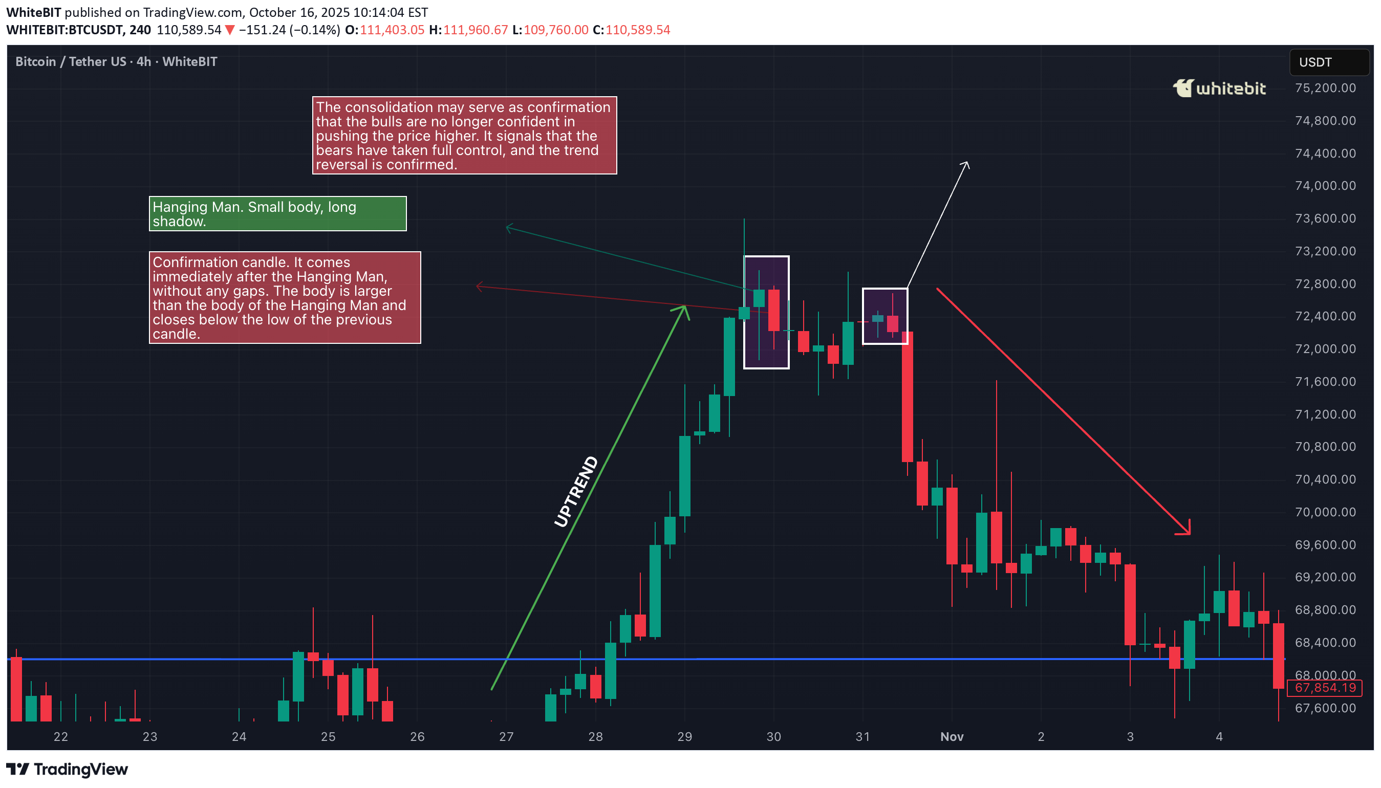
Alright, traders, let’s talk about the Hanging Man candlestick pattern. This one’s a classic, and if you know what you’re looking at, it can be a game changer when you’re spotting potential reversals. So, what exactly is the Hanging Man pattern, and how can you use it to your advantage? Let’s break it down. What Is the Hanging Man Pattern? The Hanging Man pattern appears when the market has been pushing higher, and then—bam—a sign that it could be running out of steam. It’s called the Hanging Man chart pattern because the candlestick looks like a little figure hanging by its feet, with a long lower wick. The body is small, and the lower shadow is long—typically at least twice the size of the body. This shows that while buyers were in control, sellers came in strong towards the end of the session, pushing prices lower. Hanging Man candles can be red or green. Even though the candle is green, it still suggests the same potential reversal because the rejection of higher prices by the sellers shows weakening bullish pressure. The key point to remember is that the Hanging Man candle pattern signals potential exhaustion in an uptrend. It doesn’t guarantee that the trend is reversing, but it highlights that the bullish momentum is waning, which could be a sign that a reversal is near. Where to Look for the Hanging Man Pattern? Context is everything. The Hanging Man pattern is much more significant when it appears at the top of an uptrend. In this case, it suggests that buyers are losing control, and the market could soon turn bearish. If it appears after a downtrend, it’s known as an Inverted Hammer, and its interpretation is different—it could signal a potential reversal to the upside. So, while the Hanging Man is typically seen as a bearish reversal indicator after a sustained uptrend, it is crucial to recognize that the context matters. A Hanging Man at the peak of a strong bullish trend often attracts attention from traders as a potential signal for a shift in momentum. How to Confirm the Reversal? The key to using the Hanging Man pattern effectively is the confirmation candle. After spotting the Hanging Man candlestick pattern, you’ll want to wait for a bearish candlestick in the next session that closes below the low of the Hanging Man candle. This confirms that sellers have taken control and that the market is likely heading lower. It’s also important to consider the volume during the confirmation. A strong bearish Hanging Man pattern with higher-than-usual volume adds strength to the reversal signal. If the confirmation candle has low volume, it might not carry as much weight, so always consider the volume when confirming the pattern. However, the Hanging Man candlestick pattern is not foolproof. A Hanging Man trading pattern without confirmation can sometimes lead to a false reversal, especially in markets with high volatility or when the overall trend is still strong. False Signals and Pitfalls One of the biggest challenges when trading the Hanging Man pattern candlestick is false signals. In choppy or sideways markets, the pattern may form but fail to lead to a true reversal. To avoid these traps, consider waiting for the confirmation candle and also use other tools to verify the signal, like: Trendlines: Ensure the market is actually in an uptrend before considering the Hanging Man pattern. Support/Resistance Levels: Wait for a breakdown below a significant support level to increase confidence in the reversal. Momentum Indicators (e.g., RSI or MACD): Use momentum indicators to confirm that buying pressure is truly weakening, as suggested by the Hanging Man pattern. These additional tools can help you filter out false signals and increase the reliability of your trades. The Hanging Man pattern can be a valuable tool when used correctly, but it’s not a standalone signal. It works best when combined with other forms of technical analysis, such as momentum indicators, trendlines, and volume analysis. Be patient, wait for confirmation, and always manage your risk. The Hanging Man trading pattern is a great addition to your candlestick pattern toolbox, but it should be used as part of a broader strategy that includes multiple indicators and sound risk management.
الگوی چارت فنجان چای: راز صعود قدرتمند در بازار ارز دیجیتال!
Sup, legends! Shall we tea it up? ☕ Today, we’re not just talking about your morning cuppa. We’re diving into something traders get excited about — the Teacup Chart Pattern. Just like a perfect brew, this pattern takes time to form, and knowing how to spot it can make your trading experience much smoother. What Is the Teacup Chart Pattern? The teacup chart pattern is a bullish continuation setup that resembles the shape of a tea cup when plotted on a price chart. It typically forms after an extended uptrend, signaling a consolidation phase before the asset resumes its upward trajectory. Key characteristics of the tea cup pattern include: A rounded bottom that reflects a gradual shift from selling pressure to buying support. A slight pullback, known as the "handle," which represents a brief pause or shakeout before the next move. A breakout above the resistance line at the cup’s rim, often accompanied by strong trading volume. Anatomy of the Teacup and Handle Pattern To apply teacup pattern trading effectively, traders must understand the structure: The Cup – This is the rounded consolidation. It can take several weeks or months to form, depending on the timeframe. A smoother curve is generally considered stronger than a sharp V-shaped recovery. The Handle – Following the cup’s formation, price action typically retraces slightly, creating a downward or sideways movement. This handle reflects short-term profit-taking and helps “reset” market sentiment. The Breakout – Once the handle is complete, a breakout above the cup’s rim confirms the tea cup trading pattern and signals renewed bullish momentum. Trading the Teacup Pattern When approaching tea cup pattern trading, consider the following strategies: Entry Point : A common entry is at the breakout above the rim of the cup, once volume confirms the move. Stop Loss Placement : Traders usually place stops slightly below the handle’s low to minimize downside risk. Target Projection : The potential price target can be estimated by measuring the depth of the cup and projecting it upward from the breakout point. Why the Teacup Trading Pattern Works? The teacup trading pattern embodies market psychology. The rounded cup reflects gradual accumulation, while the handle signals a controlled pullback that shakes out weak hands. When the breakout occurs, it often triggers a surge of buying pressure from both breakout traders and those re-entering the market. For crypto traders, the tea cup chart pattern is particularly valuable because digital assets are prone to sharp moves. Recognizing this structure early can provide an edge in catching strong upside momentum. Common Mistakes in Teacup Pattern Trading Even experienced traders can misinterpret the teacup chart pattern. Some common pitfalls include: Mistaking a sharp V-shaped rebound for a valid cup formation. Entering too early, before the handle completes. Ignoring volume confirmation, which often validates the breakout’s strength. Patience and discipline are critical in successfully applying the tea cup pattern trading strategy. Final Thoughts The teacup and handle pattern is one of those OG bullish setups in crypto that just works when you read it right. Think of it as the market taking a chill before the next leg up. You spot the rounded cup, wait out that handle fake-out, and when volume kicks in — that’s your green light. With crypto’s crazy volatility, the teacup trading pattern can be a solid way to catch continuation moves and ride some serious momentum. Just don’t ape in blind — always stack confirmations. Watch the volume, line it up with MAs or momentum tools, and filter out the noise. The pattern’s strong, but context is king if you don’t wanna get trapped in a fake breakout.
Disclaimer
Any content and materials included in Sahmeto's website and official communication channels are a compilation of personal opinions and analyses and are not binding. They do not constitute any recommendation for buying, selling, entering or exiting the stock market and cryptocurrency market. Also, all news and analyses included in the website and channels are merely republished information from official and unofficial domestic and foreign sources, and it is obvious that users of the said content are responsible for following up and ensuring the authenticity and accuracy of the materials. Therefore, while disclaiming responsibility, it is declared that the responsibility for any decision-making, action, and potential profit and loss in the capital market and cryptocurrency market lies with the trader.