
Youriverse
@t_Youriverse

What symbols does the trader recommend buying?
Purchase History
پیام های تریدر
Filter
Youriverse
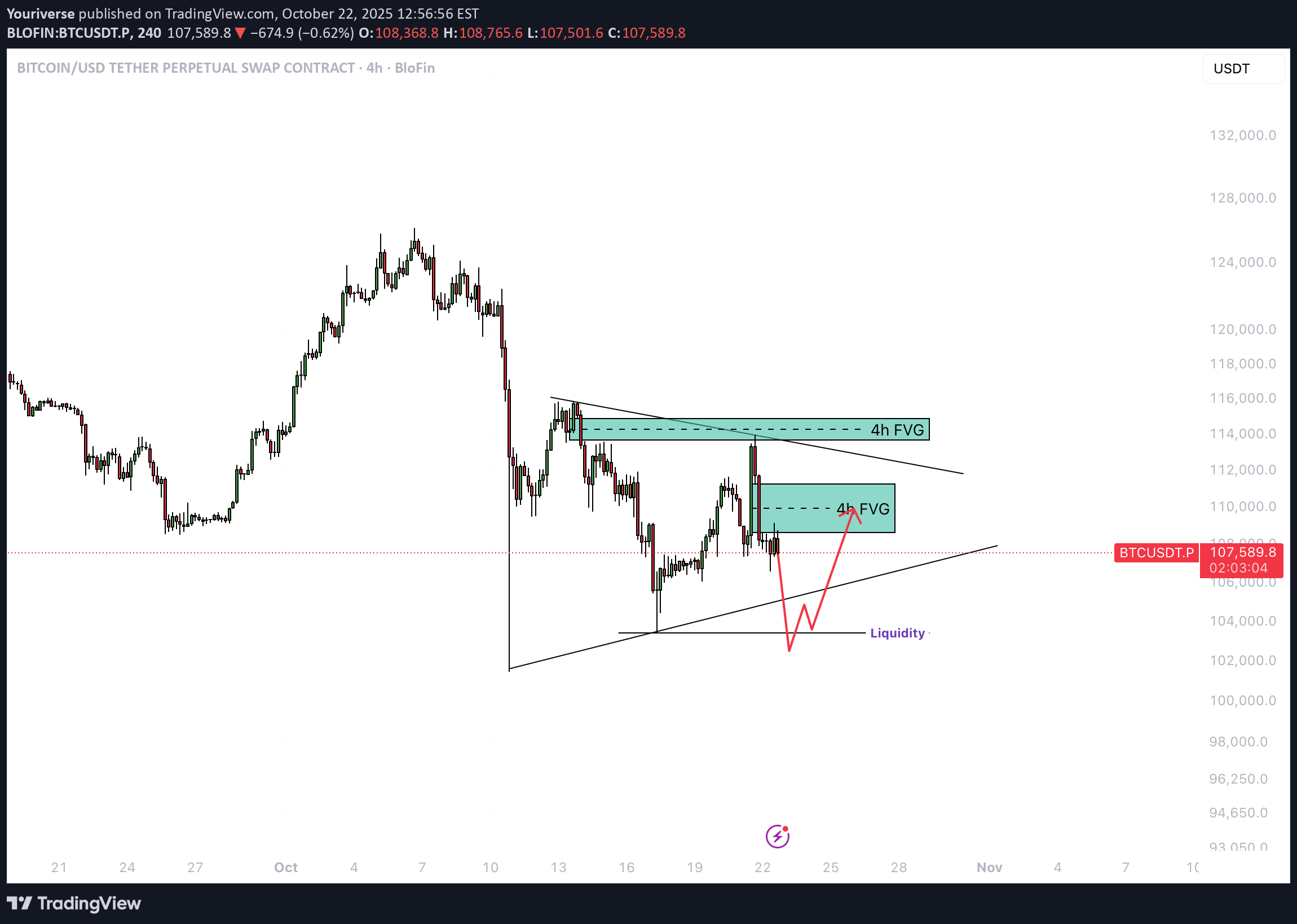
Bitcoin - Can it reclaim $89.000?
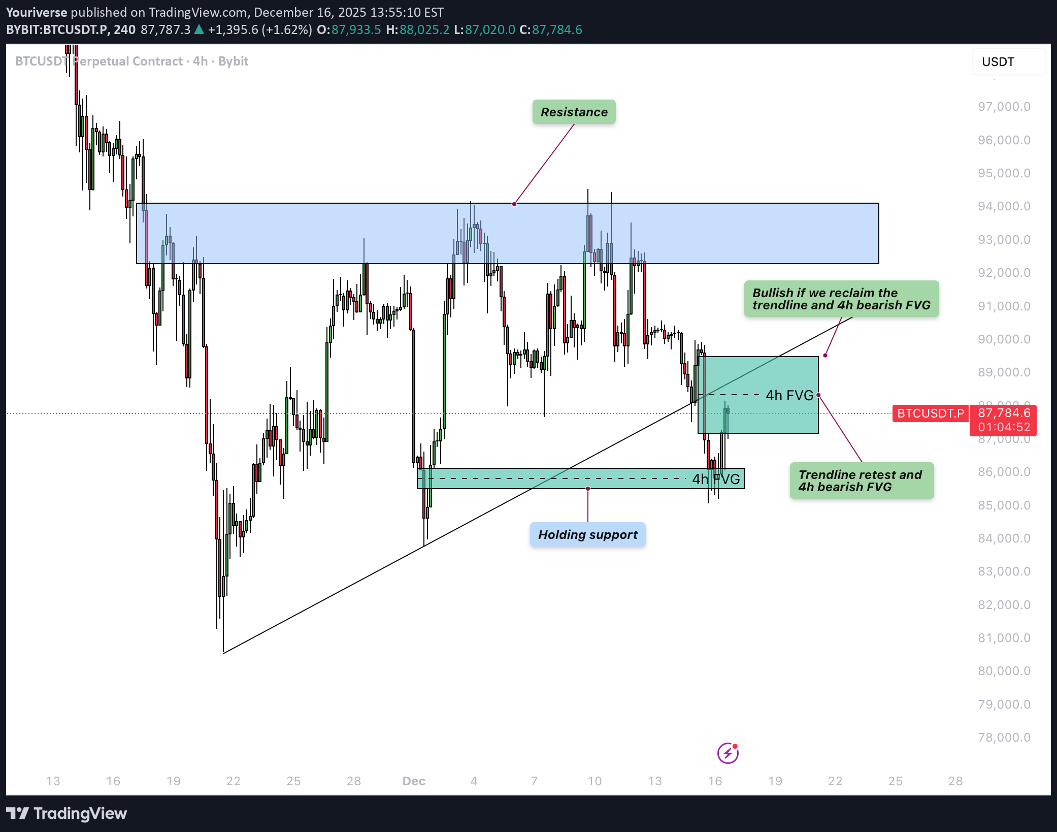
Bitcoin (BTC) is currently trading in a crucial zone after the recent decline, positioned between a bullish 4-hour FVG around the lower $85,000 region and a 4-hour bearish FVG just below resistance. This BTC technical analysis focuses on whether Bitcoin can reclaim the lost trendline and the associated FVG, or whether the market instead opts for a deeper correction. Bullish 4H FVG The bullish 4-hour FVG around approximately $85,500 is holding for now as an important support level. From this zone, BTC recently initiated a modest bounce, indicating that buying interest is still present. As long as price continues to close above this FVG, there remains technical room for a larger recovery move toward the higher resistance zones. Bearish Scenario The bearish scenario centers on a rejection within the 4-hour bearish FVG that aligns with the previously broken ascending trendline. If BTC only revisits this area as a retest and is subsequently sold off, it would confirm that former support has turned into resistance. In that case, lower prices become likely again, with potential targets below the recent lows and deeper into the $80,000 range. Bullish Scenario The bullish scenario requires a convincing reclaim of both the trendline and the 4-hour bearish FVG above it. If BTC manages to close above this cluster and then successfully retest it as new support, market sentiment would shift back in favor of the bulls. In that case, BTC would likely revisit the recent highs near the major resistance zone. This BTC technical analysis therefore emphasizes that the reaction around the converging trendline and FVG will be decisive for the next larger move. Conclusion BTC is currently at an important crossroads between a still-holding bullish 4-hour FVG around $85,500 and a critical 4-hour bearish FVG at the broken trendline. A rejection at the upper levels increases the probability of further downside, while a clear reclaim of both the trendline and the FVG would open the door for a retest of the highs.BTC tried to break above but instantly got rejected massively
Youriverse
Bitcoin - Can the ascending triangle be broken?
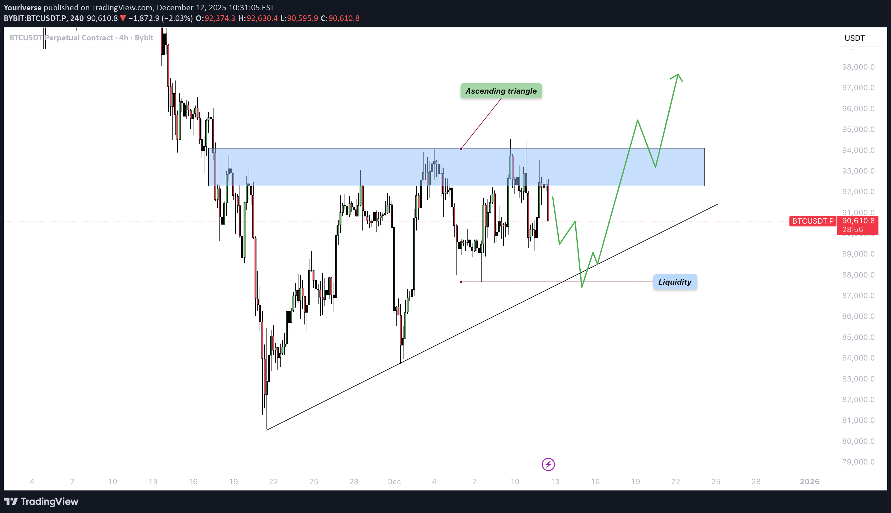
Introduction Bitcoin is currently consolidating within a well-defined structure after weeks of volatile movement. Despite several failed attempts to break higher, the market continues to compress just beneath a major resistance zone. This type of tightening price action often signals a larger move approaching, as liquidity begins to build on both sides of the range. The chart highlights two key elements that will likely determine BTC’s next direction: the ascending triangle formation and the liquidity level resting below current price. Understanding how price reacts to these areas will be essential for anticipating the next significant impulse. Ascending Triangle BTC is forming an ascending triangle pattern, characterized by rising lows meeting a relatively horizontal zone of resistance. This resistance band, highlighted on the chart, has repeatedly capped upward attempts. Each time BTC pushes into the zone, it is met with selling pressure, but the higher lows reveal that buyers are steadily gaining ground. This pattern typically suggests accumulation and a potential bullish breakout once enough pressure builds. If BTC can break above the upper boundary of this triangle with strength and volume, the move would likely target higher liquidity pools above recent highs. Such a breakout often leads to an impulsive leg upward, as trapped short positions are forced to cover and momentum buyers join in. For now, the ascending trendline remains a key structural support that defines the bullish side of this pattern. Liquidity Level Below the current range lies a clear liquidity zone, created by a cluster of equal lows and untested downside levels. This area is marked on the chart and represents where stop-loss orders and resting liquidity are likely positioned. Markets often revisit such zones before making a decisive breakout, particularly in triangle structures where liquidity builds on both sides. A sweep of this liquidity, combined with a tap into the ascending trendline, would be a textbook setup for buyers to step back in. If BTC dips into this zone and rebounds strongly, it would further strengthen the market structure and increase the likelihood that the eventual breakout takes place to the upside. However, if this liquidity level fails and price breaks below the trendline, the bullish structure would be invalidated, opening the door for a deeper move down. Final Thoughts BTC is approaching a decision point, with price tightening inside an ascending triangle while liquidity pools gather below. As long as the ascending trendline continues to act as support, the market maintains a bullish bias, and a breakout above the resistance zone becomes increasingly likely. Still, a liquidity sweep to the downside before any major rally remains a strong possibility. Traders should pay close attention to how BTC reacts if it dips into the liquidity zone, as this response will reveal whether buyers are prepared to defend the structure. A clean breakout above the resistance band would confirm the next bullish leg, while a breakdown below the ascending trendline would signal weakness and shift the outlook.BTC is consolidating here. Waiting for some better price action next week!
Youriverse
بیت کوین آماده جهش به ۹۵,۰۰۰ دلار قبل از اصلاح بزرگ؟
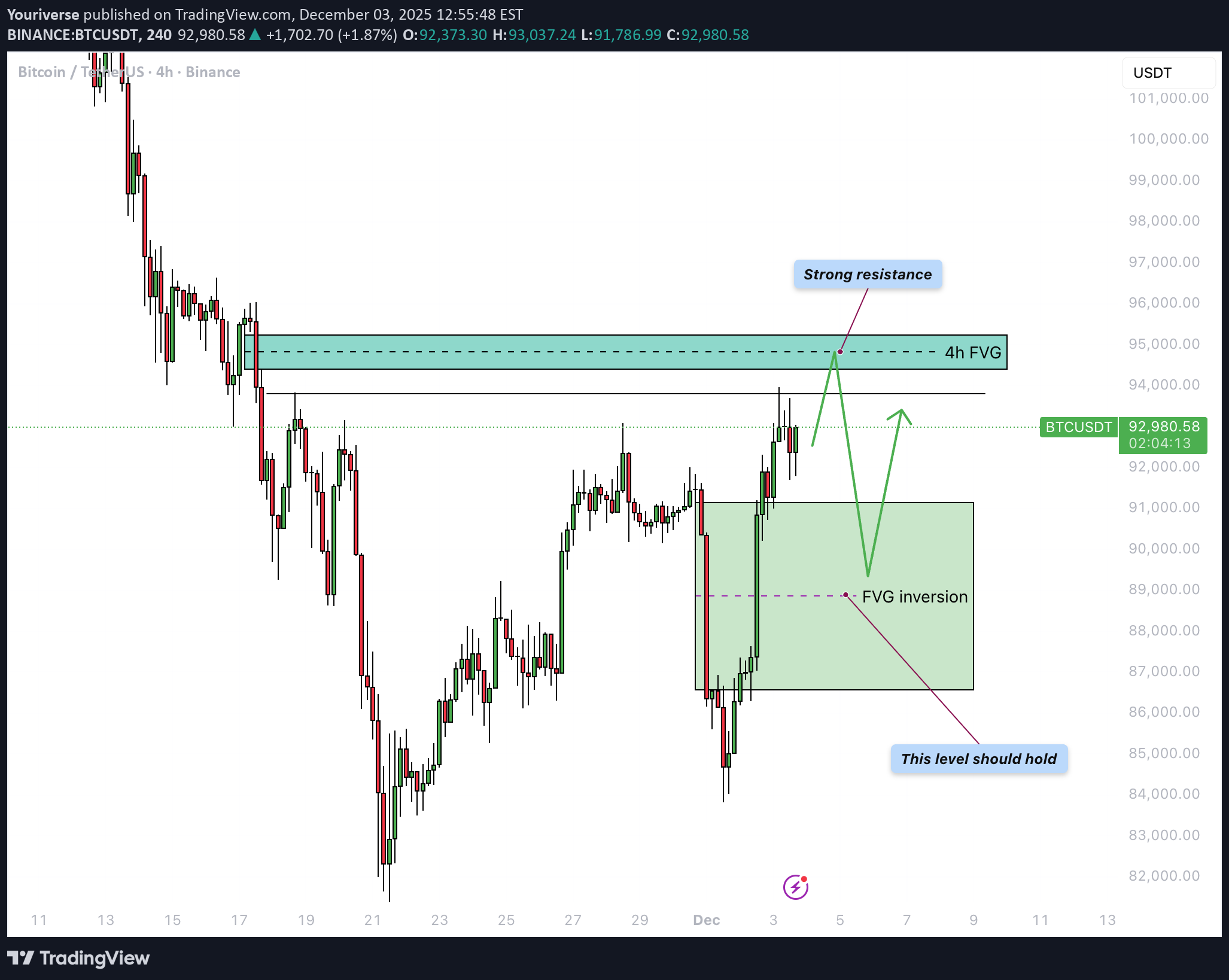
Bitcoin finds itself at an important turning point once again after a sharp decline followed by a strong recovery. In this update, we will cover the reaction to the previous 4H bearish FVG, the newly formed 4H FVG inversion acting as support, the next resistance level around 95,000 dollars, and the recent liquidity sweep. 4H Bearish FVG Inversion Two days ago, BTC made a strong downward move that reversed a large part of the earlier rally and collected deep liquidity beneath local lows. During this drop, a clear 4H bearish FVG was formed, acting as a supply zone. Yesterday, however, BTC reclaimed this entire FVG with conviction: the price broke through it and closed multiple candles above the zone. This shift flips the area from supply into demand, meaning the former bearish FVG has now transformed into a 4H FVG inversion. The green box on the chart now represents the primary support zone, ideally holding during any pullback. 4H Bearish FVG Around $95,000 Above the current price lies the next 4H bearish FVG around roughly 95,000 dollars, aligning with a previous consolidation and distribution phase. This region acts as strong resistance and is the next logical magnet for the ongoing recovery move. As long as the FVG inversion beneath price holds, it is reasonable to expect BTC to gradually move toward the 95k area. A clear reaction is likely once this zone is reached—ranging from a brief rejection and sideways consolidation to a potentially larger reversal if sellers become aggressive again. Liquidity Sweep Recently, BTC briefly pushed above a local high and pulled back immediately afterward, creating a clear liquidity sweep on the chart. This move wiped out the stops of late shorts as well as breakout longs but did not yet lead to immediate continuation to the upside. After such a sweep, the question becomes whether the market can gather enough buyers to fuel the next impulse toward the higher FVG, or whether price will first drop back toward the inversion support to gather liquidity there. The reaction at current levels will therefore provide important insight into short-term direction. Conclusion Because of today’s liquidity sweep, a direct correction from the current price is very possible, especially if short-term traders take profit after the strong bounce. However, the base scenario remains that BTC could still make one more push upward toward the 4H bearish FVG around 95,000 dollars, where a more significant reaction is expected. Such a move would fit perfectly within a structure where resistance is tested first, followed by a pullback to retest the new inversion support—confirming whether the recent reversal has real strength behind it. ------------------------- Thanks for your support. If you enjoyed this analysis, make sure to follow me so you don't miss the next one. And if you found it helpful, feel free to drop a like 👍 and leave a comment 💬, I’d love to hear your thoughts!We still have to wait for the entry. BTC is kinda consolidating here what could be bullish
Youriverse
بیت کوین در تنگنا: آیا گاوها میتوانند مقاومت سرسخت را بشکنند؟
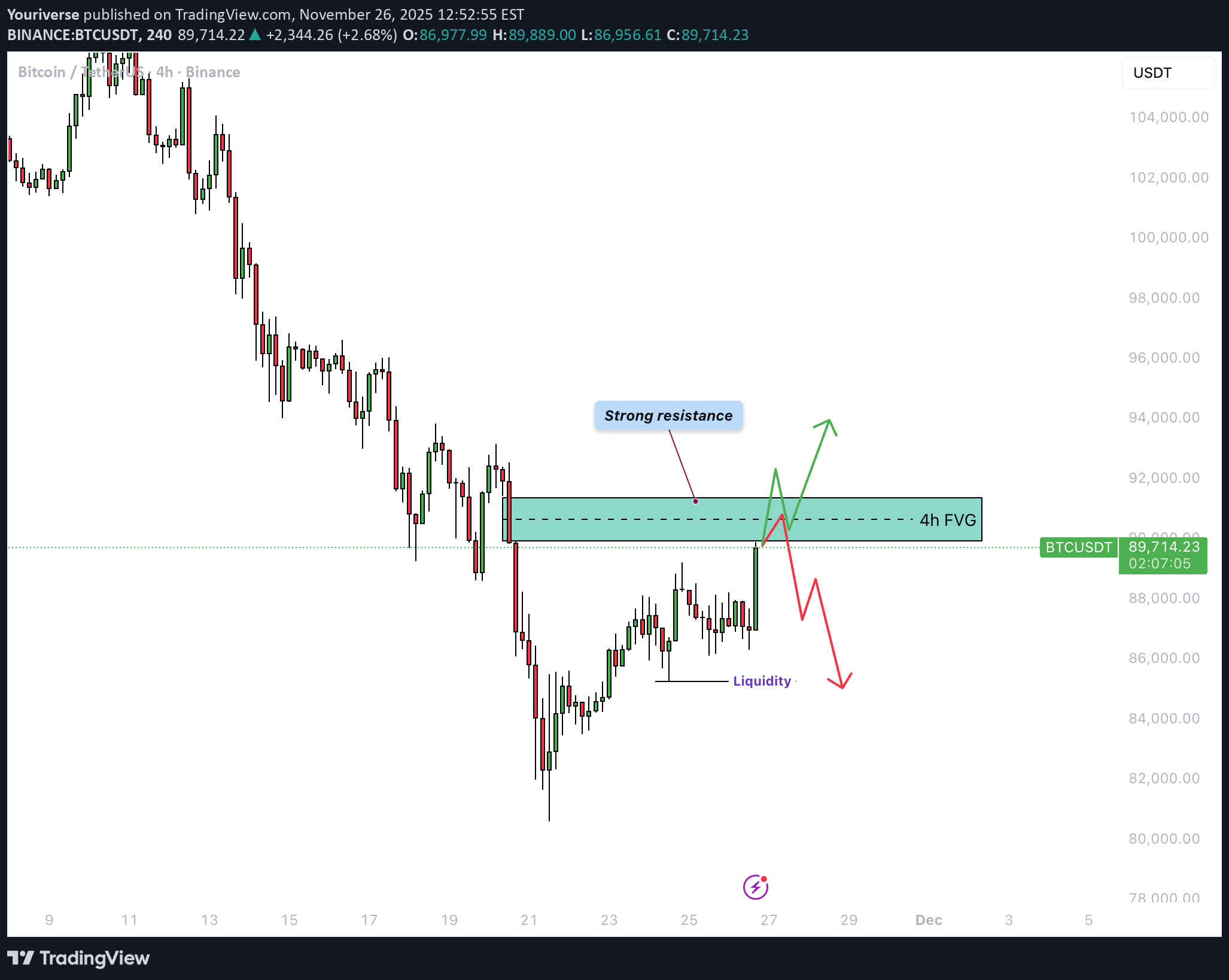
Bitcoin continues to stagnate after a strong sell-off. Market structure remains weak, and trading volume is declining as price keeps moving sideways within a tight range. Traders are uncertain about the next move, and both bulls and bears currently lack conviction. Overall sentiment is cool, with most attention focused on nearby resistance zones. Many eyes are on how BTC reacts to the current consolidation area. 4H Bearish FVG Just above the current price lies a clear bearish 4-hour Fair Value Gap (FVG). This zone now acts as strong resistance. When BTC retests this area, a rejection is the most likely scenario. Only a breakout with strong volume would give bulls something to lean on. As long as this FVG holds, further downside remains the path of least resistance. 1H Timeframe The 1-hour timeframe shows ongoing consolidation and repeated struggles with the local 1H bearish FVG. Every attempt to break through this area is immediately rejected. As a result, the probability of BTC breaking to the downside increases, which would allow the market to collect the liquidity resting below. Bears are expected to keep defending this zone until the market breaks through with conviction. Consolidation may continue as long as the support level holds, but the underlying downside risk remains significant. Conclusion BTC remains technically pressured as long as there is no convincing breakout above the 4H FVG. The current range is vulnerable to a downward break, especially with weak volume and persistent resistance structures. Traders would be wise to wait for clearer signals or a new trend on higher timeframes before committing to a direction.Looks like it is breaking up
Youriverse
بیت کوین در آستانه جهش اصلاحی؟ علائم صعود در تایمفریمهای کلیدی!
Introduction Bitcoin (BTC) has shown strong downward pressure over the past several days, yet it is beginning to display early signs of stabilization within key higher-timeframe fair value gap zones. Even though the current market structure remains bearish, several technical elements are aligning that suggest the potential for a relief rally. With multiple patterns and liquidity levels converging, the market may be preparing for a temporary upside correction before determining its next major direction. Weekly FVG On the weekly timeframe, BTC recently tapped into the weekly fair value gap and filled roughly fifty percent of this imbalance. This partial fill often indicates that the market is collecting liquidity before initiating a larger move. As a result, this weekly FVG acts as a strong demand zone where buyers tend to become active again, offering an area where price often stabilizes, even if only temporarily. The reaction here suggests that BTC may be forming a short-term base. Daily FVG On the daily timeframe, another fair value gap is present, and it aligns almost perfectly with the weekly zone. Above current price action lies a clear descending trendline, which is likely to act as resistance on any upward push. The combination of the daily FVG and the downward trendline creates a technically significant decision point. If BTC reaches this area, it may face renewed selling pressure, making this zone crucial for determining whether the market can extend higher or whether the downtrend will reassert itself. 4H Timeframe On the 4-hour chart, BTC has formed a falling wedge, a pattern that is typically considered bullish. Initially, price broke downward out of the wedge, which seemed like a continuation of weakness. However, BTC quickly moved back into the structure, signaling a fake-out. This type of movement often occurs when liquidity is collected beneath the pattern before a reversal begins. The return into the wedge strengthens the case for a short-term upward correction, suggesting that buyers may be gaining traction. Relief Rally The first zone to watch lies just above the current price level, where a 4-hour bearish FVG overlaps with the descending trendline. This confluence is likely to act as immediate resistance, making an initial rejection from this level highly plausible. After a potential rejection, price may revisit the bullish 4-hour FVG below, where buyers are expected to step in again. From this supportive zone, BTC could attempt to break through the descending trendline and continue higher toward the upper 4-hour bearish FVG around the 98,000-dollar region. This serves as a logical target for a relief rally, should momentum continue to build. Conclusion BTC is currently positioned within an important higher-timeframe demand zone, strengthened by the overlap of both the weekly and daily FVGs. Although the broader market structure remains bearish, the fake-out within the falling wedge on the 4-hour chart signals that a relief rally may be developing. The immediate resistance above price will provide the first major test. If Bitcoin finds renewed momentum from the bullish 4-hour FVG and successfully breaks the descending trendline, an upward move toward 98,000 dollars becomes increasingly realistic. For now, BTC appears to be setting the stage for a corrective bounce, with key levels offering clear guidance on how this scenario could unfold.
Youriverse
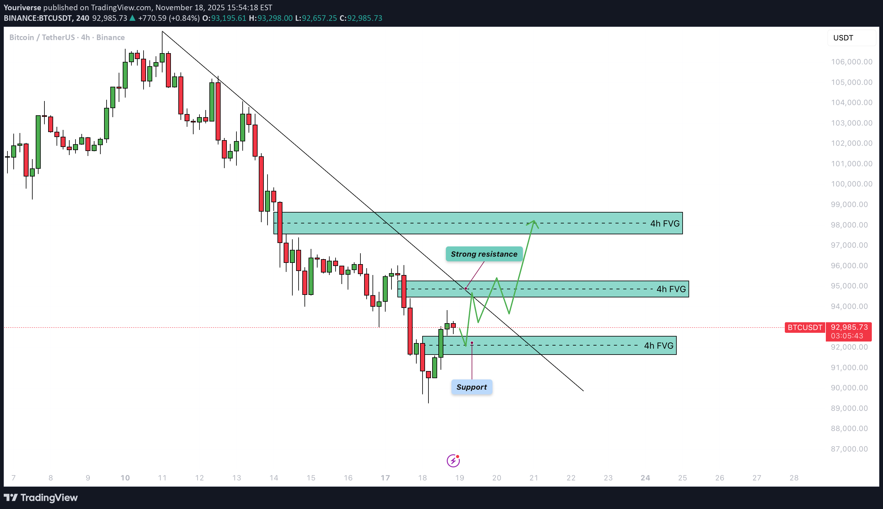
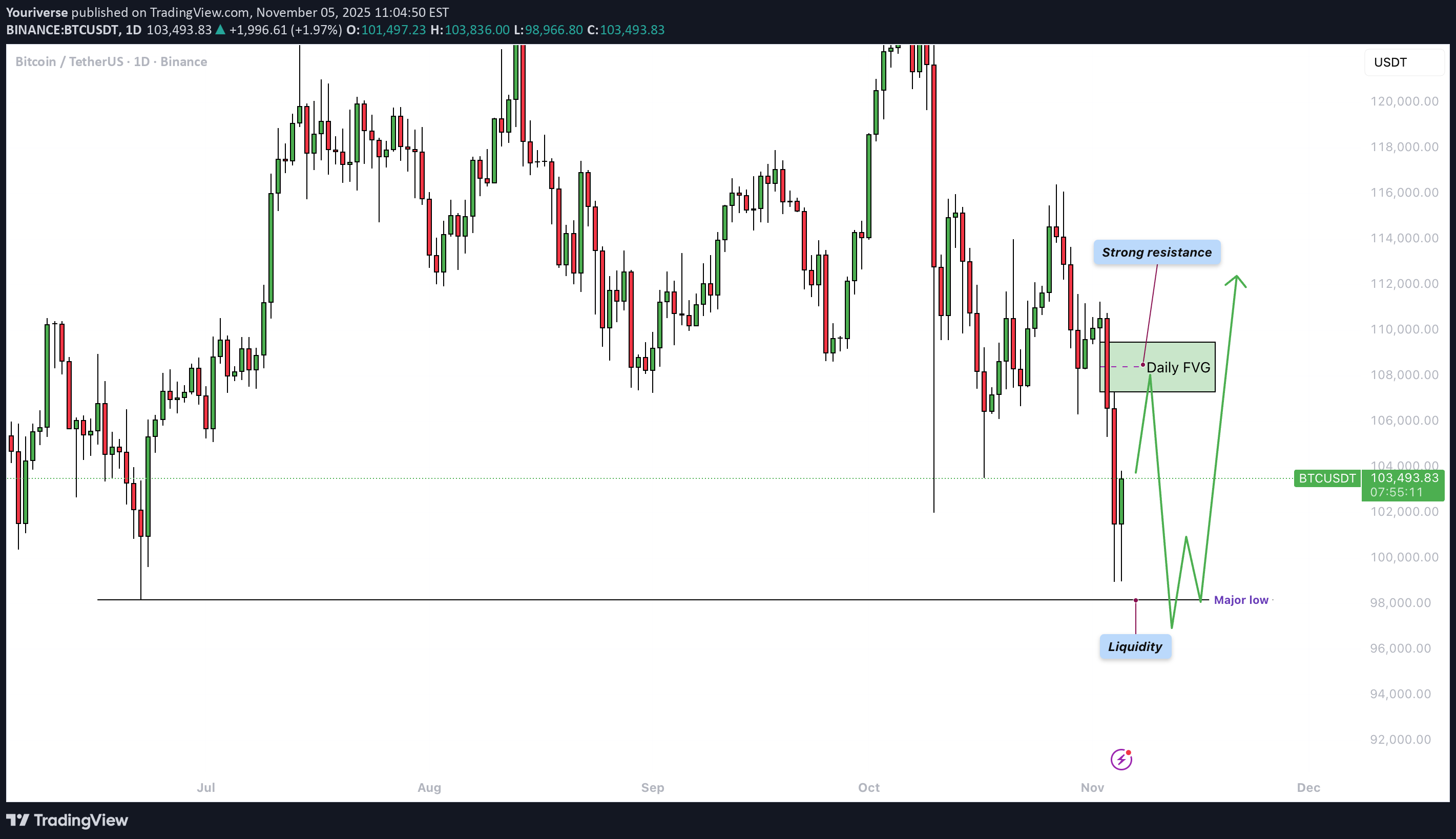
بیت کوین به ۹۸,۰۰۰ دلار سقوط میکند؟ تحلیل کاهش قیمت و نقدینگی از دست رفته!
Bitcoin (BTC) has shown a clear downward price structure in recent days. After a period of sideways movement and attempts at recovery, selling pressure has once again become dominant, resulting in a sharp decline toward key liquidity zones. 4h Bullish FVG Inversion BTC has just failed to hold the 4-hour bullish FVG and has closed below it, which now acts as resistance (inversion). This opens the path toward lower levels, and the likelihood of a continued decline remains high. The bulls are currently struggling to regain ground. Liquidity Sweep During the most recent session, a liquidity sweep occurred, with the price dipping below previous lows and triggering many stop-losses and sell orders. Although such a move often leads to a technical bounce, overall sentiment remains bearish. The remaining liquidity below the major low around $98,000 continues to create selling pressure and could lead to further downside. Conclusion Despite the recent liquidity sweep, there is still no convincing bottom in sight, and downside risk continues to dominate. As long as BTC trades below the 4h FVG inversion and bearish momentum persists, a move toward $98,000 remains the most likely scenario within the current technical outlook. ------------------------- Thanks for your support. If you enjoyed this analysis, make sure to follow me so you don't miss the next one. And if you found it helpful, feel free to drop a like 👍 and leave a comment 💬, I’d love to hear your thoughts!BTC is at the moment kinda ranging. It is still possible to move towards $98.000. We have to be patient with no clear direction on trendThanks again. BTC went down like expected and is now taking out the wick. Lets see if there is a reaction
Youriverse
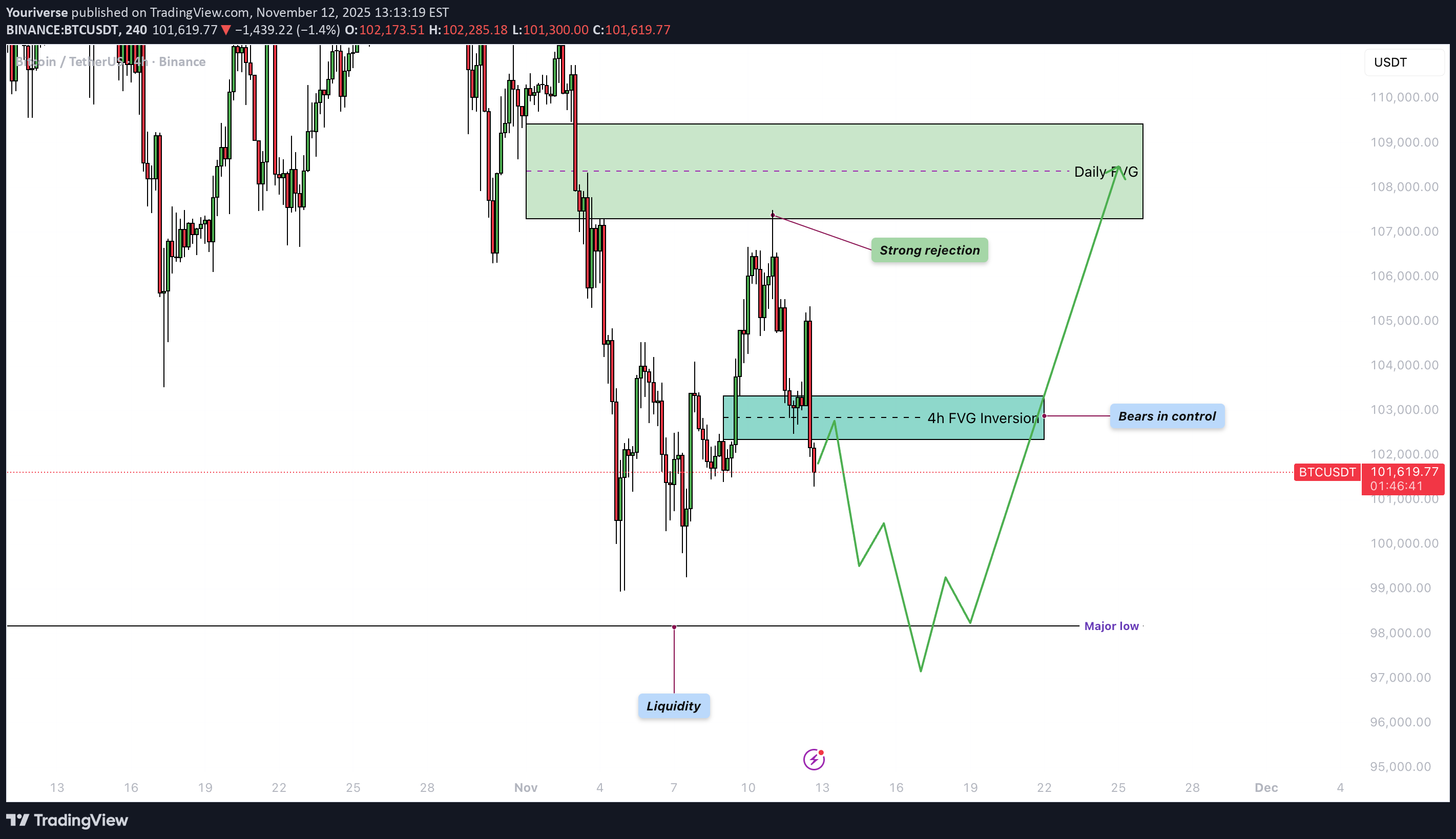
هشدار بزرگ بیت کوین: آیا "تقاطع مرگ" بازار را نابود میکند؟
Bitcoin has shown a strong move over the past week, reaching the predicted downside target. The price action is currently hovering around key technical levels that influence market sentiment on both higher and lower timeframes. Recap of Last Week Last week, it was noted that BTC had made a liquidity sweep, inversed the bullish daily FVG, and formed a fake-out, all pointing toward further downside movement. The target was set just above $103,000, and this was convincingly reached, with a decline of roughly 7–10%. The prediction played out accurately, and the market clearly demonstrated that the bears remain in control. Daily Timeframe On the daily timeframe, it’s notable that the major low around $98,000 has not yet been taken out. At the same time, BTC is trading below a strong resistance zone just above the current price. This area will be difficult to break and could create downward pressure, making a sweep of the $98,000 level more likely. However, if BTC manages to reclaim these resistance zones, sentiment could shift to a more bullish outlook, but for now, the bears are still in charge. 4h Timeframe On the 4-hour timeframe, there’s a 4h FVG located just above the current price. From a technical standpoint, this is a logical area for a potential rejection. The expectation is that BTC will first move up toward this FVG before facing a rejection and then drop again toward the $98,000 zone. Death Cross A death cross may form within the next 1–2 weeks, occurring when the 50-day MA crosses below the 200-day MA. This is a well-known bearish signal, but historically, it often appears toward the end of a downtrend. In this cycle, we’ve already seen three death crosses, all of which either marked or came close to marking a bottom. However, during 2017 and 2021, death crosses also appeared at the end of bull markets — followed by a sharp decline, and then a relief rally that pushed prices back above the death cross level. Therefore, it’s crucial to stay alert to whether this signals the end of the bull market or rather a final shakeout before a new rally. Conclusion BTC has reached the expected downside target and is currently trading below strong resistance. It’s likely that BTC will first test the 4h FVG and then move toward the $98,000 zone. The upcoming death cross could add pressure, but historically, such signals often mark the end of a downward phase. The coming weeks will be crucial in determining whether this is a deeper correction or the start of a new bullish impulse. ------------------------- Thanks for your support. If you enjoyed this analysis, make sure to follow me so you don't miss the next one. And if you found it helpful, feel free to drop a like 👍 and leave a comment 💬, I’d love to hear your thoughts!Going down
Youriverse
بیت کوین در دام افتاد: شکار نقدینگی و سقوط احتمالی تا ۱۰۳ هزار دلار!
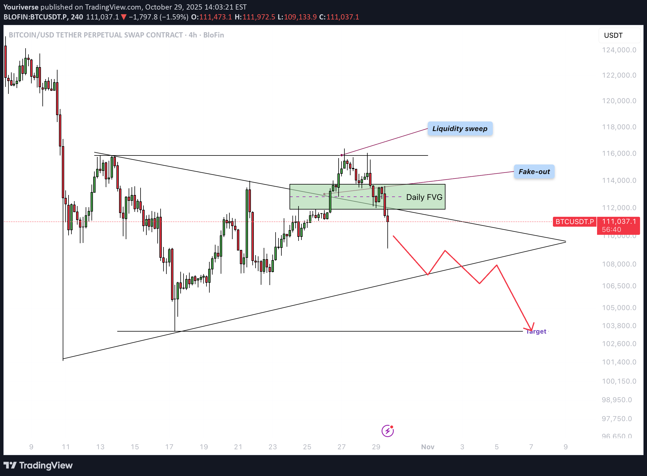
Bitcoin (BTC) is currently in a crucial phase within a broader consolidation structure. After a strong upward move, the price has encountered significant resistance and is showing signs of weakening buying pressure. On the daily chart, it is clear that the price has re-entered the triangle structure after a brief breakout above resistance. Liquidity Grab Around $116,000, a clear liquidity sweep can be observed. Above this level, many stop orders and short-position liquidity were clustered. After this liquidity was taken, the price reversed sharply downward — indicating that large market players likely used this move to take profits or open short positions. Fake-Out from the Triangle Pattern The breakout above the triangle structure turned out to be a fake-out. Instead of holding above the trendline for confirmation, the price quickly fell back within the formation. This indicates buyer weakness and strengthens the bearish scenario. A fake-out above a consolidation pattern often leads to a move in the opposite direction — toward the lower boundary of the structure. Daily FVG The current candle is positioned within an important daily Fair Value Gap (FVG). If the daily close remains as it is, this bullish FVG will convert into a bearish FVG, meaning the area will now act as resistance. This suggests that bears are taking control and further downward price action is likely. Target After an upward fake-out that collects liquidity, price often moves to the opposite side of the pattern. In this case, that would be the lower side of the triangle. A drop toward $103,000–$104,000 is therefore the most likely scenario. This zone aligns with previous structural support and can serve as a logical target area. Conclusion Bitcoin is showing clear signs of exhaustion near the top of the range. The liquidity grab and fake-out from the triangle reinforce the bearish outlook. With the daily FVG flipping bearish and bullish momentum fading, a move down toward the $103,000–$104,000 zone appears to be the most probable next step — unless BTC unexpectedly manages to close above the FVG. ------------------------- Thanks for your support. If you enjoyed this analysis, make sure to follow me so you don't miss the next one. And if you found it helpful, feel free to drop a like 👍 and leave a comment 💬, I’d love to hear your thoughts!The price of BTC has closed below the daily FVG. since then it has find its way down. lets see if we close around $104k soon.
Youriverse
بیت کوین در آستانه سقوط؟ آیا خرسها قیمت را به ۱۰۴ هزار دلار میرسانند؟
Introduction Bitcoin is currently in a phase of consolidation following the recent sharp decline. For several days, the price has been forming a symmetrical triangle, indicating increasing tension between buyers and sellers. This phase is often seen as a period of preparation for a larger move. However, clear bullish momentum is still lacking, which increases the risk of a downward breakout. Triangle pattern The price is moving within a triangle pattern, where the highs are decreasing and the lows are slightly rising. This suggests a compression of liquidity and declining volatility. The upper boundary of the pattern acts as dynamic resistance, while the lower boundary serves as support. Once the price breaks out of this structure, the direction of the next major move will likely be determined. For now, the price seems trapped between these two key levels. Liquidity at the top with the bearish 4h FVG tested Yesterday, the upper side of the structure was tested, just above the 4-hour bearish Fair Value Gap (FVG). In that area, liquidity from previous highs was also located. The price reacted with a strong rejection and quickly fell back. This reaction confirmed that sellers still have control and that demand has weakened. The signal indicates that the market is struggling to break above $114,000. 4h bearish FVG The 4-hour bearish FVG is located between approximately $108,600 and $111,300. This zone now serves as a key resistance area. Each time the price touches this region, selling pressure increases, limiting further upside movement. As long as this zone is not convincingly broken with volume, the short-term trend remains bearish. A breakout above this level could open the door to higher targets. Liquidity area at the bottom At the lower end of the triangle, there is a clear liquidity area around $103,500. This is where stop-losses from long positions and potential buy orders from large players are located, waiting for a liquidity grab. If the price moves into this area, a short wick downward could occur before a potential bounce takes place. Therefore, this level is important to monitor in case of a downward breakout. Conclusion BTC still shows no signs of strength. The rejection from the 4-hour bearish FVG above the liquidity zone points to a lack of buying interest. As long as the price remains within the triangle and trades below $113,000, the likelihood of a downward move remains higher. Only a convincing breakout above the upper boundary could temporarily improve market sentiment. Until then, the bears remain in control, with focus on the support around the lower liquidity zone. ------------------------- Thanks for your support. If you enjoyed this analysis, make sure to follow me so you don't miss the next one. And if you found it helpful, feel free to drop a like 👍 and leave a comment 💬, I’d love to hear your thoughts!
Youriverse
آیا اوج بیت کوین همین حالا رقم خورده است؟ تحلیل زمانبندی دورههای تاریخی
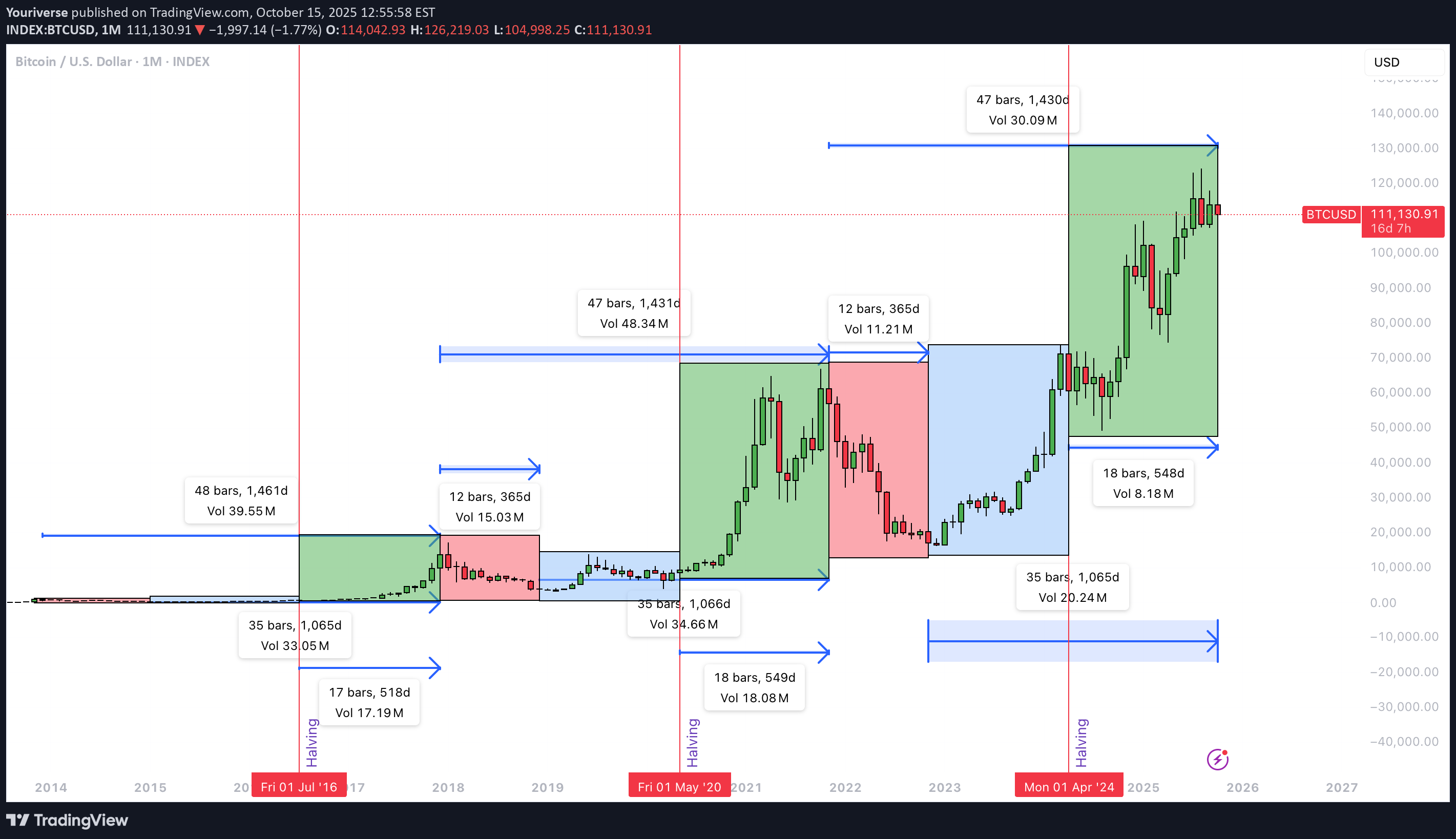
Introduction This chart analyzes Bitcoin’s cyclical timing. The focus is on time, not price. It examines the number of days between structural moments such as cycle tops, cycle bottoms, and halvings. By comparing these intervals, we can understand rhythm and consistency. This helps determine whether the current cycle top may have already formed in early October. Cycle Top to Cycle Bottom The period from cycle top to cycle bottom represents the bear phase after a market peak. In the previous two cycles, this phase lasted about 365 days each. This pattern suggests that the market typically needs a year to recover. After that, a new accumulation phase usually begins. If the pattern holds, it provides a fairly predictable window for correction. It marks the transition from euphoria to rebuilding. Cycle Bottom to Cycle Top The phase from cycle bottom to cycle top defines the bull run itself. In the last two cycles, this period lasted 1,065 and 1,066 days. That is just under three years. During this time, Bitcoin rose from deep accumulation to a new all-time high. Based on current data, 1,065 days points to early October. In that month, a new ATH was reached. This makes the current phase consistent with past cycles. It supports the idea that the top may already be in. Cycle Top to Cycle Top The full duration from peak to peak measured 1,461 and 1,431 days in previous cycles. This shows a clear recurring rhythm. The market moves in fairly consistent four-year patterns. Comparing this with the current cycle shows a slight extension. If the peak occurred in early October, this cycle is longer than the last. That may suggest a more mature market. Growth is slower but structurally stronger. Halving to Cycle Top The time between a halving and the next cycle top is key. Halvings affect both supply and market sentiment. In past cycles, this interval was 518 and 548 days. We are now exactly at day 548 since the last halving. This aligns perfectly with historical timing. It supports the idea that the top was reached in early October. The moment fits the halving-to-top rhythm observed in earlier cycles. Conclusion Based on this timing analysis, it is very likely that the cycle top formed in early October. The bottom-to-top duration of 1,065 days and the halving-to-top of 548 days confirm this. Both match previous patterns. The current cycle is slightly longer than earlier ones, suggesting a slower rhythm. If Bitcoin sets a new ATH later, it would mark an extended cycle. Timing alone does not guarantee future price direction. Macro factors, policy shifts, and liquidity events can all change the rhythm. Use timing cycles as context, not as prediction. Combine them with price structure and on-chain signals. Maintain active risk management, since longer cycles often bring higher volatility and larger deviations from historical averages.
Disclaimer
Any content and materials included in Sahmeto's website and official communication channels are a compilation of personal opinions and analyses and are not binding. They do not constitute any recommendation for buying, selling, entering or exiting the stock market and cryptocurrency market. Also, all news and analyses included in the website and channels are merely republished information from official and unofficial domestic and foreign sources, and it is obvious that users of the said content are responsible for following up and ensuring the authenticity and accuracy of the materials. Therefore, while disclaiming responsibility, it is declared that the responsibility for any decision-making, action, and potential profit and loss in the capital market and cryptocurrency market lies with the trader.