akikostas
@t_akikostas

What symbols does the trader recommend buying?
Purchase History
پیام های تریدر
Filter
akikostas
رمزگشایی از "سبکی" قیمتها: تحلیلی جدید فراتر از اندیکاتورها
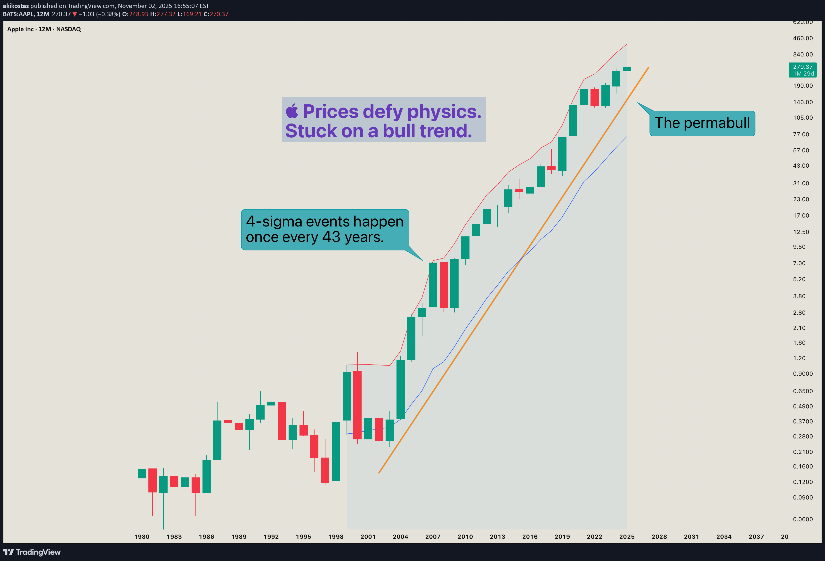
Whenever I prepare an idea to publish, well... I don't prepare. As you may already have realized, my "blog" is not about trading / investment analysis. It is an attempt of mine to describe the indescribable. To smell the un-smellable (like a Greek song said). My first ideas were an attempt of mine to reach out to others to spark conversation.I wasn't trying to give out any meaningful insight, because I had none. Now I think I have information to share, but Socrates would not agree with me, he is certain that he knows nothing . Since I cannot / don't want to be like Socrates, I will be like Diogenes the Cynic, I like him more... His views on philosophy and the world have grown on me. And speaking of grown... Apple has grown. From a seed of a Macintosh in a wooden box, into to a computer that would destroy Orwell's 1984, and then to a pair of smart glasses that would become the dystopia they tried to avoid. Traders have also grown, most only in their age and appetite. The minds stood still. And prices have grown higher and higher, but lighter than ever before. Many analysts develop indicators in reverse. They want profit and shape indicators in a way to satisfy this growing appetite. The appetite of the man who isn't satisfied with the few, cannot be satisfied with the many. I have done this myself in the past. There are two ways this chart is misleading. First: Price on top of Bollinger Band can be interpreted as a "strong push", and at the same time an "overextended price". The indicator by itself is not misleading. It is us who don't analyze it properly. Second: While this indicator calculates a statistical deviation (a pure mathematical idea), it fails in the act. Statistical deviation of trending prices cannot be calculated with ordinary moving averages. Don't listen to me, listen to the scientists from whom I found this, research it yourselves. A secondary problem is log scale. A portion of traders, whom I call gamblers have grown light minded, it seems. They don't want prices to ... slide backward into oblivion, just as (we / they) have finally begun to see the light. And just like gamblers, lighter my charts have apparently become. I simply try to shed some light into the darkness of technological / artificially untelligent societies. Since my publications of indicators have been buried in the darkness, now it is time for them to shine, in simple terms. And so, fixing analysis needs many steps. I show again the original statistical band: Our data lives in a log-scaled world of increasing proportions, not increasing amounts. So, we re-shape our/Bollinger's mathematics to survive in this wild world of massive numbers. We then conclude to the log-scaled band: One of the major problems however has not been fixed. Mathematicians dictate that classical moving averages don't apply in "Time Series Data" i.e. price history. Statistics don't work in trending data. To fix this issue I have constructed a simplified MA model and applied it in multi-timeframe price data using PineScript. The MA-Model is not a moving average (it doesn't describe an average price). It is instead one of the infinite trend-nullifying lines, from the base of which statistics are calculated. The band is the same 2-sigma area like the classic Bollinger. What is the conclusion of this chaotic story, I hear you say... It is either too simple or too complex. The simple explanation is that history repeats itself. Going back to 1998, we see the following: Price divergences have become apparent from statistics. On the first arrow of each one, price reaches a 2-sigma deviation. On the second arrow of each divergence, price fails to make a second deviation jump, price instead returns to mean. It is as if prices move in two steps. First they define a trend from a 2-sigma event (either bullish / bearish), then they follow up on the trend, while reverting to mean. Now in 2025, in a larger timeframe, Apple seems to crave bitter sweets. The 1998-2000 bubble is dwarfed from this massive chart. Apple has done it. From the bottom of the world and a sub 1% market share, to conquer the world. It is the most loved brand. Sells the most popular smartphone. Designs the most powerful chips. Shapes future trends. And ironically, this very idea is typed on a modern Apple device. You have reached the top, when everyone is sure that you will live forever. And I mean everyone, including me who hypocritically votes against them. The drop will come when a single person changes their mind. Be wise. Be safe. Be aware. -Breen P.S. I will follow up this idea with some interesting charts on SPX in the following days.
akikostas
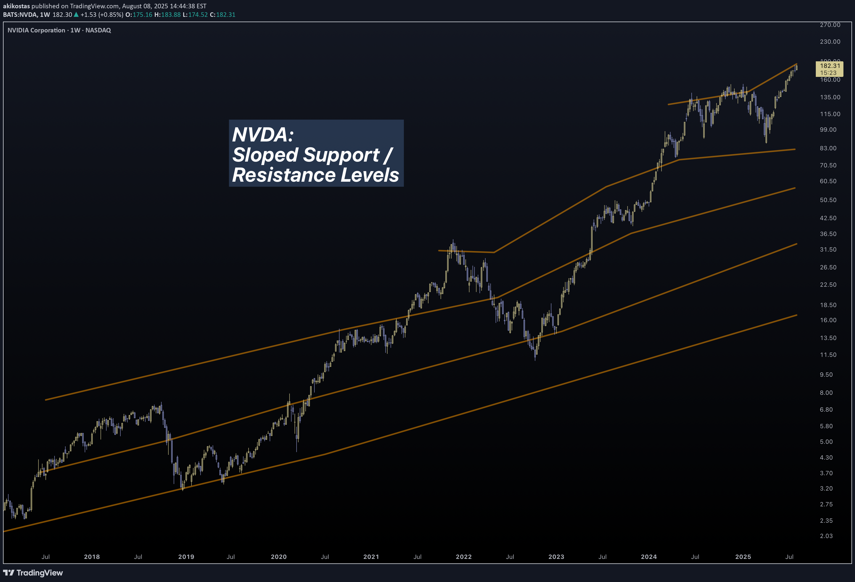
In this slowly but continuously updating idea I will be posting an interesting way to analyze charts. It is something old but also new, like duality. We all know that the stock market continuously grows. But it doesn't always grow. For markets lie between worlds. The reasonable and the unreasonable. The free choice and the illusion of free choice. Let me explain... In micro scale, we seem to believe that the markets follow the "support / resistance" rule. An (over)simplification necessary for us to comprehend the infinities of the quantum world. There are lots of stories told in the picture above... - Prices are chaotic and completely incomprehensible. - We have to smooth-out to get a clearer picture. - Is Support / Resistance real or a result of crowd psychology? - At what point horizontal action "ceases" to exist and "trend" takes over? Either we call it a "power law" or a Lin-log regression, charts in macro scale seem to trend. So prices sometimes move with one "law" (support) and sometimes with another (trend). Do we remember / know what is the foundation of price movement? A century ago, Wyckoff came up with his theory of accumulation and distribution. We can safely say that his research was not a result of crowd psychology. He backtested countless price charts, in a period (1920s) when trading was purely psychological, with traders having little experience to modern ideas of "trend", "support" etc. Just like the new modern technology design principles, ahem aapl, technological information lies inside bubbles. Transparent but distorted. Clear but fuzzy. Duality once again. Modern trading is a self sustaining loop. The "freedom" of our actions is trapped inside a bubble. Most of us "trade" with similar strategies, and end up in the mass pool of barely-profitable-investors. Unconventional strategists like Hedge Funds must have "alien" technology to overcome such psychological traps. Back to the main chart: It is one attempt to bring a new dimension to chart analysis. To merge these two worlds of "support" and "trend". I cannot possibly reach the expertise of massive corporations, but I can bodge something out, and I did. Price charts can be analyzed with unconventional / proprietary methods to conclude into the chart above. It is a little rough but bear with me. I had to perform complex calculations which I couldn't compile into a Pine Indicator. There is a reason that the top lines are not exactly straight. Their calculations depend on a blend between micro and macro movements. A couple of interesting charts to conclude the first update of this idea: BTC Daily BTC Weekly A Perfect Fractal. [/I] I hate bubbles. Mental ones, Soapy ones, Stock ones and UI ones. - An angry Father Grigori.Ask me for your favorite index to analyze. I am not sure what is popular these days...Prices are the border between sellers and buyers. A random line drawn on the map, the current state on the eternal war on terror/profit. The peak comes when everyone has made profit. Question is: Who hasn't made profit? Answer: That's who, the hodlers! And their amount is large and will take much effort to dwindle.Kagi is an incredible tool. In low timeframes (e.g. daily) it acts as a low-pass filter. "Noise" is mitigated in a high degree. In high timeframes (e.g. 3M) is reveals (and widens) information hidden inside tiny wicks. "Sharpness" is significantly increased. As if... stocks behaved the same way as light itself. Like quantum mechanics. Like the uncertainty principle.
akikostas
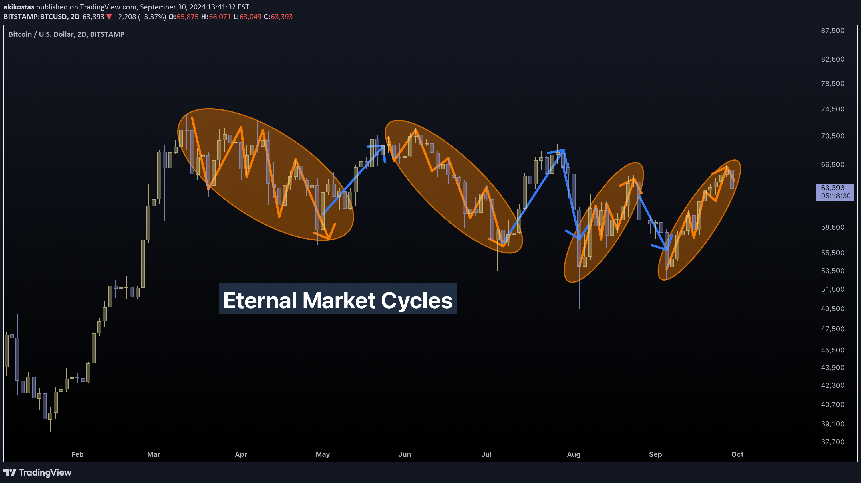
What will happen when an unstoppable force meets an immovable object? -- Market Basics -- Commodities are like an "immovable object". They have no legs, they pay no dividends / yield rates. Unlike stocks, owning them doesn't give you the ability to "vote" for the growth of a company. When you buy them, you don't get a "souvenir" contract to hang on your office wall. Commodities are materials, so cumbersome that you have to store them in a freaking silo. Commodities don't expire. You can only buy them, store them and sell them. Perhaps convert them into some other material, but this is in sense a sort of selling and buying. Either we are talking about hard commodities or stocks, markets are based on the exchange of rare / (semi) fixed supply of goods. Markets is a massive supply of goods. But to dance there must be two. If there was nobody to buy and sell, then there would not be any market. Natural/abundant materials like sea water, Markets is a massive supply of traders. -- Market Patterns -- On the main chart I have drawn some colored lines. The zig-zagged orange ones (I call them springs) represent periods of accumulation (or distribution), while the blue abrupt ones represent bull (or bear) corrections. The same springs appear innumerable times in recent Bitcoin history. This cryptocurrency goes through apparent periods of accumulation (orange) and distribution (blue). All of these ovals are periods when price movement takes the shape of a "spring", and between them a short correctional move. -- Wyckoff Analysis -- Wyckoff made some observances of how markets move. Just like our previous analysis, we witness the same "upwards springs" usually seen in periods of distribution. A similar chart can be plotted for accumulation periods. -- Art of Discount -- Capitalism is the art of discounts. A shop (seller) can find customers (buyers) simply by lowering prices (and good advertising). It is the act of deliberate price change that causes market movements. Consider the following scenario. A very specific shirt from a known brand can be sold in innumerable places throughout the world. The historical price of this item is also tracked by financial firms. We consider a fixed supply of this item (this shirt is produced for one year only). Every day copies of this shirt are sold in similar prices (but not identical). A shop can make slightly better discounts to encourage buyers. Another shop in a tourist area can have higher prices due to increased demand. We realize that, while the financial firm tracks the "spot price" of a commodity, it is just calculating an "average price" of the underlying asset. -- Business 101 -- A seller will not sell lower than what they bought. Not all shops are equal. Some of them may have made a large initial order of shirts with a good price from the factory. Other ones made smaller orders with higher initial buying price. Therefore, the following table can be constructed of the available supply of shirts, based on initial buying price. 1000 shirts of $10 each 500 shirts of $11 each 250 shirts of $12 each 125 shirts of $14 each 125 shirts of $17 each IPO is the weighted average price (1000*10 + 500*11 + ... ) / 2000 = $11.1875 (notice that these prices are the ones shops bought from factory, let's say the final selling price to the customer is 2x of the prices above) -- Market Psychology -- With ample supply of shirts, a reasonable buyer will almost certainly buy the best offering they can. They will obviously buy from the cheaper shop they can find, one of the many which have prices of $20 per shirt (2 * $10). While prices are fixed, buyer habits are not constant. They will gradually exhaust the cheaper end of the supply. When 500 of the cheapest shirts are sold, the average price is calculated again. Now there are 500x10 + 500x11 + ... with a total of 1500 and an average price of $11.5833 Price before demand: $11.18, price after demand $11.58 Unsurprisingly, demand has caused prices to increase. Of course this change is not linear. Shops which bought at $10 and have many sellers, will attempt to increase prices from strong demand and increase profits. Price increase will inevitably result in lower demand. The inevitable crash will follow. Demand has vanished and prices abruptly crash. This happens when all $10 shops reached the selling price of $11 ones. A rapid correction back down to $10 follows. A chart of Bitcoin is shown to demonstrate this oscillation. -- End of the Road -- The exact same happens in periods of accumulation in the end of the cycle. In the initial period of market cycles, prices have their lowest price, in the end the highest. (this is not always the case, but it is always the target) When most shirts are sold, all shops are still working, most of them have supply in hand, and selling prices have reached $34 (2x$17). It is then when the most expensive of shops have their chance to make their target profit. Prices have gone so high and the new season is right around the corner. We have reached a dilemma. We cannot increase prices much higher because demand will not show up. If the most expensive of shops cannot reach their target price of $34, they will definitely have to make $17 per shirt to break-even. It is that pressure which makes sellers slowly and progressively reduce prices to find demand. A downward zig-zag is taking shape. -- Conclusion -- This entire idea is by itself a conclusion. A tale of a fight between the unstoppable force of traders against the immovable object of assets. The chaos of capitalism simplified. Everything should be made as simple as possible, but not simpler. Tread lightly, for this is hallowed ground. -Father GrigoriProud to be marginalized.The top comes when everyone wins.Most of us are trapped... We could encourage constructive conversation about markets in general, without a definitive yes/no, buy/sell. There is no absolute answer in nature after all. It is all quantum. Instead we all fall for the bull/bear trap. We want to translate all knowledge into profit and wealth. If we had the Library of Alexandria today, we would sell it for "insider info". Your investment is quantum. You have zero profit before you sell. Price changes don't reflect real profits. And so, sometimes yay-high is not high enough. You need wow-high. Too-high. The average Dollar Strength is sitting in 97 points right now. This chart, like all charts, has two meanings. Dollar is above average (good for sellers), but not high enough for bull exhaustion (good for buyers). It honestly looks like it has passed a hard obstacle.
akikostas
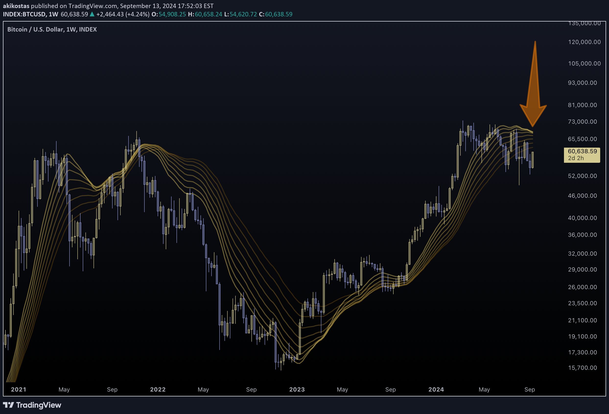
Classic price-based ribbons are commonly used. Their inversion signifies a bear market, while their normalization a bull one. They are unfortunately very laggy. In markets, it is trends that change first and then prices. Therefore, a trend-based ribbon can prove a highly responsive and clear way to visualize market cycles. This trend-based ribbon can be used as a price centerline and as an indicator of market trends. With this trend-based ribbon, the famous 1970s stagflation and the 2000s stagnation is clearly discernible. Applying this indicator to Bitcoin, we realize the following. We are entering a period o stagnation for Bitcoin. Its trend-ribbon has began inverting. This has happened in 2015 and 2022. Also notice the broader Crypto problems. P.S. PineCoders have banned dozens of my indicators for violating "House Rules" I don't know which rule in specific, because many of them were open-source. Some of you may have briefly seen some of them before their demise. The protagonist indicator of this idea, called Trend-Based Ribbon, got banned yesterday. This idea is posted after following some useful guidance from PineCoders. In this fashion, I can analyze a chart and talk about it with you, while at the same time showing you the reaction of my indicators. I thank them for the workaround. Feel free to ask for a private copy by commenting below. I will get to you ASAP. Individual, you are convicted of multi-anti-civil violations . Implicit citizenship revoked, status: malignant P.S. Again... I got sick of having all of my work banned. I have been developing these indicators for hundreds of hours, only to see them locked for no explanation. (They can't ban an idea now, can they?)The offer will be applicable until 2024-09-30.Talking about contraband...
akikostas
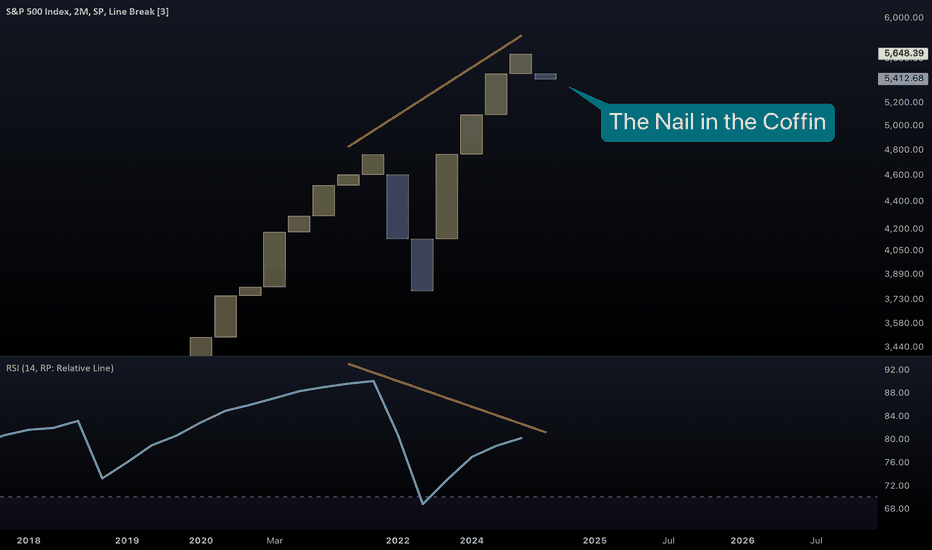
Just another day at the office... Plotting the SPX median line shows something quite ordinary. No problem is apparent. All is well in the financial markets. Classic candle charts hide the truth, as I have many times explained. SPX now prints a bear 2M bar on the 3-line-break chart. This simply means that a bearish engulfing has taken place on a significantly large timeframe. These things come up rarely. They must not be ignored. ... Extinction Level Event 2 On the main chart we see a massive RSI divergence taking shape. Coupled with a massive bearish engulfing, fear is beginning to hit. Too much has accumulated in Big Tech. (Notice the bull confirmation) SPX Democracy is at a multi-year low. The XLK vs SPY ratio has reached the 2000 levels. (Notice the bear confirmation) The .com bubble burst is coming again. No big stock is safe from this event... MSFT META There is really no point showing more. If you get it, you get it. Mayday Mayday Mayday Brace for impactOh and don't expect Bitcoin to save you.The Big Tech bubble is never going to end. You will have to end it yourself. There is nobody around who has stopped using the internet altogether. We still use, misuse and abuse all these companies. Graphics (NVDA), Information (GOOG), Communication (META), Consumption (AAPL), all that is our oxygen. Let's make the bubble burst.
akikostas
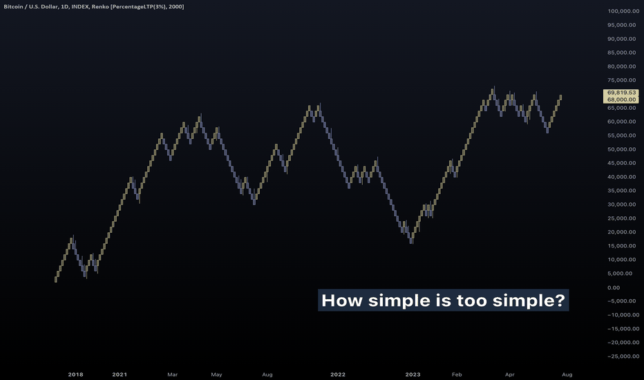
Everything should be made as simple as possible, but not simpler. That is a famous quote, sometimes written under "inspirational photos" of influencers on social media. It is attributed to Albert Einstein, he however expressed something more rough than that. Einstein quoted: It can scarcely be denied that the supreme goal of all theory is to make the irreducible basic elements as simple and as few as possible without having to surrender the adequate representation of a single datum of experience. Even though he was not a philosopher, he adopted what William of Ockham proposed hundreds of years ago. He believed that an explanation must come from the simplest set of elements. Occam's Razor is what defeats "Last Thursdayism" aka "the Omphalos hypothesis". Simplicity is stronger than complexity. But enough of history and philosophy, I hear you say. This is an investment platform after all, we are tired of reading about theories. The thing is, if you don't think before you buy, you end up in a loophole. In an investment strategy that has no way in, and no way out. From my mere two years of stock market analysis, I have one rough quote for your social media pics: Clear your mind. Choose wisely your favorite ship, and pick your favorite destination. Now sit back and relax. The time will come when the wind blows fair to your ways. It is not exactly doric, but it will do for now. So basically, there are two things you must decide and believe in. The type and the timing of investment. Contrary to what some may say to you, you actually need both. If you aren't selective of your investment, then you better hope to break-even to inflation. If you don't let the times ripe, then you don't do anything more, or less than a hodler. (or similarly an inflation mitigator) The point I am trying to make is simple. That investing must be simple... ...and charting must be simple. Hence Renko charts! Some time ago, I discovered the interesting properties of these charts. They "normalize" growth, from violent spikes to perfect pyramid fractals. To an untrained investor, this chart is an oversimplification. How on earth Minecraft is better than reality? Answer: Legibility and Indicators Legibility: The violent nature of stocks is tamed from this chart type. This was the original intention of the Japanese inventors. Indicators: The unknown charisma of these charts is their magic behavior with indicators. They give powerful new ways to analyze prices. So how and why do Renko charts surpass candlestick charts? In classic (timed) charts like candle, the baseline is time. Rapid price breakouts and deadly black swans may come incredibly quick. Since most indicators depend on some amount of lookback (the length of a Moving Average for example), they under-weigh rapid events like black swans, and over-weigh slow, and perhaps, insignificant price movements. In timeless charts like Renko, no detail is hidden. The appropriate amount of importance is shown to each point of price history. With candles, momentum is time-based. With cubes, momentum is price-based. Renko charts, even though are a big simplification, provide an entirely new visualization of charts, and all of that without exotic coding. Your indicators still work. DXY shows subtle but important differences in bull-market analysis. More advanced indicators show this even clearer. As a theoretical experiment, a trader waited for two candles of confirmation after KST broke down. NVDA paired with Renko reveals its true face. Divergences hidden in plain sight. And all of that with the most rudimentary of tools, MACD. The point Renko tries to make is simple. A stable growth is a decisive growth. Renko punishes stocks that begin to exhibit backtests / retreats in price. By simplifying technical analysis and price data, the deep ocean becomes a child's pool. Accessible by everyone. The point Grigori try to make is simple. That trading should not be considered to be astrophysics, because it clearly is not astrophysics. We are not Einsteins (some may be), but the majority are not (including me). We, as humans, need clear and simple arguments and data in order to make robust conclusions. Final thought: The investor's mind must keep clear of chaotic charts and concentrate on picking the right ship, at the right time. Select beforehand your ultimate target. The earth is round. If you keep sailing without stopping, the time will certainly come, when you will reach ground-zero. Tread lightly, for this is simple ground. Father Grigori. P.S. I will keep this idea updated with any interesting Renko vs Candle charts I discover.Simple & Poors 500
akikostas
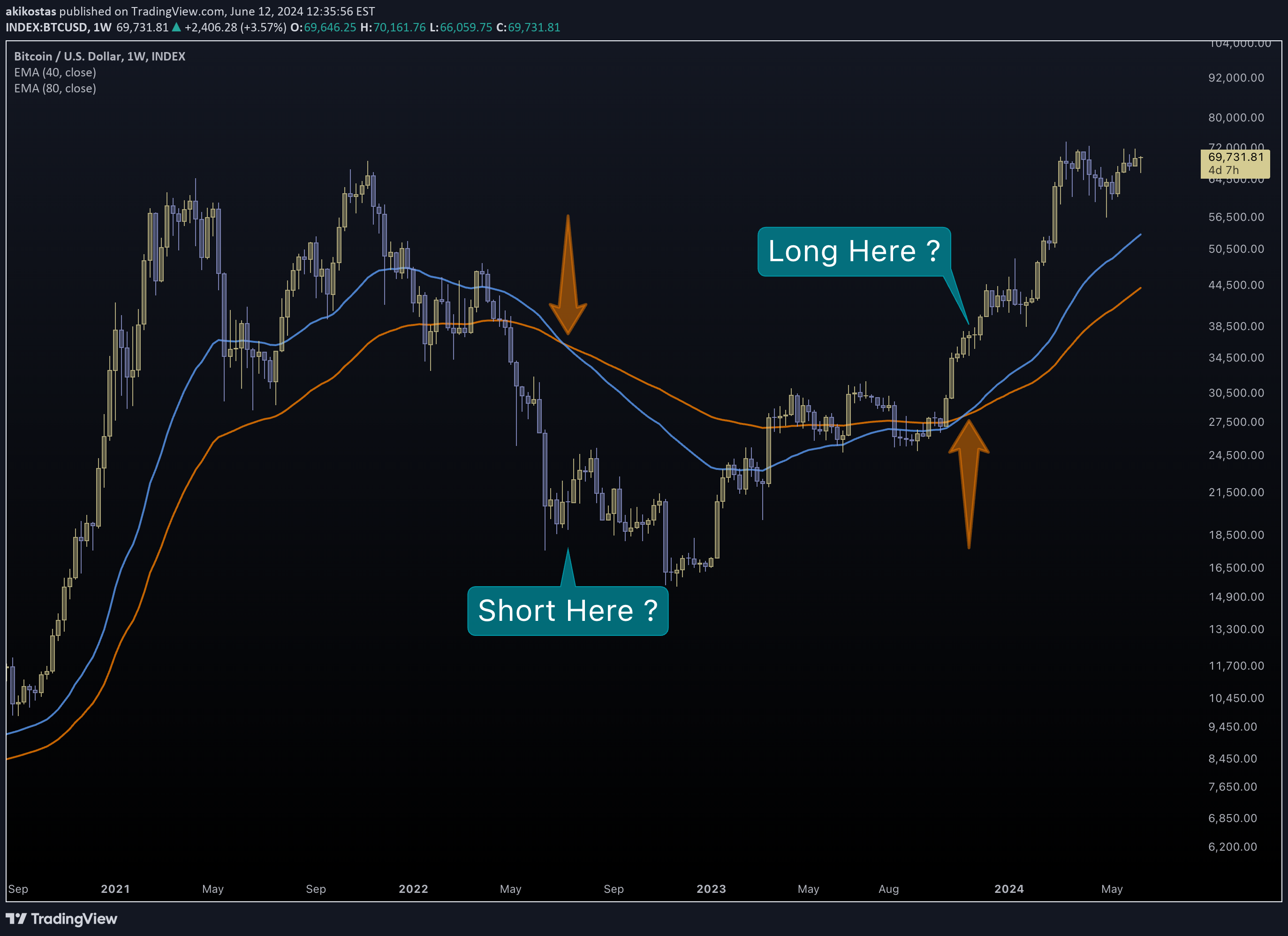
Have you missed me? I haven't been uploading lately. I've been busy serving my time. I am not at liberty to say whom I was serving. In that time I have realized many important aspects of how life and societies work. If you take a close look you will too realize... - The way we live is insanity. A constant rush to work with no end in sight. The money you manage to save from your wage is soon deemed worthless from growing inflation. - The way we defend is insanity. A constant rush to arm our countries with stronger weapons. The more you defend, the weaker you become. The enemy will rush to surpass your forces. - The way we invest is insanity. A constant rush to improve our investment algorithms with MMT and AI is a zero-sum game. The opposition will attempt to get richer than you, and faster. - The way we trade is insanity. A constant rush to get the fastest signals while ignoring the bigger picture. We trap ourselves in a zero-sum game with whales simply sitting and looking. While market manipulation may exist in some extent, the ultimate manipulator is "The Composite Man". The "common mind" of all traders out there. That mind is very easy to fool. And it gets confused on its own, and trapped into its own rabbit hole. And so, here you will see how easy it is to get trapped. Long MA crossings are considered "the signal of the whales". If a short MA crosses above a long MA we go long, and the opposite we short. If you pick a long timeframe like 50D and 200D you will be trading like "smart money". Or so you think. This assumption made above is trivially easy to debunk. The following chart is NOT trading advice. It is how the "common mind" works. Most sold when Bitcoin plunged below 20k. Some bought in Q4-2023 and most bought right about now, near all-time-highs. This is the way 90%+ think and behave. People actually trade this way for years. And it doesn't sound bad. Until you realize the premium this trader is paying right now. In 2022 many sold all their Bitcoin in a significant discount compared to a massive period of 4 years. Selling below the orange line means that one is selling at a 4-year low. In 2023 some bought with a 50% premium, while now they are paying more than 2x the average to get a place in Bitcoin. MA crossings are lagging indicators. Even if you shorten their length, you are simply moving between timeframes and at the same time losing quality in your lines. By the time your MAs cross, the event has already passed. Trading vs Hodling is a painful conversation to have. A trader must do the extreme. Make faster money than gen-pop. They must be more profitable than Bitcoin itself. And that is possible sometimes. The orange arrows signify the "investment track". There have been times in recent history of Bitcoin when traders have managed to outperform the fastest growing asset. As a trader you must do the unthinkable. Break all rules and negate all paradoxes. To survive you must be the fastest. You have to buy against all odds when everyone is scared, and sell silently, when nobody makes a second thought. You must first become paranoid to understand how the insane ones think and manipulate their craziness. Stock markets and trading is not about theft. It is about truth. Tread lightly for this is hallowed ground. -Father GrigoriJapanese traders mainly use concepts like "Disparity". The distance between current price and the mean. They basically look for extremes in price difference. A deeply corrected price to buy and a highly extended one to sell.Talking about Japan... A 8+ perfect streak is a sign of bull exhaustion. Another paradox. A growing stock is a dying stock.History tends to repeat itself. The equity market has found support. The bubble we talk about hasn't been born... yet.The LLY bubble will pop. It is moving exactly like Bitcoin in 2017. Custom supply-demand charts confirm this similarity. I will post them only if anyone asks for them.The following are custom supply/demand kagi charts for today's prices. NVDA LLY Notice that we have reached the demand level. The last chart (LLY) is moving just like Bitcoin did in its 2015 peak. BitcoinIs the profit of an active investment equal to what it would be if we closed it today?No difference
akikostas
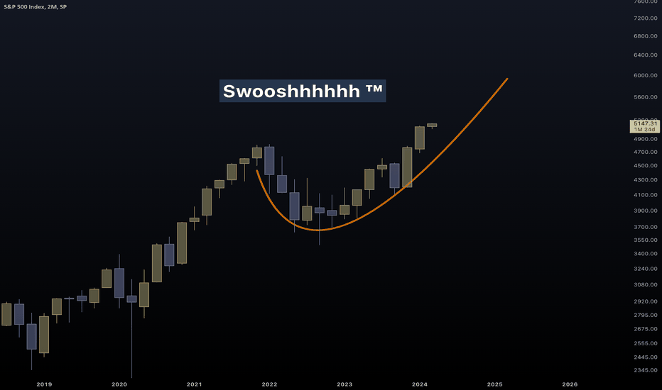
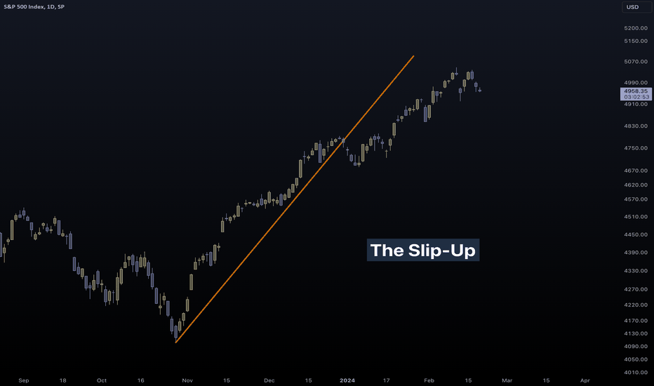
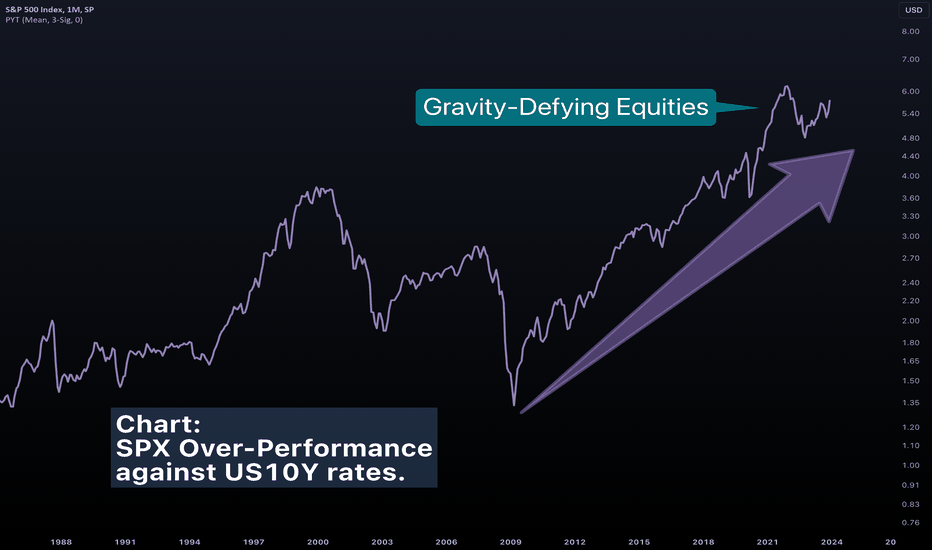
SPX has been breaking new records the past few months. But with inflation also breaking new records, it is not the time to relief. As you will soon realize, SPX is not out of the storm for now. Inflationary pressures have caused a caving in profits. After inflation has (temporarily?) calmed, the broad market has recovered significantly. Gold, Equities and Crypto have soared making record highs almost simultaneously. The way these markets are growing however is highly unstable. Curvature is one simple, straightforward way to visualize and analyze a trend. For decades SPX has made progress by making "positive curves" that have the shape of a bear. Now, something has changed. A massive cup is taking shape. Such deep retracements are able to trap both bulls and bears. They leave nobody alive. The 2022-2023 recession was caused from extensive fear in the equity market from the inflation surge. Equities increased only after inflation showed signs of cooling. Bears got trapped in the bottom when fear maximized. Bulls get trapped now. A multi-month stagnation will be destructive to the performance of their recent investment. Those who feared inflation took the hardest beating. I hope Powell is not afraid of it. And I believe he is far from afraid of it. Zooming in one of these instances, in 1984 after Black Monday, a massive cup took shape. After price made a record high, it stagnated for years, making slow and unstable progress. While SPX is generally moving in steady, positive-curved trajectories, Bitcoin is the exact opposite. It suffers from unsolvable instability and deeply-negative arcs. Many charts point us to an inflationary future. Utility companies which sell energy, water have had a desperate decade. The Post-GFC (QE) world has been full of low interest rates and low inflation. The dream of any President and FED chairman. A bottoming in Utility coincides with what happened in 2000. Utilities confirm an incoming surge in inflationary pressure. Inflation is what everybody is fearful of. And the performance of energy is not helping. All of that reminds us of the '60s. SPX vs Inflation is approaching its peak. There is little wiggle room for real profits in the equity market. Especially for the big-tech part of equities. Big Tech (QQQ) vs SPX (IVV) has just made a quadruple top. The entire chart is drawn inside a triangle, which could very well bearishly break down. I have said that Powell may be not afraid of inflation. My belief is that since the US is now exporting energy, inflation is vital for its survival. As you can see, crude oil is breakout for importing countries. Inflation as a weapon of war. But remember. The enemy will always try to hit back. I watched Powell live in his testimony. For most questions he gave careful answers. For AI he showed sincere concern on its effects on the economy. AI could be used to affect investments, psychology and/or financial stability as an act of war. We now have AI Financial Presenters and AI trading bots for everyone. Let that sink in. Maybe it is a war of weapons all over again. Between those using weapons of instability like AI and negative-curved (unstable) growth. And those using weapons of stability like the broad economy and inflation. Comparing junk bonds to long-term ones, we reach at the following chart: Yield rates suggest that they have reached a peak. The decision may have been made. Low rates and high inflation. Maybe the time has come, when the traditionally calm force of the FED will strengthen. In an attempt to stabilize the US economy, they could attempt to destabilize all of its enemies. Exporting crude oil and inflation may be a matter of survival for the US. It could very well be the best, worst deal of the century. Beware! Don't fight the FED! Tread lightly, for this is highly unstable ground. Swoosh is a trademark of Nike Inc. Swoosh is also the sound a plane or rocket would make. P.S. With everything human-made turning into an artificial replacement, what source should you trust? For all we know, I cannot prove I am a human writing all of that.If you waited for the approval of Bitcoin ETFs, read the history. On one of the charts above I meant to say "record low utility performance".The thing about airplanes is that they move too fast. If the equity market comes to sense, it will slow down. Right now, with negative curvature, it seems that the market wants to go ballistic. A plane that slows down is landing. A plane that is accelerating is going kamikaze. The percentage of stocks above 200-day average is taking the shape of a bull flag. If this breaks to the upside, we will witness a broad acceleration in equities. Looking like September 2020?I love exotic charts and exotic girls. An inverted (bullish) HnS has printed in SPX. Hidden in plain sight.Smoothing ≠ AverageIs the yield curve about to get uninverted?Are you feeling that yield rates are high? You are feeling wrong. The 100+ year average of the US10Y ticker is 4.7% Rates have just reached the mean after two decades of QE. The 1998 dip was the first instance of lower-than-average rates.Pick your favorite parabola! AVGO or LLY ??? Which one will be in headlines next week?I know which is mine! Instability at its finest. Swoosh™️ at its finest.The Half-Life game series is always the answer in your trading problems.No difference
akikostas
Traders have made the ultimate mistake, they were caught sleeping on the steering wheel. And after missing the trend, they attempt to enter it again, only to realize that they have trapped themselves. A question arises: Were they sleeping or are they performing a suicide attack? SPX is like a sharp kamikaze plane. Perhaps of Japanese origin, closing in to Perl Harbor. A wise one should never cut towards them. A knife pointing upwards can only kill bulls. If they wish prices to go up, they must turn the knife down, to kill any bears that step in their way. But it seems though the markets are not wise right now. A successful kamikaze is a fearless kamikaze. All was well when the soldier was certain of their attack. SPX has been moving in perfect correlation with fearless index, aka VVIX / VIX ratio (orange line). But now they have second thoughts. And that is their weakness. SPX is heading upwards with growing fear right now. VVIX/VIX is the thought, SPX is the action. We are in a jet lag, in no mans land. The seconds before the pilot moves the joystick back instead of forward. This is not the first time we are dealing with a soldier who is having second thoughts. Once in 2018... ...another one in 2020... ...and finally in 2021. This fight is almost over for the bulls. Question is: Who will win the war? Tread lightly, for this is hallowed ground. -Father Grigori P.S. Many have made jokes about the POTUS as being sleepy. Never call someone something you don't want to be called yourself.Bitcoin Futures tell a similar story. Futures can help measure fading sentiment. Another perspective to analyze besides fear, could be the concentration of growth in few companies. The magnificent seven, have lost one of their warriors (TSLA) and are now trapped themselves. Market Oligarchy cannot continue much longer.Paradoxically, Traders and Investors alike, are afraid of heights. Acrophobia. An expensive, growing stock (MSFT) is scary for them. It seems like it has reached the top no matter how you look at it. Humans ask for very small things... Sometimes, it is everything or nothing.Finding and selling at the absolute top is not the most profitable strategy.RSP/IVV calculates the democracy in SPX. Right now, everything regarding this ratio is as bearish as it gets. There is no room for further increase in oligarchy. SPX is held in artificial life support by a handful of companies. Brace for impact!American NYSE vs Composite NYSEDid you buy into the whole CV19 and healthcare mania? If you did, then congratulations. You may be invested in some of the worst stocks.Find a log-scaled Kagi chart of the entire history of MSFT. You'll know when the test starts. -GLaDOSNo difference
akikostas
In a fortunate turn of events, inflation has calmed. For equity bulls, more good news. Yield rates have probably peaked. To stop inflation, you must cool down a HOT economy. Overconsumption tends to increase prices. In an unfortunate (?) turn of events however, the markets haven't calmed down. Some charts suggest that the markets haven't felt at all the decisive rate-hike schedule. A question arises: Are markets so strong not to feel current yield rates? Or is there some kind of lag we must take into account? When will equities suffer, and how much? These are important questions right now that need serious answers. A custom indicator was invented to calculate the average-rate-of-return of equities against yield rates. It attempts to answer the following question: How much better do equities perform YoY against the "safe" US 10-year bond investment? Some interesting charts come up from this analysis: In 1951 yield rates broke out of their long-term bear market. At the same time, the equity market exploded in even higher strength. Note that at that period, equities managed to perform better than the ever-increasing yield rates. It was after yield rates ~tripled that problems arised. Moving to today, we only recently witnessed a breakout in the equity and the yield-rate-schedule. Judging from the '60s, we could even witness a decade of yield rates trying to catch up to the equity market. A simultaneous breakout can make sense. A massive amount of money has flown out of the bond market and had to enter the equity market. Equities may be forced to grow, for now. An incoming drop in yield rates from a pause in the rate-hike-schedule will almost certainly create an outflow from equities and back into bonds. Be prepared. The weakness in the equity market hasn't showed up yet. At any point, the steep upward trend can collapse. A crash will certainly come. But at a time when nobody expects it to. Remember, rates of ~7% managed to break irreversibly the equity market back in the '60s. Ask yourself and wonder. How tight of an economy can opportunistic equities handle? At what point will stability become more important for us than growth? Tread lightly, for this is hallowed ground. -Father GrigoriMany Americans hate Chinese. Many Chinese hate Americans, and everything they make. They hate American capitalism, stock markets, humanity. Everything they don't make. Stock market, being an American + Japanese invention is the enemy of China's regime. It is especially bad for them when it shows them that they are weak. There is a big elephant in the room of China. And there are many empty rooms over there right now, and so, many many elephants. A housing bubble larger than anything we have seen before is brewing over there. Empty properties that could house 3Bn more people. I haven't seen a worse chart for an entire country. I wish good luck to Mao's descendants...There are more of them! If you zoom in the mini elephant, you will see a micro elephant. We have reached inception levels here... Luckily, Russia is in a much better state. The original Babushka may live long and prosper. I wouldn't necessarily bet against a country that has just won a war. (Ukraine)Dollar is not exactly looking alive however. This indicator simply compares how many positive and how many negative renko bricks appear.Dollar Bull Market is probably over... It's a little hard to see, but after price steps on channel, it signals the end of the bull market. The Lin-Log Regression shows that we have reached a significant upper limit.The .com bubble burst we expect, may be already priced-in. IXIC/SPX has formed a perfect double top to the peak of the .com bubble. The future ABC pattern is drawn for illustrative purposes. No specific targets were selected.The following chart may get a little overwhelming. 1970 --> 2000 = 1990 --> 2030 Does technology play a larger role than it did in 2000? Big Tech had consumers as customers. Now entire governments are customers.You know, nothing stops Big Tech from swallowing all other markets once again. It did in the previous cycle. Impossible as it may seem, everything is possible.QE until 2030 is, indeed, possible. No bank rushes to cut rates. They only rush to hike rates.Is WALCL a measure of how much are markets broken? If the economy is alive thanks to massive purchases by FED, what will happen when they bail out? Right now, the FED is reducing their assets, effectively stepping out of the economy.This is what happens when a stock breaks down, but it pretends it hasn't. What it says happened: What really happened:There are contraband charts that validate this breakdown. It is unfortunate however that many of my indicators have seemingly vanished.History tends to repeat itself. The equity market has found support. The bubble we talk about hasn't been born... yet.Is the profit of an active investment equal to what it would be if we closed it today?
Disclaimer
Any content and materials included in Sahmeto's website and official communication channels are a compilation of personal opinions and analyses and are not binding. They do not constitute any recommendation for buying, selling, entering or exiting the stock market and cryptocurrency market. Also, all news and analyses included in the website and channels are merely republished information from official and unofficial domestic and foreign sources, and it is obvious that users of the said content are responsible for following up and ensuring the authenticity and accuracy of the materials. Therefore, while disclaiming responsibility, it is declared that the responsibility for any decision-making, action, and potential profit and loss in the capital market and cryptocurrency market lies with the trader.