
TopChartPatterns
@t_TopChartPatterns

What symbols does the trader recommend buying?
Purchase History
پیام های تریدر
Filter
TopChartPatterns
Gold: The Coiled Spring
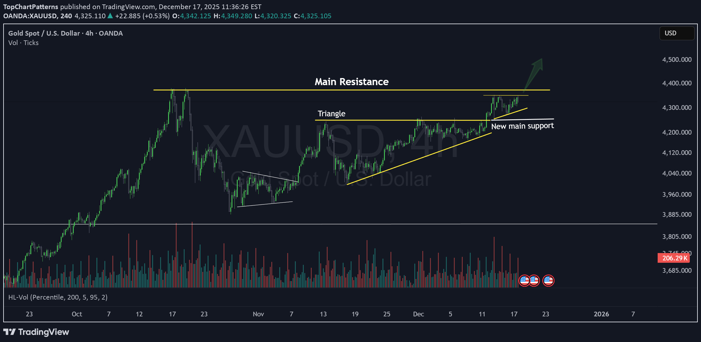
[h2]Gold: The Coiled Spring 🚀 [/h2] Gold is moving creating beautiful chart patterns right now. Sometimes, the charts don't need a thousand words to tell a story, they just need you to listen. Right now, Gold is whispering "momentum," stacking one bullish pattern on top of another like a masterclass in price action. [h3]The Triangles [/h3] We are currently looking at a perfectly compressed triangle. If we see a clean break above this current structure, we aren't just looking at a move, we’re looking at Gold finding the fuel to launch into brand-new, all-time highs. It’s exciting to watch that energy build up! [h3]The Catch (Watch Your Step! ⚠️) [/h3] Context is everything. There is one thing that keeps me sharp, this breakout is happening right against a massive wall of resistance. It’s a posible trap. When a small pattern breaks out right into a major ceiling, it’s very common to see a fakeout. The market loves to tease a move before the real one happens. But... if Gold finds the strength to pierce through that level, it will be the definitive "impulse" we've been waiting for to reach those new horizons. [h3]The Long Game [/h3] I’ve said it before, and I’ll say it again, zoom out. In the coming years, Gold doesn't just have room to grow—it has the margin to fly. 🦅 Stay patient, watch the price action with intention, and let the market show its hand before you step in. 🎁 Let’s make a simple deal. I will handle the heavy lifting to find the top 1% of setups like this, and you just HIT the 🚀 Rocket, Follow and Enjoy. 🤝 Deal?
TopChartPatterns
آمازون (AMZN): استراتژی خرید بلندمدت در کانال 200 دلاری با پتانسیل 300٪ سود!
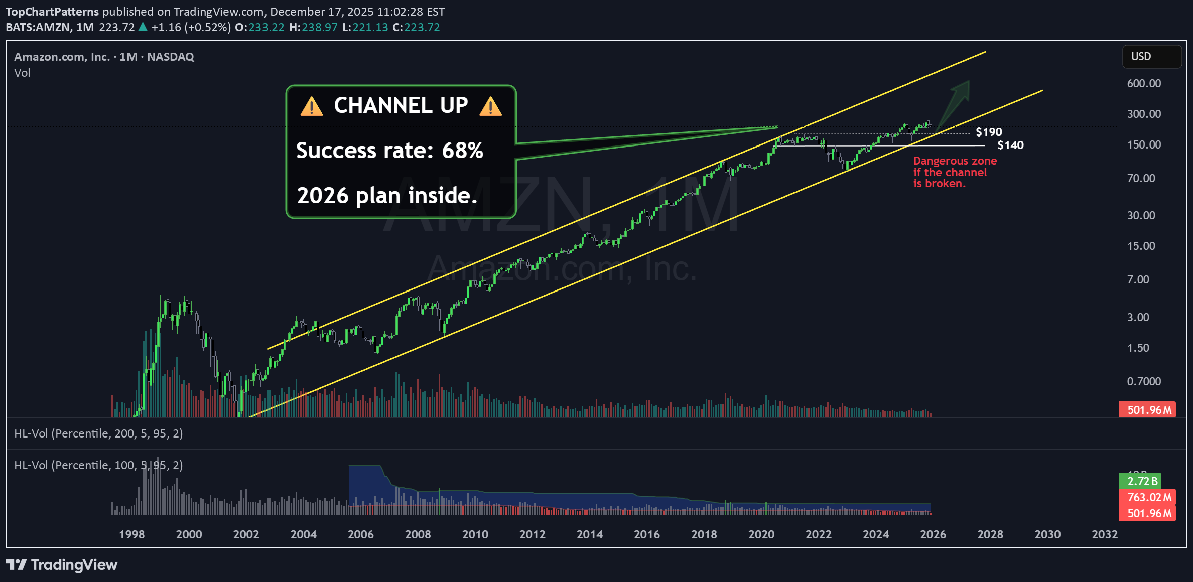
AMZN Long term: Perspective, Patience, and a Channel Hello traders, Today, I want to invite you to look at the AMZN chart through a lens of history and probability. It is not just about where price is today, but understanding the journey of how it got here. Two eras in Amazon When we analyze the journey of Amazon from 2001 to 2020, we witness something truly spectacular, an average growth rate of 40% . It was an era of explosive expansion. However, as we know, when a giant reaches the summit, the climb changes. Over the last 5 years, that pace has settled to 8% . Yet, if we zoom out and look at the annualized average since 2001, we are still looking at a formidable 32% . While the law of large numbers tells us it is complicated for a company of this massive capitalization to maintain that early velocity, the technical structure provides us with a distinct advantage. The Asymmetric Opportunity We find ourselves interacting with a clearly defined long-term channel. This is where clarity meets opportunity. The supports near the 200 zone allow us to position ourselves strategically. This grants us leverage. By entering in this zone, we are looking at a potential 300% upside over the coming years if the price returns to the top of the channel. Conversely, because the support is so clearly defined, we can cap our risk at a maximum of 15% should the channel break and the long-term narrative change. It is a classic scenario of limited downside with a horizon of great potential. ⚔️ My Battle strategy in the long term 📈 BUY ZONE: $200 Level ⛔ STOP LOSS: 15% Risk (Clearly below lower channel support) 🎯 TARGET: Top of the Channel (+300% potential long-term) _________________________________________________ 🔓 Unlocking the Full Potential I am opening the vault on my personal long-term charts for the 2026 cycle. We are stepping away from the daily noise to look at the structure of the market. I want this series to be valuable for your portfolio. You tell me an asset, and I will share the long-term chart and all the insights with you. Feel free to slide into my DMs or leave a comment below. 🤝 Deal?
TopChartPatterns
هشدار جدی برای سهام انویدیا (NVDA): آیا گرمای بیش از حد بازار منجر به سقوط 60 درصدی میشود؟
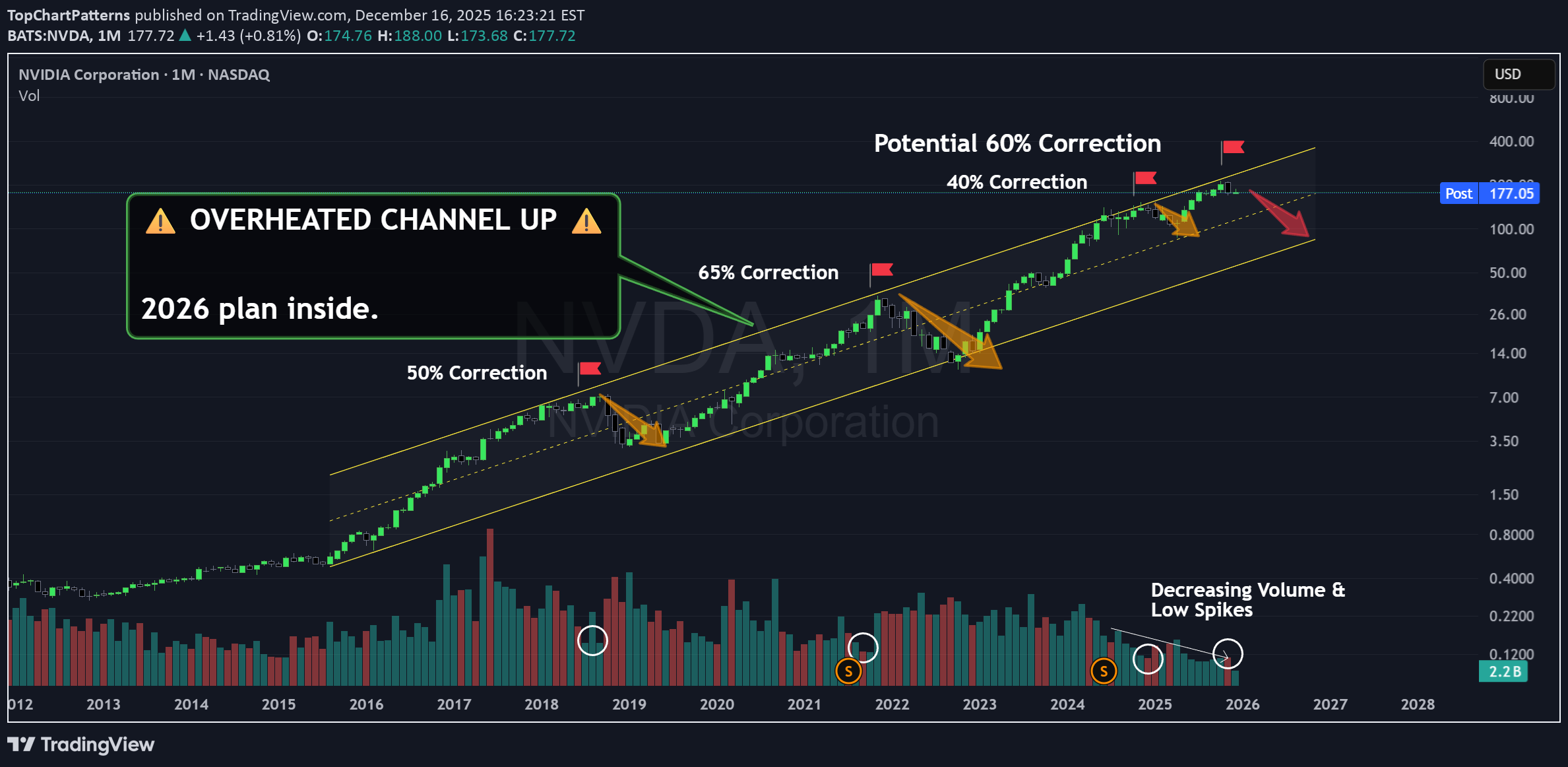
Early Call for NVDA: Overheated Chips Hello traders! 👋 I am kicking off a very personal, long-term series of posts today. For the first time, I am revealing the charts that truly guide my market vision, the deep-dive long-term analysis. I usually share my tactics and daily patterns that are simpler to follow, but the reality is that there is a larger strategy behind the scenes that I haven't shown until today. I am sharing this because it might help you prepare for a scenario I don't like . The first stock in this new series is NVDA . And that is no coincidence. The Dangers of the Upper Channel 📉 The long-term NVDA chart is scary. It is a rising channel that NVDA has respected for years without much trouble. However, if you have read anything about chart patterns, you know that hovering at the very top of such a steep channel is not a good sign, it usually implies corrections. And I’m not the one saying it, NVDA is saying it. Every time we have been in this upper zone, the market has ended up correcting, and seriously. Look at the drops marked with orange arrows: • 50% correction in 2018 • 65% correction in 2021 • 40% correction in 2024 And now, we are back in the danger zone . This alone should make you cautious. A return to the bottom of the channel would mean another 60% correction . Be very careful with this. But that’s the "nice" part, my friend... Volumes Have Vanished 👻 Look at 2018 and the monthly volumes during that first drop. Just before it happened, price kept rising while volume hit multi-month lows. It was the first warning that something was up—major market transactions disappeared. Institutional flows weren't there to fuel the rocket. In 2021, the situation was similar: price approached the channel top, and volume evaporated again. And recently, in 2024, we saw a very similar setup. With even lower and decreasing volumes. Today, we are in a similar situation for the fourth time. We are at the top of the channel, and there is no volume . It has been missing since April and May, right when the price started recovering. We are going up on inertia , the big players have left the building. And if that weren't enough, recent months have formed a Bearish Engulfing , a classic exhaustion pattern. 🎲 A Game of Probabilities Now, you might say, "But this hasn't happened yet." Do we know for sure what will happen? True, anything is possible. But I’ll leave you with a few images so you can judge for yourself. The trend-end case for DG : The trend-end case for INTC : The case for NKE : We could go on all day. As you know, the stock market is a game of probabilities , and being long NVDA doesn't look like the best hand to play right now. To better time this potential correction, I recommend watching the Daily timeframe , where a Head and Shoulders pattern could deal the final blow to NVDA if it loses the $165-$169 zone. 🔓 Unlocking the 2026 Watchlist Next week, I am opening the vault on my personal long-term charts for the 2026 cycle . We are stepping away from the daily noise to look at the structural truth of the market. I want this series to be valuable for your portfolio. You tell me and asset and I share with you the long term chart and all the insights. Feel free to slide into my DMs or leave a comment below. 🤝 Deal?
TopChartPatterns
Mastering the Art of the Exit With a Simple Trick.
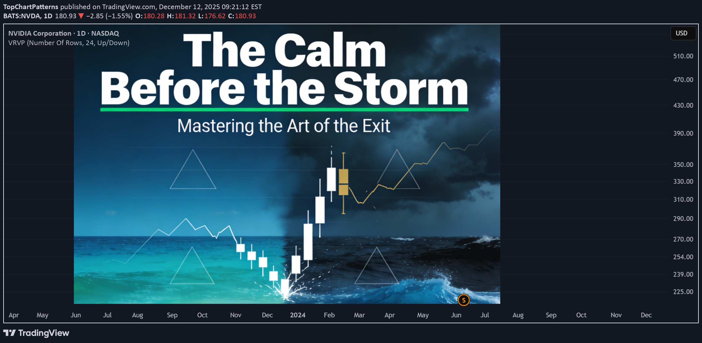
Mastering the Art of the Exit With a Simple Trick. Let me share a situation with you that has caused me more anxiety in the market than any other. You buy a stock, a currency, or a cryptocurrency. And this time... yes! It starts to climb. And climb. You are up 5%. Then 10%!! Suddenly, you are staring at a 15% gain!!!! It feels brilliant. You have nailed the entry point, and your ego starts to whisper that you might just be a GENIUS. But, my friend, this is the easy part of trading . Finding entry points is relatively simple. The complexity of trading lies in the exit. And this is exactly where our brain serves us a banquet of overwhelming anxiety. Do we take that 15% and call it a win? Do we get out? But what if I sell and it shoots up to 30%? I entered so perfectly, I better stay. I couldn’t bear missing the rally... But what if it suddenly turns around and we drop back to 0%? If you have ever invested a single dollar, this internal dialogue must resonate deeply within you. This anxiety is born from a lack of control. Because we lack control over when to exit, our minds go wild, tossing scenarios into the air like someone plucking petals off a flower to decide their future. REGAINING CONTROL Today, I want to hand you a tool that will help you identify the precise moment it becomes interesting to reduce positions in a bull market, or even start considering a short position. This strategy is incredibly simple to execute, and it works on any stock or listed market. In the charts below, I have marked a few specific candles. These are magnificent candles for identifying when a bullish cycle is coming to an end, or at the very least, is about to take a significant pause. What do you think they have in common? Notice that these are charts from very different companies and sectors, in bullish, sideways, or bearish situations. But all of them mark moments of change . They are highly interesting moments to sell. What do you believe these candles share? I am going to give you the answer in a moment, but whether you guessed right or not, I would love to know what went through your mind. I’ll read you in the comments! The answer, once you know it, is quite obvious, and it might even make you feel a little frustrated (my apologies!) . But the truth is, the answer has always been right there in front of you. It is like when you do not understand a language: you hear the sounds, but you do not comprehend the meaning. In this case, you have seen it, but perhaps you haven’t realized its significance. Come on, let me give you one more clue. Do you see it now? Precisely. The volume on those days is absolutely ridiculous. When you compare it with the surrounding days, these days clearly fall below the average. In fact, for those of you who love the data, we are talking about volumes in the 2nd or 3rd percentile maximum. That means out of every 100 trading days, we are looking for the 2 or 3 days with the least volume. We are looking for the rare ones! Important Note: You must NOT count public holidays or the days immediately preceding them. During Christmas, August, and other holidays or semi-holidays, volume is low per se. We are looking for low volume on normal trading days. THE PSYCHOLOGY OF LOW VOLUME The market moves based on the buying and selling of its participants. When you buy, an immutable record remains of how many shares were bought and at what price. The sum of these shares and prices creates the trading volume. When many people are interested in a stock, volume rises. Many shares change hands rapidly, causing the price to climb and climb, provoking even more transactions. But sometimes, something incredible happens. The price is making new highs, or is very close to them, yet the volume is ridiculous. Why? It means we have reached a point where we have run out of buyers. However, at the same time, the sellers do not want to "undersell" . They are waiting for that buying pressure to appear again. When it doesn’t happen, and we see a day of low volume because buyers want it cheaper and sellers (for now) don’t want to lower their prices , we see a standoff. No exchanges are achieved. When the smartest sellers realize this, they begin to lower their prices in search of liquidity. As this drop in price initiates, the rest of the sellers begin to sell, entering into a progressively greater panic. These candles indicate a lack of transactions due to a misalignment of supply and demand. The day following this misalignment, we typically see a forceful candle confirming that the price needs to be in a different zone, one where we are all willing to transact. These days can signal both trend continuation and trend reversal, but that is a detail requiring a depth we won’t cover today. Today, I will focus on the days of trend reversal. Notice that in addition to working in bearish trends, this works equally well for bullish reversals. In fact, on the same chart, you can find opposite examples and make money in both directions, like this: It even works well on higher timeframes like the Weekly, especially when combined with larger Chart Patterns, such as the Double Bottom. HOW TO DETECT THEM To spot these moments, TradingView offers a very interesting, and quite unknown free indicator. It is called High/Low Volume. It marks percentile lines, which helps you visualize the days with the lowest volume. Remember to be careful, many of these marks will be holidays, or days near Christmas or August. Discard those. I hope that the next time you see a day of low volume, provided it isn’t a holiday, you will see the market through a different lens. I invite you to start analyzing if this is happening at support or resistance levels , or if it fits with a larger chart pattern to guide your way. 🎁 Let’s make a simple deal. I will handle the heavy lifting to create content like this for free, and you just HIT the 🚀 Rocket and Follow for more! 🤝 Deal?
TopChartPatterns
بیت کوین پیام مهمی داد: نادیده گرفتن این سیگنال، بزرگترین اشتباه شما خواهد بود!
Bitcoin Just Dropped a Message. Ignore It at Your Own Risk 🚨 Bitcoin just did it. Yes, it finally broke the big ascending trendline that had been guiding the market for months. And not by accident. This break comes exactly 18 months after the halving , a moment we had already discussed in earlier articles. For many cycles, the 18-month mark has signaled exhaustion , a point where trends weaken and a deeper shift begins. This time, BTC respected the pattern again . Each line is a BTC cycle starting at each halving. Except the first one which was ver y fast and agressive, all cycles end at the 18 months mark. And just look what happens during the next year... a kid could see the pattern!! But let’s zoom in. On the chart, BTC didn’t just break the trendline. It also lost the $108k level , a key resistance-turned-support that buyers had protected again and again . Once that level was gone, the chart opened the door for lower levels. And guess what? Bitcoin has been touching, and respecting, every one of the white historical support lines drawn on the chart. This behavior is not random. This is structure. This is how big money moves, and you must do the same to stay alive. In the previous article, I showed you how institutions mark their buying and selling levels . These are zones where the risk-reward becomes exceptional. The difference between knowing them and ignoring them is simple: 👉 If you don’t know these levels, you’re trading blind. That’s why BTC is reacting exactly where it should. These white support lines aren’t just lines. They are footprints, the footprints of the players who actually move the market . So… What Now? A broken trendline. A lost $108k. A dance on historical supports. A perfect timing of the Top of the cycle. This is not the end of the story, it’s the setup for the next chapter and a confirmation of what will happen NEXT. I will share the exact levels where this drop should end and WHEN , not only the price, but also how to profit from the next move with low risk as we have been done this whole year in the bull market. We are entering one of those rare moments where the market gives a clear map , if you know how to read it. Stay sharp. Stay ready. The next big opportunity is closer than most think. 🚀 Check my signature to learn more!!
TopChartPatterns
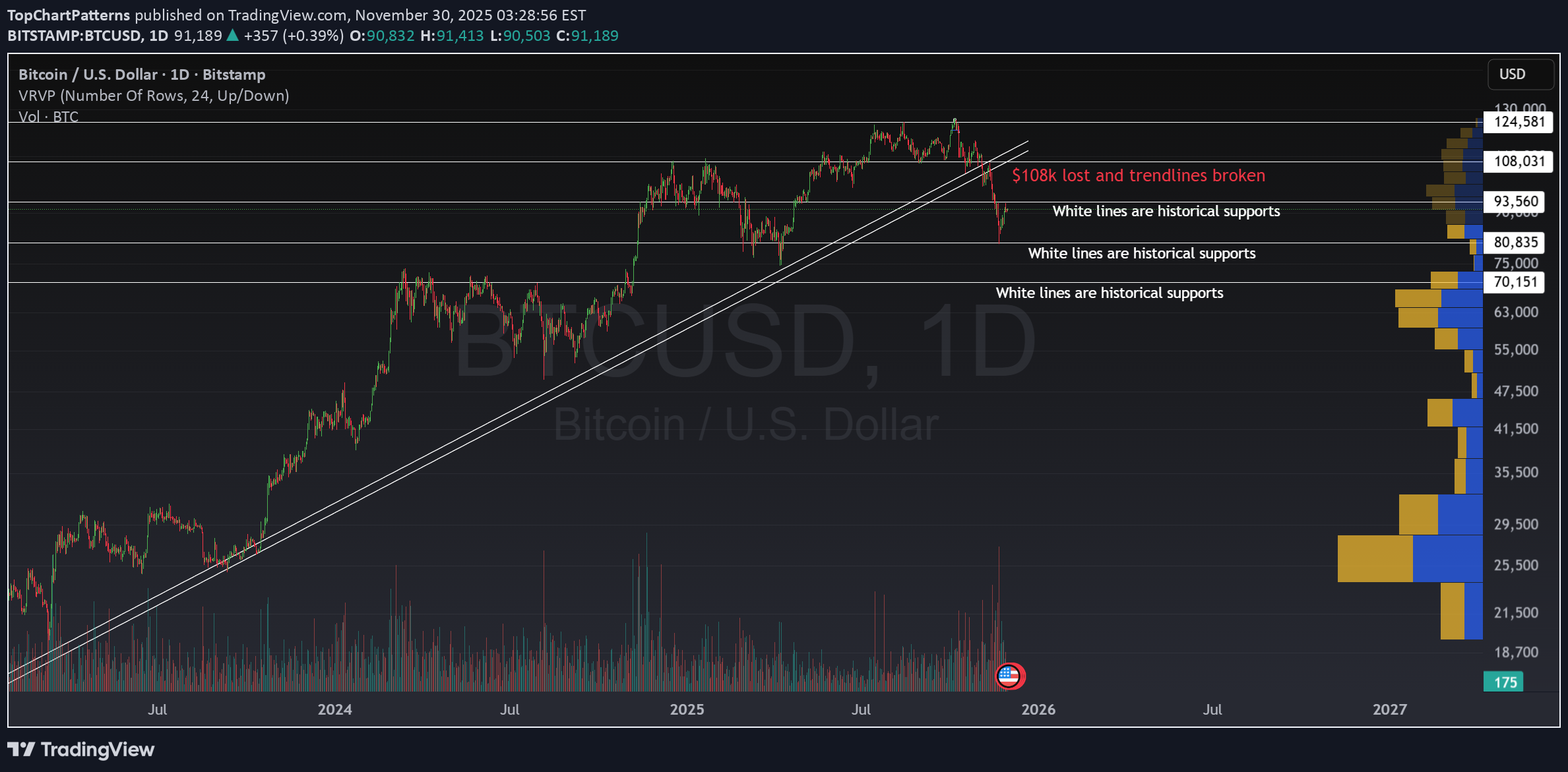
بیت کوین ریخت: سطوح حیاتی برای معاملهگران جسور (آیا ۹۳ هزار دلار دوام میآورد؟)

Bitcoin Breaks Down: Key Levels For the Brave Last time we talked about Bitcoin, there was a clear warning: Losing $108k would be a game-changer. Well, here we are. The uptrend is broken, that milestone is lost, and it’s time to brace for a correction . But don’t let fear take over , this is where skilled traders come alive. The First Major Test: $93-97k Right now, BTCUSD finds itself hovering near a critical support zone: $93-97k USD. This isn’t just a random range. It’s a historical support, and if you check the volume profile, there’s big buying interest here. This could generate a solid bounce! If it happens, expect a return to the $108k area, but don’t get too excited . Breaking back above that won’t be easy. The price would need serious momentum to flip $108k into support again. What If Support Fails? If the $93-97k zone gives way, don’t panic, just prepare. The next key level sits at $80-83k. This is another area where Bitcoin has a long buying history and buyers could pile in again. These supports act as opportunity magnets. Every bounce means another shot at low-risk, high-reward trades. Why These Levels Matter Support and resistance aren’t just lines, they’re the heartbeat of any market. For Bitcoin, these zones are where whales swim and retail dreams can turn into gains. The market loves to bounce between levels; that’s where the magic happens for disciplined traders. Master these zones, and y ou could trade with minimal risk, catching big moves while avoiding the noise. Stay sharp, follow the price, and don’t forget, it’s these moments of chaos that bring the biggest trading opportunities.
TopChartPatterns
شکست تلگرام تسلا: آیا موج فروش در تکنولوژی بزرگ آغاز میشود؟

🚨 Tesla Breaks the Double Top This is the kind of setup that gets my blood pumping! Clean, Technical and Powerful. The neckline gave way, volume confirmed, and the price dropped fast. A sell opportunity has appeared in front of us! For me, this isn’t fear, it’s opportunity. This is where a trader lives. Where plans meet reality. ⚡ Why It Matters Double Tops are simple , but they’re brutally honest. They show where bulls finally lose control as I recently explained. https://www.tradingview.com/chart/SPX/nVz3ef5w-How-to-Trade-the-Double-Top-Pattern-Like-a-Pro/ In Tesla’s case, we’ve been watching that zone for weeks, and now, the break is real. If you’ve been following my recent posts, you already know the playbook: Entry after neckline break Stop Loss around 38.2% retracement Take profit at 61.8%, or scale out for multiple targets This isn’t guessing. This is structure, risk, and discipline. This kind of pattern works about 70% of the time, and dude, your TP is way higher than your SL, so the edge is clearly on your side. More Context: Watch GOOGL and MSFT Next Tesla just confirmed, but Alphabet (GOOGL) and Microsoft (MSFT) are right at the edge. Both are showing the same Double Top structure, same psychology, same potential setup. MSFT GOOGL Will they break? We don’t know yet. But after Bitcoin’s breakdown and with many of the Mag7 and Big Tech stocks now falling, it might be time to start shorting some names. If their necklines give way too, we could see a wave of short-term weakness across tech. And that’s what makes this moment so interesting. You can almost feel the tension in the charts. ❤️ Why I Love This I love trading moments like this. Not because of the profit, but because of the clarity. The market is pure when it speaks through patterns. You can’t control the outcome, but you can control your plan. And that’s what makes this job so amazing .
TopChartPatterns
ترید الگوی سقف دوتایی: اسرار معاملهگری حرفهایها

How to Trade the Double Top Pattern Like a Pro The Double Top is one of the most reliable patterns in technical analysis. It often marks the beginning of a resistance zone and signals that bullish momentum is losing strength. The first top is hard to anticipate, it’s usually just a continuation of the existing rally. But when the second top fails to break above the previous high, that’s when things get interesting . This failure creates a resistance level, and it’s the first warning sign that buyers may be running out of steam. 🔵 Why Do Double Tops Form? There are usually two main reasons why a Double Top appears: Profit-taking after a strong rally.Bulls start to lock in profits, causing the momentum to fade. Lack of new buyers . Demand weakens, and bears begin to take control gradually. Learning to tell which case you’re facing can help you decide whether it’s a great buying opportunity during a healthy pullback, or a signal to take profits, or even go short . 🧭 Step 1: How to Identify a Real Double Top Before trading it, make sure it’s a true Double Top: - Both peaks must form after a strong upward move . If the market was falling before, it’s not a classic pattern. - The two tops should be at almost the same price level (no more than a 0.5% difference). - The most important part is the neckline , the lowest point between the two tops. That neckline defines whether the move is just a healthy pullback or the beginning of a new downtrend. If the neckline doesn’t break, there is no Double Top yet. The pattern is only confirmed after the neckline breaks downward. 💥 Step 2: Trading the Pattern There are three main scenarios to understand: 1️⃣ A Confirmed Double Top (Breaks Down) When the neckline breaks, the market often drops about 61.8% of the pattern’s height, with a probability above 70%. A small pullback to retest the neckline is possible, but usually, the price won’t return to the previous highs. A Double Top is spotted: The neckline is broken: A decline happens sharply: 2️⃣ A Fake Double Top (Break Fails) If the price fails to break the neckline and instead makes new highs, it’s not a real Double Top. This typically means we’re in a profit-taking phase, not a trend reversal. In these cases, it’s often best to stay out, as the market tends to move sideways or show mixed signals. A spotted double Top: Fails to break down, instead breaks up: The rally unfolds: 3️⃣ A Double Top Trap in a Strong Bull Market Sometimes, a small break below the neckline triggers stops before the price explodes higher again. These are common during powerful bull runs. A spotted double Top: The neckline is broken: Inmediately the price reverse and break upwards. The price rallies: 💲 Real Double Tops: Theory is simportant, but let's go real! A Double Top is now unfolding in Microsoft , and as you can see the neckline is almost there! Is this a signal? Wil a fake breakout occur? Are we witnesing the end of AI rally? https://www.tradingview.com/x/fe7drXb4/ And some previous Double Tops: ❗ A final recommendation Tradingview offers a great indicato r to Spot Double Top patterns easily. Once you are in a chart, click on indicators and search Double Top Chart Pattern indicator. It's only for paid users and works fine! Take a look how it spots the Double Top pattern and also gives you and idea of the posible target price! Or the current one in MSFT In short: Double Tops work roughly 70% of the time , but context matters. They perform best in sideways or slowing markets, and are less reliable in strong rallies , where false breaks can easily trap traders. Always confirm the neckline break, watch for volume, and never forget: A pattern is just a probability, not a guarantee.
TopChartPatterns
واگرایی ترسناک بازار: آیا بازار سهام از واقعیت هوش مصنوعی جا مانده است؟

The Scariest Divergence In the Market If you look at the chart, you’ll see the SPX (candles) and U.S. job openings (in blue) plotted together since 2001. Historically, these two metrics have been highly correlated , both rising and falling almost in sync as the economy expanded or contracted. But something changed dramatically in November 2022. That’s when ChatGPT went live, marking the start of the AI boom that has reshaped entire industries and mindsets. From that point on, we can see a massive divergence, the kind we’ve never seen before. While job openings have kept declining steadily, the market has rallied like never before. This is not logical from a historical point of view. 🤖 Is AI Replacing Workers? One possible explanation is that the market sees AI as a reason for optimism: “If companies can do more with less labor, that means higher margins and better efficiency.” So, fewer job openings might not scare investors anymore, it could even be seen as a sign of progress. But that raises two key questions: Is AI really replacing workers ? If so, what happens to the broader economy and ? 📊 What the Data Says So Far Surprisingly, unemployment in the U.S. has increased only slightly since AI went mainstream. It’s a slow, healthy rise not a surge. So i t doesn’t seem like AI is replacing workers at scale just yet. That’s good news in one sense, if unemployment remains low, consumer demand stays healthy, and the economy keeps running. However, it also means that companies’ fixed costs haven’t really improved, and their productivity gains from AI are still very moderate , far from the exponential growth that the market seems to be pricing in. 💡 My current View From my perspective, this chart makes one thing very clear. The benefits of AI , as of today, are still much smaller than what the market is assuming. Yes, AI will improve margins and efficiency over time. But if everyone implements it, competition will eventually push prices down again, and margins with them. The very same than internet with the online sales. The real challenge won’t be for companies that adopt AI, but for those that don’t adapt fast enough , or for those that overspend on AI tools that fail to deliver meaningful returns. ☄️Some AI Stocks Are Starting to Show Doubt Several major AI-related stocks are also showing concerning patterns . We don’t have confirmation yet , but it’s time to stay alert and be prepared in case the market starts breaking key support levels among the main players. And the main index, S&P 500 is still in the bull zone but are key levels to watch closely: 🤔 What Do You Think? Is AI truly transforming company performance as fast as investors believe? Or are we witnessing a global over-excitement where expectations are running far ahead of reality?
TopChartPatterns
بیت کوین سقوط کرد: آیا پایان چرخه صعودی آغاز شده است؟

⚠️ Bitcoin Loses $108K Support, The First Major Breakdown of the Cycle. Bitcoin has lost the $108K support zone, breaking through not only a key horizontal level but also both trendlines that defined this cycle’s uptrend. As many seasoned traders anticipated , we’ve now reached the 18-month mark after the halving, historically, the point where bullish cycles tend to fade . This breakdown is therefore a first major warning that we may be entering a broader bearish phase. 🔍 False Breakout or Real Trend Shift? Could this be a fakeout? It’s always possible. But one key detail stands out: The volatility during this drop has been remarkably low. That’s not typical of a stop-hunt or manipulation-driven sell-off, it’s more consistent with a gradual trend reversal where buying pressure quietly fades away. So far, the structure suggests a slow distribution phase , not panic selling. And that are bad news for $BITSTAMP:BTCUSD. 📊 What to Watch Next And Some Good News Price is currently hovering near the $100K zone, which could act as a temporary balance area, a place where Bitcoin might consolidate before making its next move. A good place to play the range and make money. Remember that Bitcoin is moving in clear ranges as demonstrated here: If this level fails to hold, the next significant supports are around $93K and $81K, both of which align with historical volume nodes and the previous explanation. Another way to see where the ecosystem stands now is by watching stocks like MSTR or COIN , which are highly correlated with BTC. In both cases, key supports are still holding, but there’s significant downside risk if those levels fail. 🧭 Strategy Outlook This is not a comfortable time to be long on BTCUSD or crypto in general. The risk/reward ratio for bullish positions has deteriorated sharply, and confirmation of any recovery would require reclaiming $108K with solid volume. Until then, staying cautious, hedged, or shorting the resistances might be the wisest move. 💬 Markets don’t crash all at once, they turn slowly, then suddenly. This could be one of those moments where early observation makes all the difference.
Disclaimer
Any content and materials included in Sahmeto's website and official communication channels are a compilation of personal opinions and analyses and are not binding. They do not constitute any recommendation for buying, selling, entering or exiting the stock market and cryptocurrency market. Also, all news and analyses included in the website and channels are merely republished information from official and unofficial domestic and foreign sources, and it is obvious that users of the said content are responsible for following up and ensuring the authenticity and accuracy of the materials. Therefore, while disclaiming responsibility, it is declared that the responsibility for any decision-making, action, and potential profit and loss in the capital market and cryptocurrency market lies with the trader.