
Day_Trading_Attack_Penguins
@t_Day_Trading_Attack_Penguins

What symbols does the trader recommend buying?
Purchase History
پیام های تریدر
Filter
Signal Type
Day_Trading_Attack_Penguins
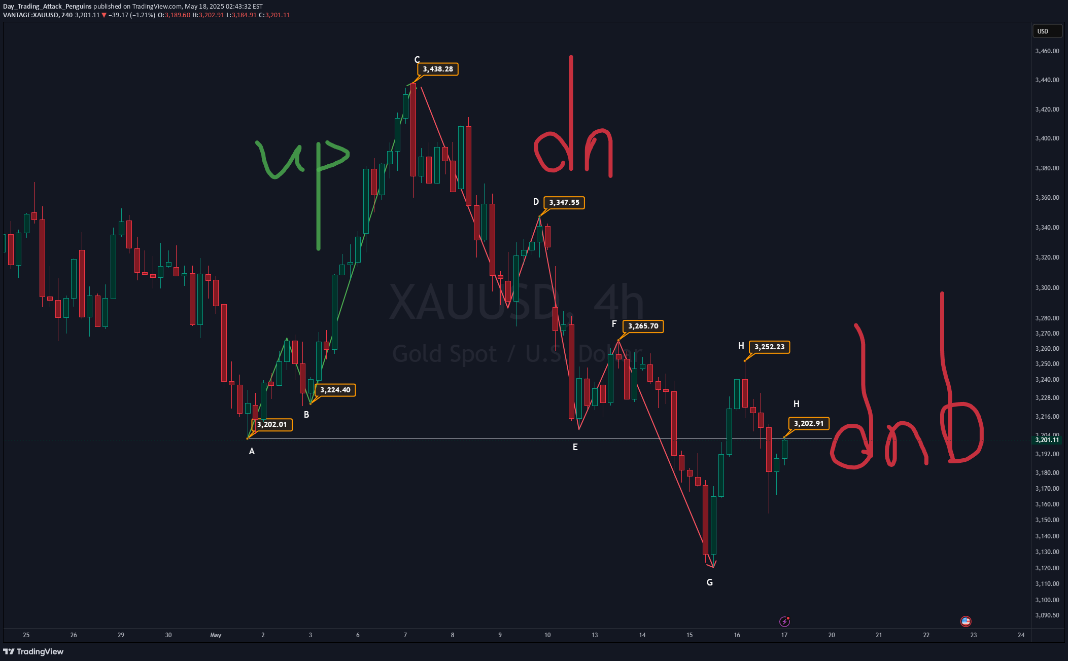
"Swing" is just fancy talk for the market’s ups and downs — like waves crashing on a chart! 🌊 We’ve labeled these swings from A to H to make it easier to spot trends. 🟢 The Rise & 🔴 The Fall: A → H Story A → B → C: A clean uptrend (think: "stairway to heaven" for bulls 🐂). C → D → E → F → G: The plot twist — a downtrend kicks in (bears take over 🐻). 🔥 Why Gold’s Trend is DEAD (And How to Spot It) 1️⃣ Key Support Broken: Gold crashed through A and B — the critical support levels of its uptrend. Translation: "RIP Bullish Dream" 💀. 2️⃣ The Final Nail (F → G): The drop from F to G wasn’t a dip — it was a freefall 🪂 with no parachute! 3️⃣ Weak Bounce (H Point): The "recovery" to H? Pathetic. It didn’t even reach F, let alone A. This week’s closing price? Below A. Yikes. ✅ Triple Confirmation: Broken supports + violent drop + weak bounce = Downtrend Certified!
Day_Trading_Attack_Penguins
Consider selling first. If the price falls to a reasonable level, consider buying first. My trading system's four steps: Step 1: 📈 Trend: Capture the market's momentum Step 2: 📍 Position: Identify the trading location 🎯 Step 3: 💹 Sentiment: Interpret price behavior 📊 Step 4: 💹 Exit: Maximize profits 🏆 Once you can read the charts, you'll naturally understand the short-term signals they provide.
Day_Trading_Attack_Penguins
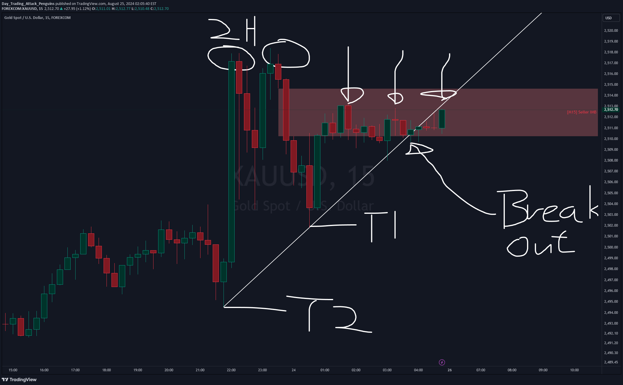
Double Top Reversal: In the chart, two tops are marked, forming a classic reversal pattern that usually signals a potential price reversal. These patterns typically indicate that the market has reached a resistance level and is pulling back quickly, suggesting that the bullish momentum is weakening. Supply Zone (Seller IMB): The red zone highlights a supply area where strong selling pressure was encountered after bulls attempted to push prices higher. The price repeatedly tested this area but failed to break through, indicating that the selling pressure in this zone is significant. Breakout: The chart indicates a breakout from the trendline, suggesting that the price may continue to decline. This breakout serves as another signal for choosing to sell. Trendline (T1 and T2): The trendline marks the target areas for the bearish move.
Day_Trading_Attack_Penguins
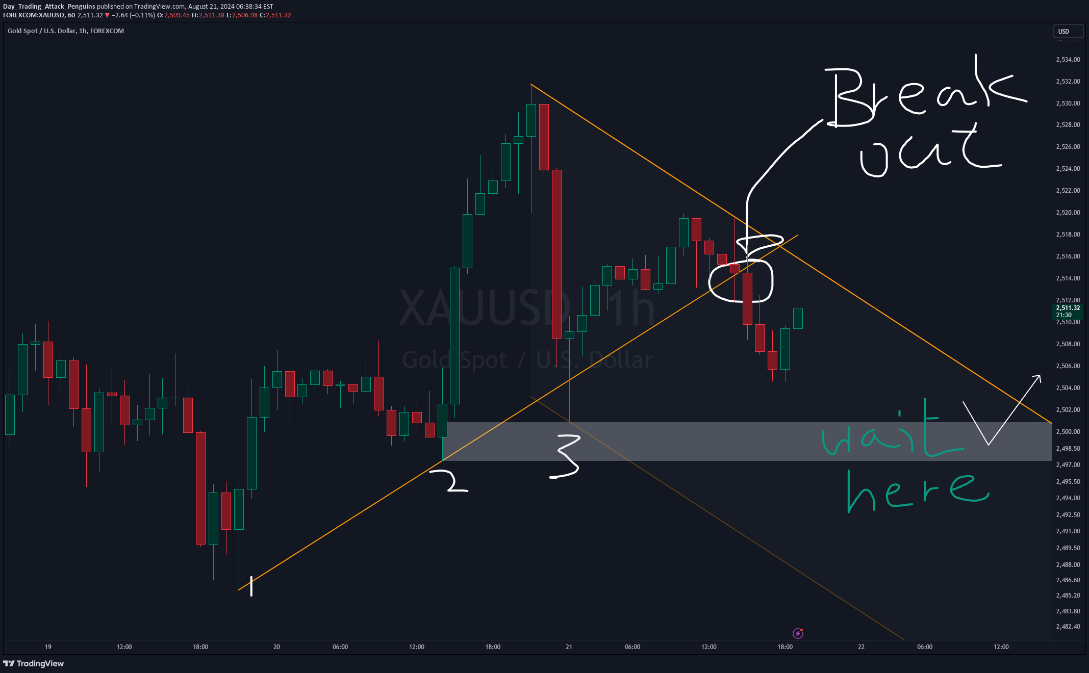
In this 1-hour chart of XAU/USD (Gold against the US Dollar), we can observe key market price actions. The yellow trendline on the chart connects several lows from the bottom left, indicating that the market has been in an upward trend recently. However, as the price breaks this upward trendline, this trend may be coming to an end, suggesting that the market could reverse or enter a new downward phase. Notably, the gray area on the chart is marked as a potential support zone. This zone is approximately between 2500 and 2490 and could serve as a support level for the market. It's important to closely monitor the price action within this area to confirm whether effective support (price behavior) will appear, which will help determine the next trading strategy. After the market breaks the trendline, it's important not to rush into selling. Instead, it's advisable to cautiously wait for the price to retrace to this key support area and use additional market signals to confirm the right entry point. This strategy can help reduce risk and increase the likelihood of successful trades.
Day_Trading_Attack_Penguins
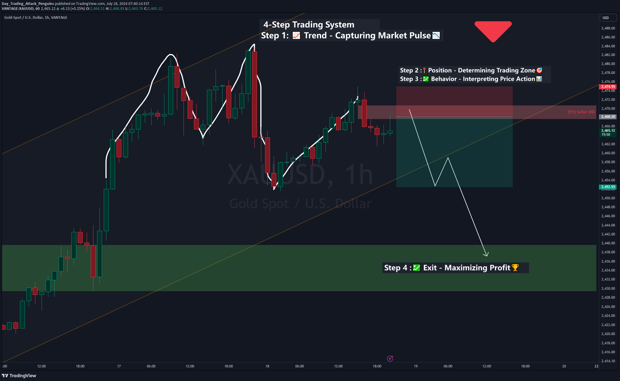
4-Step Trading System Step 1: Trend - Capturing Market Pulse The purpose of this step is to determine the primary market trend direction. From the chart, you can see that a double top reversal is marked with white lines. Step 2: Position - Determining Trading Zone This step is about identifying the trading zone for entry. In the chart, the red area marks the seller zone, indicating significant selling pressure within this region. Step 3: Behavior - Interpreting Price Action This step involves understanding market sentiment and potential movements through price action. The chart shows the reaction of prices upon entering the seller zone, indicating potential price movements. Step 4: Exit - Maximizing Profit The final step is selecting the optimal exit point to maximize profit. The chart marks the potential exit zone in the green area, with an arrow indicating the expected price movement and showing the potential profit zone. This chart combines trend analysis, trading zone identification, price action interpretation, and optimal exit strategy to provide a comprehensive trading framework. This approach can help traders better understand market dynamics and make informed trading decisions.
Day_Trading_Attack_Penguins
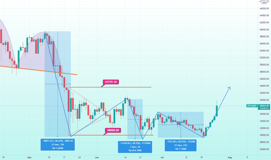
Continuation Long Scenario:Watch for price to break the 43K level and get in on the retest of 43K with stops below the structure.Retracement Long Scenario:Watch for price to retrace back to the 36K level where we have previous structure. Entry on breakout of the retracement correction.
Disclaimer
Any content and materials included in Sahmeto's website and official communication channels are a compilation of personal opinions and analyses and are not binding. They do not constitute any recommendation for buying, selling, entering or exiting the stock market and cryptocurrency market. Also, all news and analyses included in the website and channels are merely republished information from official and unofficial domestic and foreign sources, and it is obvious that users of the said content are responsible for following up and ensuring the authenticity and accuracy of the materials. Therefore, while disclaiming responsibility, it is declared that the responsibility for any decision-making, action, and potential profit and loss in the capital market and cryptocurrency market lies with the trader.