
Youriverse
@t_Youriverse

ما هو الشيء الذي ننصحك بشراءه من المواد الغذائية؟
سابق في الشراء
پیام های تریدر
مرشح
Youriverse
Bitcoin - Can it reclaim $89.000?
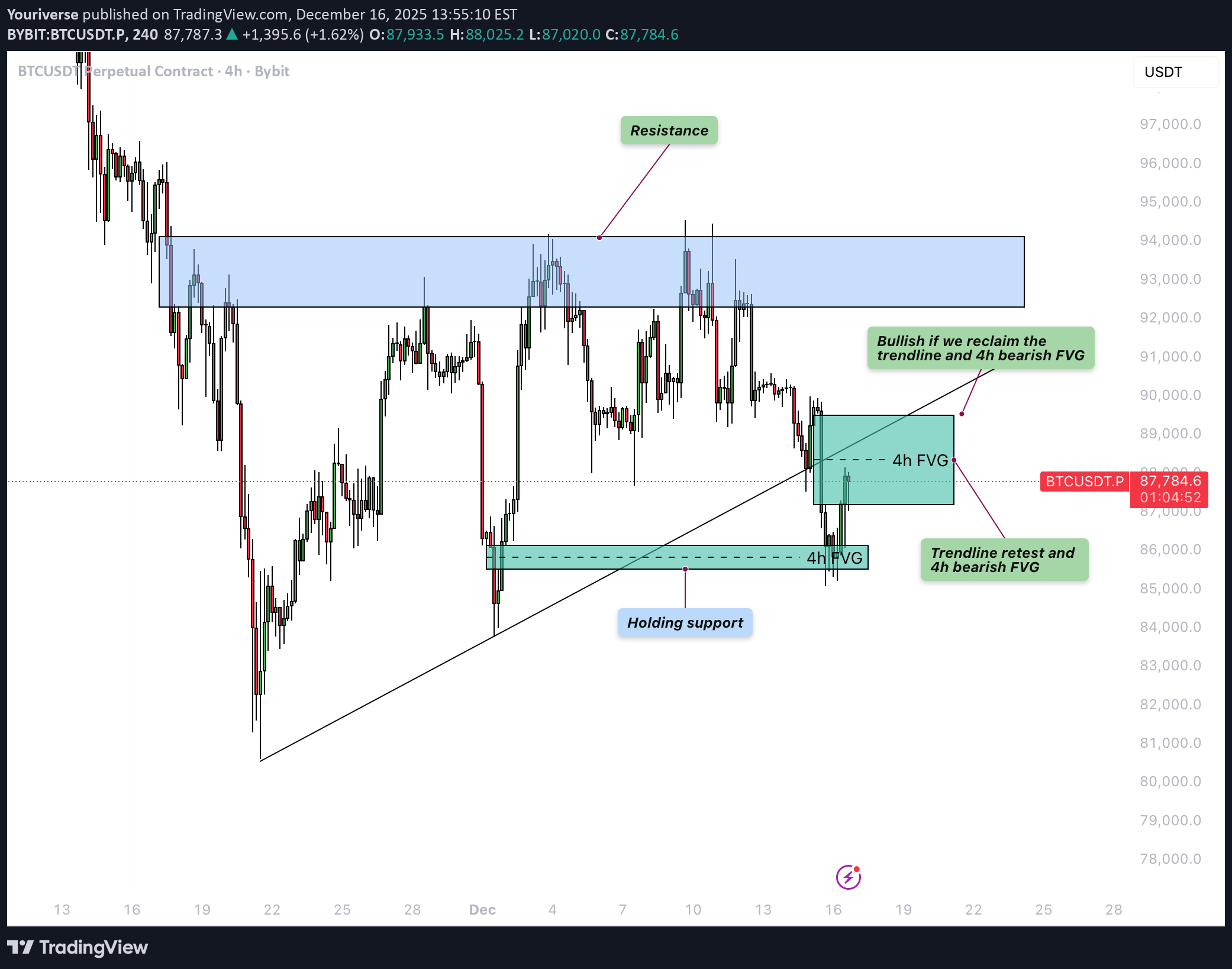
یتم تداول Bitcoin (BTC) حالیًا فی منطقة حاسمة بعد الانخفاض الأخیر، حیث یقع بین FVG الصعودی على فریم 4 ساعات حول المنطقة السفلیة 85000 دولار وFVG الهبوطی على مدى 4 ساعات دون المقاومة مباشرةً. یرکز هذا التحلیل الفنی BTC على ما إذا کان Bitcoin قادرًا على استعادة خط الاتجاه المفقود وFVG المرتبط به، أو ما إذا کان السوق یختار بدلاً من ذلک تصحیحًا أعمق. صعودی 4H FVG یظل FVG الصعودی على إطار 4 ساعات حول 85,500 دولار تقریبًا بمثابة مستوى دعم مهم فی الوقت الحالی. من هذه المنطقة، بدأ BTC مؤخرًا ارتدادًا متواضعًا، مما یشیر إلى أن الرغبة فی الشراء لا تزال موجودة. وطالما استمر السعر فی الإغلاق فوق FVG، لا یزال هناک مجال فنی لانتعاش أکبر move نحو مناطق المقاومة الأعلى. السیناریو الهبوطی یتمحور السیناریو الهبوطی حول رفض مستوى FVG الهابط على الرسم البیانی لأربع ساعات والذی یتوافق مع خط الاتجاه الصاعد المکسور سابقًا. إذا قام BTC بإعادة النظر فی هذه المنطقة فقط کإعادة اختبار وتم بیعها لاحقًا، فسیؤکد ذلک أن الدعم السابق قد تحول إلى مقاومة. فی هذه الحالة، من المرجح أن تنخفض الأسعار مرة أخرى، مع وجود أهداف محتملة أقل من أدنى مستویاتها الأخیرة وأعمق فی نطاق 80 ألف دولار. السیناریو الصاعد یتطلب السیناریو الصعودی استعادة مقنعة لکل من خط الاتجاه وFVG الهبوطی على الرسم البیانی لأربع ساعات فوقه. إذا تمکن BTC من الإغلاق فوق هذه المجموعة ثم أعاد اختبارها بنجاح کدعم جدید، فإن معنویات السوق ستتحول مرة أخرى لصالح المضاربین على الارتفاع. فی هذه الحالة، من المرجح أن یقوم BTC بإعادة النظر فی الارتفاعات الأخیرة بالقرب من منطقة المقاومة major. وبالتالی یؤکد هذا التحلیل الفنی BTC على أن رد الفعل حول خط الاتجاه المتقارب وFVG سیکون حاسمًا بالنسبة للخط الأکبر التالی move. الاستنتاج یقع BTC حالیًا عند مفترق طرق مهم بین FVG الصعودی على مدى 4 ساعات الذی لا یزال صامدًا بحوالی 85500 دولار أمریکی وFVG الهبوطی الحرج على مدى 4 ساعات عند خط الاتجاه المکسور. یؤدی الرفض عند المستویات العلیا إلى زیادة احتمالیة المزید من الاتجاه الهبوطی، فی حین أن الاستعادة الواضحة لکل من خط الاتجاه وFVG ستفتح الباب لإعادة اختبار الارتفاعات.
Youriverse
Bitcoin - Can the ascending triangle be broken?
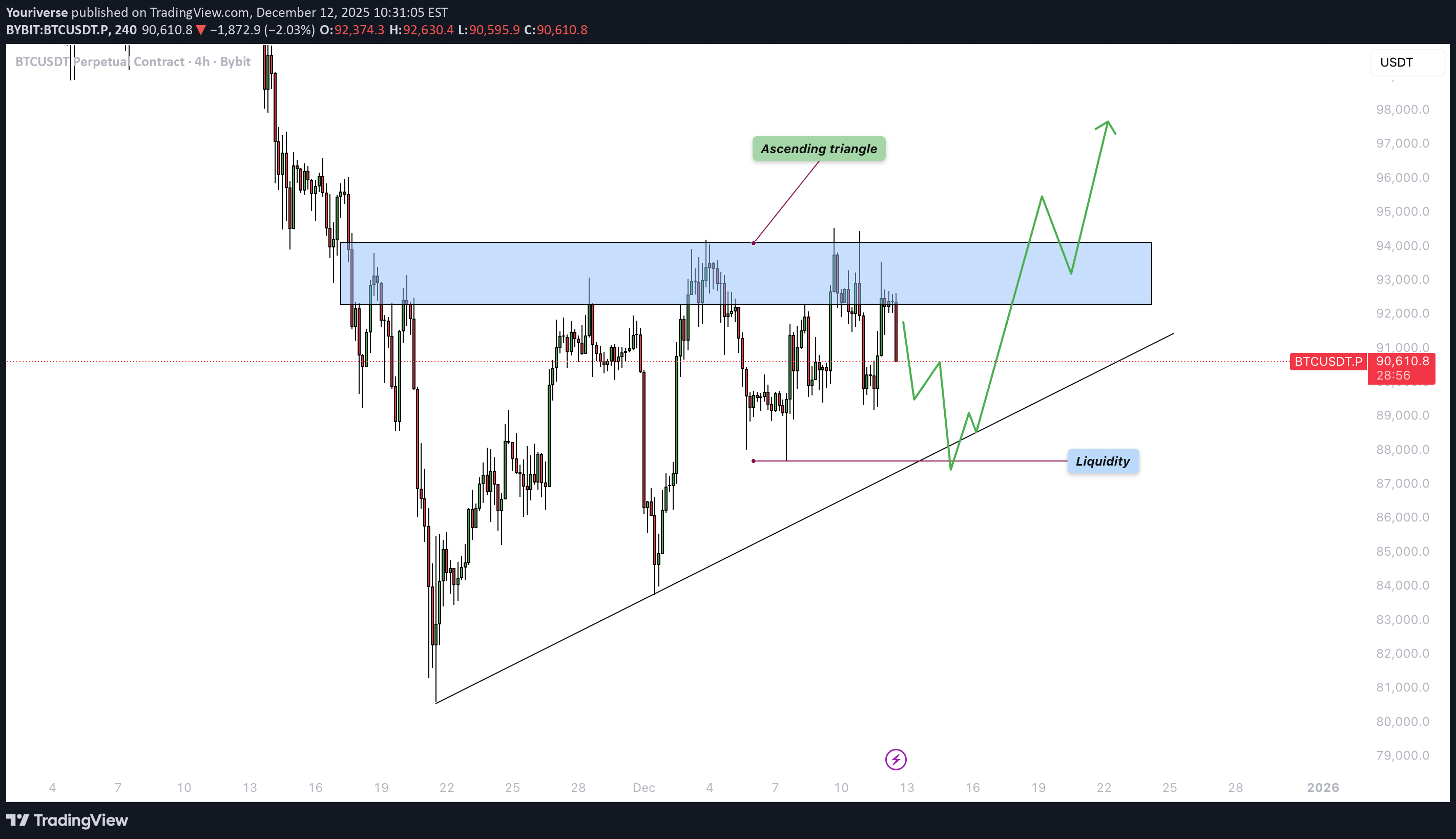
مقدمة یتماسک Bitcoin حالیًا ضمن هیکل محدد جیدًا بعد أسابیع من التقلب movement. على الرغم من المحاولات العدیدة الفاشلة للارتفاع، یستمر السوق فی الضغط أسفل منطقة المقاومة major مباشرة. غالبًا ما یشیر هذا النوع من تشدید حرکة السعر إلى اقتراب أکبر move، حیث تبدأ السیولة فی التراکم على جانبی النطاق. یسلط الرسم البیانی الضوء على عنصرین رئیسیین من المرجح أن یحددا الاتجاه التالی لـ BTC: تشکیل المثلث الصاعد ومستوى السیولة الذی یستقر تحت السعر الحالی. سیکون فهم کیفیة تفاعل السعر مع هذه المناطق أمرًا ضروریًا لتوقع الدافع الکبیر التالی. المثلث الصاعد BTC یشکل نموذج مثلث صاعد، یتمیز بارتفاع القیعان التی تلتقی بمنطقة مقاومة أفقیة نسبیًا. وقد توج نطاق المقاومة هذا، الموضح على الرسم البیانی، بشکل متکرر بالمحاولات الصعودیة. فی کل مرة یندفع BTC إلى المنطقة، فإنه یقابل بضغط بیع، لکن المستویات المنخفضة الأعلى تکشف أن المشترین یکتسبون الأرض بشکل مطرد. یشیر هذا النمط عادةً إلى تراکم واختراق صعودی محتمل بمجرد تراکم الضغط الکافی. إذا تمکن BTC من اختراق الحد العلوی لهذا المثلث بقوة وحجم، فمن المرجح أن یستهدف move مجمعات سیولة أعلى فوق أعلى المستویات الأخیرة. غالبًا ما یؤدی مثل هذا الاختراق إلى تحرک اندفاعی للأعلى، حیث تضطر مراکز البیع المحاصرة إلى التغطیة وینضم إلیها مشترو الزخم. فی الوقت الحالی، یظل خط الاتجاه الصعودی بمثابة دعم هیکلی رئیسی یحدد الجانب الصعودی من هذا النمط. مستوى السیولة أسفل النطاق الحالی توجد منطقة سیولة واضحة، تم إنشاؤها بواسطة مجموعة من المستویات المنخفضة المتساویة والمستویات الهبوطیة غیر المختبرة. تم تحدید هذه المنطقة على الرسم البیانی وتمثل المکان الذی من المحتمل أن یتم وضع أوامر وقف الخسارة فیه واستراحة السیولة. غالبًا ما تقوم الأسواق بإعادة النظر فی مثل هذه المناطق قبل تحقیق اختراق حاسم، خاصة فی الهیاکل المثلثیة حیث تتراکم السیولة على کلا الجانبین. إن اکتساح هذه السیولة، جنبًا إلى جنب مع النقر على خط الاتجاه الصعودی، سیکون بمثابة إعداد کتابی للمشترین للعودة إلیه. إذا انخفض BTC إلى هذه المنطقة وارتد بقوة، فسیؤدی ذلک إلى تعزیز هیکل السوق وزیادة احتمالیة حدوث الاختراق النهائی فی الاتجاه الصعودی. ومع ذلک، إذا فشل مستوى السیولة هذا وانکسر السعر تحت خط الاتجاه، فسیتم إبطال الهیکل الصعودی، مما یفتح الباب أمام انخفاض أعمق move. الأفکار النهائیة یقترب BTC من نقطة القرار، مع تشدید الأسعار داخل مثلث صاعد بینما تتجمع مجمعات السیولة فی الأسفل. وطالما استمر خط الاتجاه الصعودی عند act کدعم، فإن السوق یحتفظ بتحیز صعودی، ویصبح الاختراق فوق منطقة المقاومة محتملاً بشکل متزاید. ومع ذلک، فإن انجراف السیولة إلى الجانب الهبوطی قبل أی ارتفاع بمقدار أقل من 12 یظل احتمالًا قویًا. یجب على المتداولین الانتباه جیدًا إلى کیفیة رد فعل BTC إذا انخفض إلى منطقة السیولة، حیث ستکشف هذه الاستجابة ما إذا کان المشترون مستعدون للدفاع عن الهیکل. من شأن الاختراق الواضح فوق مستوى المقاومة band أن یؤکد الاتجاه الصعودی التالی، فی حین أن الاختراق تحت خط الاتجاه الصعودی من شأنه أن یشیر إلى الضعف ویغیر التوقعات.
Youriverse
بیت کوین آماده جهش به ۹۵,۰۰۰ دلار قبل از اصلاح بزرگ؟
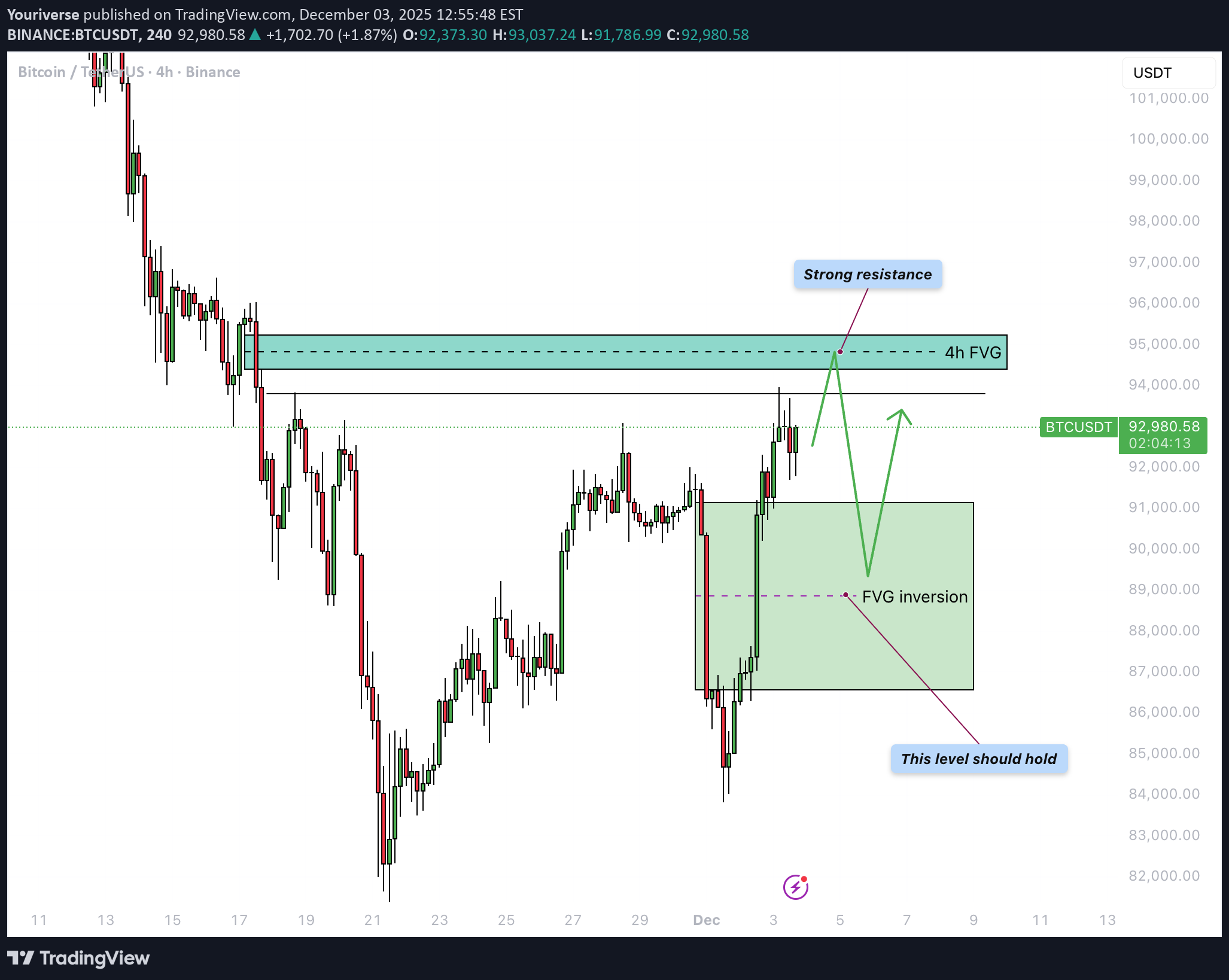
یجد Bitcoin نفسه عند نقطة تحول مهمة مرة أخرى بعد انخفاض حاد أعقبه انتعاش قوی. فی هذا التحدیث، سنغطی رد الفعل على FVG الهبوطی السابق على مدار 4 ساعات، وانعکاس FVG على 4 ساعات الذی تم تشکیله حدیثًا والذی یعمل کدعم، ومستوى المقاومة التالی عند 95000 دولار، واکتساح السیولة الأخیر. 4H انعکاس FVG الهبوطی منذ یومین، سجل BTC اتجاهًا هبوطیًا قویًا move عکس جزءًا کبیرًا من الارتفاع السابق وجمع deep سیولة تحت أدنى المستویات المحلیة. خلال هذا الانخفاض، تم تشکیل FVG هبوطی واضح على مدى 4 ساعات، والذی کان بمثابة منطقة العرض. ومع ذلک، بالأمس، استعاد BTC هذا FVG بأکمله بکل اقتناع: اخترق السعر خلاله وأغلق عدة شموع فوق المنطقة. هذا التحول یقلب المنطقة من العرض إلى الطلب، مما یعنی أن FVG الهبوطی السابق قد تحول الآن إلى انعکاس FVG على مدار 4 ساعات. یمثل المربع الأخضر على الرسم البیانی الآن منطقة الدعم الأساسیة، ویظل ثابتًا بشکل مثالی أثناء أی تراجع. 4H FVG هبوطی حوالی 95000 دولار فوق السعر الحالی یقع مستوى FVG الهبوطی التالی على مدار الأربع ساعات حول 95000 دولار تقریبًا، وهو ما یتماشى مع مرحلة الدمج والتوزیع السابقة. تعمل هذه المنطقة کمقاومة قویة وهی المغناطیس المنطقی التالی للتعافی المستمر move. وطالما أن انعکاس FVG تحت السعر قائم، فمن المعقول أن نتوقع أن ینخفض BTC تدریجیًا move نحو منطقة 95 ألفًا. من المحتمل حدوث رد فعل واضح بمجرد الوصول إلى هذه المنطقة، بدءًا من الرفض القصیر والتوحید الجانبی إلى انعکاس أکبر محتمل إذا أصبح البائعون عدوانیین مرة أخرى. اکتساح السیولة فی الآونة الأخیرة، اندفع BTC لفترة وجیزة فوق أعلى مستوى محلی ثم تراجع على الفور بعد ذلک، مما أدى إلى نشوء اکتساح واضح للسیولة على الرسم البیانی. أدى هذا move إلى القضاء على نقاط الوقف فی صفقات البیع المتأخرة بالإضافة إلى نقاط الاختراق الطویلة ولکنه لم یؤد بعد إلى استمرار فوری فی الاتجاه الصعودی. بعد هذا الاجتیاح، یصبح السؤال هو ما إذا کان السوق یمکنه جمع عدد کافٍ من المشترین لتغذیة الدافع التالی نحو FVG الأعلى، أو ما إذا کان السعر سینخفض أولاً نحو دعم الانعکاس لجمع السیولة هناک. وبالتالی فإن رد الفعل عند المستویات الحالیة سیوفر رؤیة مهمة للاتجاه على المدى القصیر. الاستنتاج وبسبب اکتساح السیولة الیوم، فإن التصحیح المباشر من السعر الحالی أمر ممکن للغایة، خاصة إذا قام المتداولون على المدى القصیر بجنی الأرباح بعد الارتداد القوی. ومع ذلک، یظل السیناریو الأساسی هو أن BTC لا یزال بإمکانه القیام بدفعة صعودیة أخرى نحو مستوى FVG الهبوطی على الرسم البیانی للأربع ساعات حول 95000 دولار، حیث من المتوقع حدوث رد فعل أکثر أهمیة. من شأن هذا المستوى move أن یتلاءم تمامًا مع الهیکل الذی یتم فیه اختبار المقاومة أولاً، یلیها تراجع لإعادة اختبار دعم الانعکاس الجدید - مما یؤکد ما إذا کان الانعکاس الأخیر له قوة حقیقیة وراءه. ------------------------- شکرا لدعمکم. إذا استمتعت بهذا التحلیل، فتأکد من متابعتی حتى لا یفوتک التحلیل التالی. وإذا وجدته مفیدًا، فلا تتردد فی إسقاط إعجابک 👍 وترک تعلیق 💬، ویسعدنی سماع أفکارک!
Youriverse
بیت کوین در تنگنا: آیا گاوها میتوانند مقاومت سرسخت را بشکنند؟
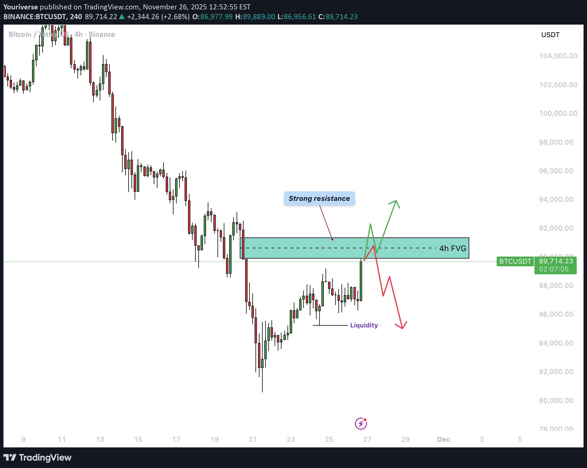
Bitcoin یستمر فی الرکود بعد عملیات بیع قویة. لا یزال هیکل السوق ضعیفا، وحجم التداول آخذ فی الانخفاض مع استمرار السعر فی التحرک بشکل جانبی ضمن نطاق ضیق. التجار غیر متأکدین بشأن الخطوة التالیة، ویفتقر کل من المضاربین على الارتفاع والدببة حالیًا إلى الاقتناع. المعنویات العامة باردة، مع ترکیز معظم الاهتمام على مناطق المقاومة القریبة. تتجه العدید من الأنظار نحو کیفیة تفاعل BTC مع منطقة التماسک الحالیة. 4H FVG هبوطی فوق السعر الحالی مباشرة توجد فجوة القیمة العادلة الهبوطیة الواضحة على مدى 4 ساعات (FVG). تعمل هذه المنطقة الآن کمقاومة قویة. عندما یقوم BTC بإعادة اختبار هذه المنطقة، یکون الرفض هو السیناریو الأکثر احتمالاً. فقط الاختراق بحجم قوی من شأنه أن یمنح الثیران شیئًا یعتمدون علیه. وطالما أن مؤشر FVG صامد، فإن المزید من الانخفاض یظل هو المسار الأقل مقاومة. الإطار الزمنی 1H یظهر الإطار الزمنی لساعة واحدة تماسکًا مستمرًا وصراعات متکررة مع FVG المحلی الهبوطی على شارت الساعة. یتم رفض أی محاولة لاختراق هذه المنطقة على الفور. نتیجة لذلک، تزداد احتمالیة الاختراق إلى الجانب الهبوطی BTC، مما یسمح للسوق بجمع السیولة الموجودة أدناه. من المتوقع أن یستمر المضاربون على الانخفاض فی الدفاع عن هذه المنطقة حتى یخترق السوق اقتناعهم. قد یستمر التماسک طالما ظل مستوى الدعم ثابتًا، لکن المخاطر الهبوطیة الأساسیة تظل کبیرة. الاستنتاج BTC یظل تحت الضغط الفنی طالما لا یوجد اختراق مقنع فوق خط الأربع ساعات FVG. النطاق الحالی عرضة للاختراق الهبوطی، خاصة مع ضعف الحجم وهیاکل المقاومة المستمرة. سیکون من الحکمة أن ینتظر المتداولون إشارات أکثر وضوحًا أو اتجاهًا جدیدًا على أطر زمنیة أعلى قبل الالتزام بالاتجاه.
Youriverse
بیت کوین در آستانه جهش اصلاحی؟ علائم صعود در تایمفریمهای کلیدی!
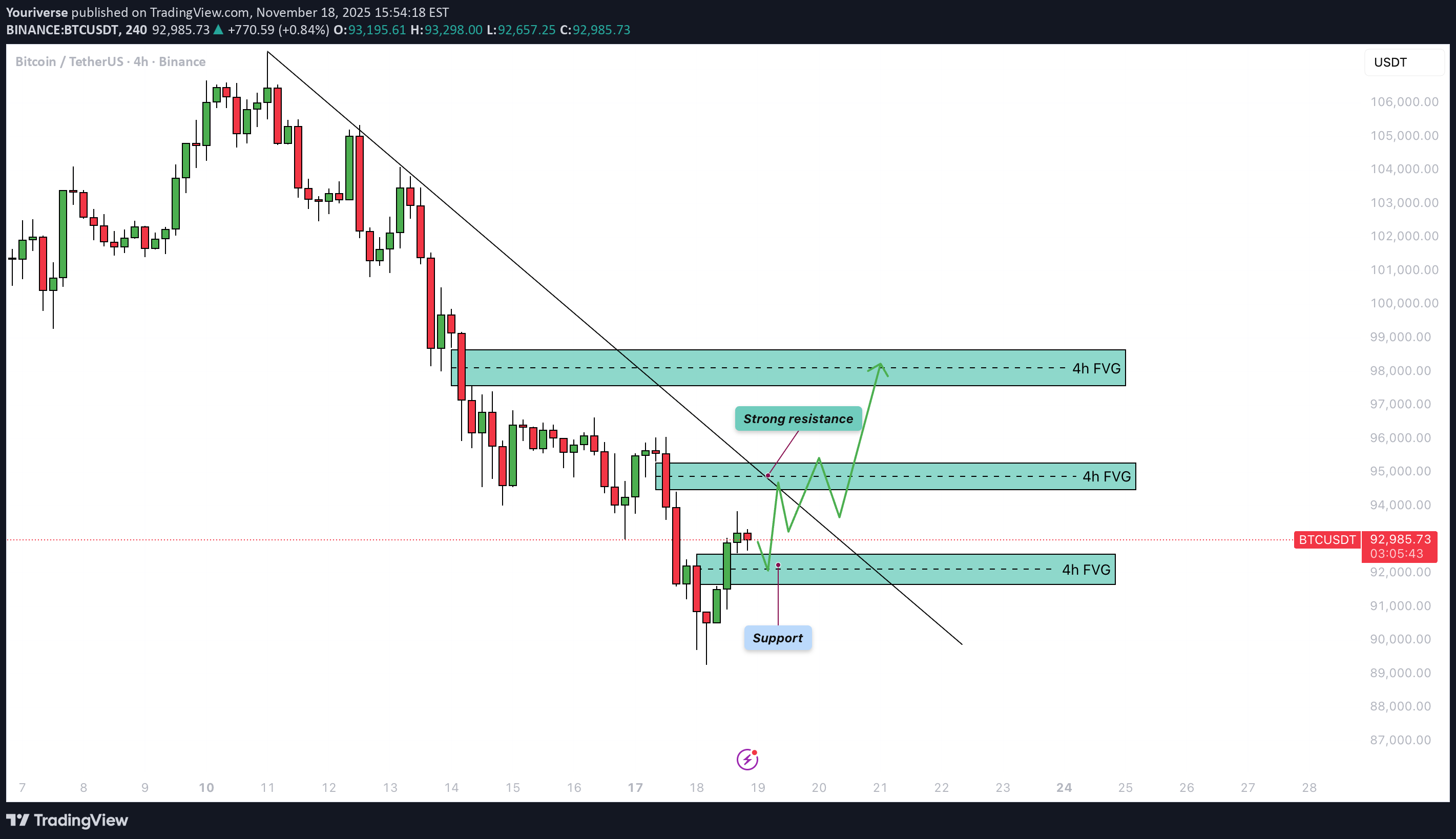
مقدمة أظهر Bitcoin (BTC) ضغطًا هبوطیًا قویًا خلال الأیام القلیلة الماضیة، ومع ذلک فقد بدأ فی إظهار علامات مبکرة على الاستقرار ضمن مناطق فجوة القیمة العادلة الرئیسیة ذات الإطار الزمنی الأعلى. على الرغم من أن هیکل السوق الحالی لا یزال هبوطیًا، إلا أن هناک العدید من العناصر الفنیة المتوافقة التی تشیر إلى احتمال حدوث ارتفاع مریح. ومع تقارب الأنماط ومستویات السیولة المتعددة، قد یستعد السوق لتصحیح صعودی مؤقت قبل تحدید اتجاهه التالی major. FVG الأسبوعیة على الإطار الزمنی الأسبوعی، تمکن BTC مؤخرًا من سد فجوة القیمة العادلة الأسبوعیة وسد ما یقرب من خمسین بالمائة من هذا الخلل. غالبًا ما یشیر هذا الملء الجزئی إلى أن السوق یجمع السیولة قبل البدء فی عملیة أکبر move. ونتیجة لذلک، فإن FVG الأسبوعی هذا یعمل کمنطقة طلب قویة حیث یمیل المشترون إلى النشاط مرة أخرى، مما یوفر منطقة یستقر فیها السعر غالبًا، حتى ولو مؤقتًا. یشیر رد الفعل هنا إلى أن BTC قد یشکل قاعدة قصیرة المدى. یومیا FVG على الإطار الزمنی الیومی، توجد فجوة أخرى فی القیمة العادلة، وتتوافق بشکل مثالی تقریبًا مع المنطقة الأسبوعیة. فوق حرکة السعر الحالیة یوجد خط اتجاه تنازلی واضح، والذی من المرجح أن یکون act کمقاومة عند أی دفعة صعودیة. یؤدی الجمع بین FVG الیومی وخط الاتجاه الهبوطی إلى إنشاء نقطة قرار مهمة من الناحیة الفنیة. إذا وصل BTC إلى هذه المنطقة، فقد یواجه ضغوط بیع متجددة، مما یجعل هذه المنطقة حاسمة لتحدید ما إذا کان السوق یمکنه التوسع للأعلى أو ما إذا کان الاتجاه الهبوطی سیعید تأکید نفسه. الإطار الزمنی 4H على الرسم البیانی لمدة 4 ساعات، شکل BTC وتدًا هابطًا، وهو النمط الذی یعتبر عادةً صعودیًا. فی البدایة، اخترق السعر للأسفل خارج الوتد، والذی بدا وکأنه استمرار للضعف. ومع ذلک، BTC عاد سریعًا إلى الهیکل، مما یشیر إلى حدوث تزییف. یحدث هذا النوع من movement غالبًا عندما یتم جمع السیولة أسفل النموذج قبل أن یبدأ الانعکاس. وتؤدی العودة إلى الوتد إلى تعزیز حالة التصحیح الصعودی على المدى القصیر، مما یدل على أن المشترین قد یکتسبون زخمًا. تجمع الإغاثة تقع المنطقة الأولى التی یجب مراقبتها فوق مستوى السعر الحالی مباشرة، حیث یتداخل نموذج FVG الهبوطی على مدى 4 ساعات مع خط الاتجاه الهبوطی. من المرجح أن یکون هذا الالتقاء act کمقاومة فوریة، مما یجعل الرفض الأولی من هذا المستوى محتملاً للغایة. بعد الرفض المحتمل، قد یعید السعر زیارة FVG الصعودی على الرسم البیانی لأربع ساعات أدناه، حیث من المتوقع أن یتدخل المشترون مرة أخرى. من هذه المنطقة الداعمة، یمکن أن یحاول BTC اختراق خط الاتجاه الهبوطی والاستمرار فی الارتفاع نحو مستوى FVG الهبوطی العلوی على الرسم البیانی لـ 4 ساعات حول منطقة 98000 دولار. یعد هذا بمثابة هدف منطقی لارتفاع الإغاثة، إذا استمر الزخم فی البناء. الاستنتاج یتم وضع BTC حالیًا ضمن منطقة طلب مهمة ذات إطار زمنی أعلى، مدعومًا بتداخل کل من FVGs الأسبوعیة والیومیة. على الرغم من أن هیکل السوق الأوسع لا یزال هبوطیًا، إلا أن الاختراق الوهمی داخل الوتد الهابط على الرسم البیانی لکل 4 ساعات یشیر إلى أن ارتفاعًا مریحًا قد یتطور. ستوفر المقاومة المباشرة فوق السعر أول اختبار major. إذا وجد Bitcoin زخمًا متجددًا من FVG الصعودی على إطار 4 ساعات وکسر خط الاتجاه الهبوطی بنجاح، فإن الارتفاع move نحو 98000 دولار یصبح واقعیًا بشکل متزاید. فی الوقت الحالی، یبدو أن مستوى BTC یمهد الطریق لارتداد تصحیحی، حیث تقدم المستویات الرئیسیة إرشادات واضحة حول کیفیة ظهور هذا السیناریو.
Youriverse
بیت کوین به ۹۸,۰۰۰ دلار سقوط میکند؟ تحلیل کاهش قیمت و نقدینگی از دست رفته!
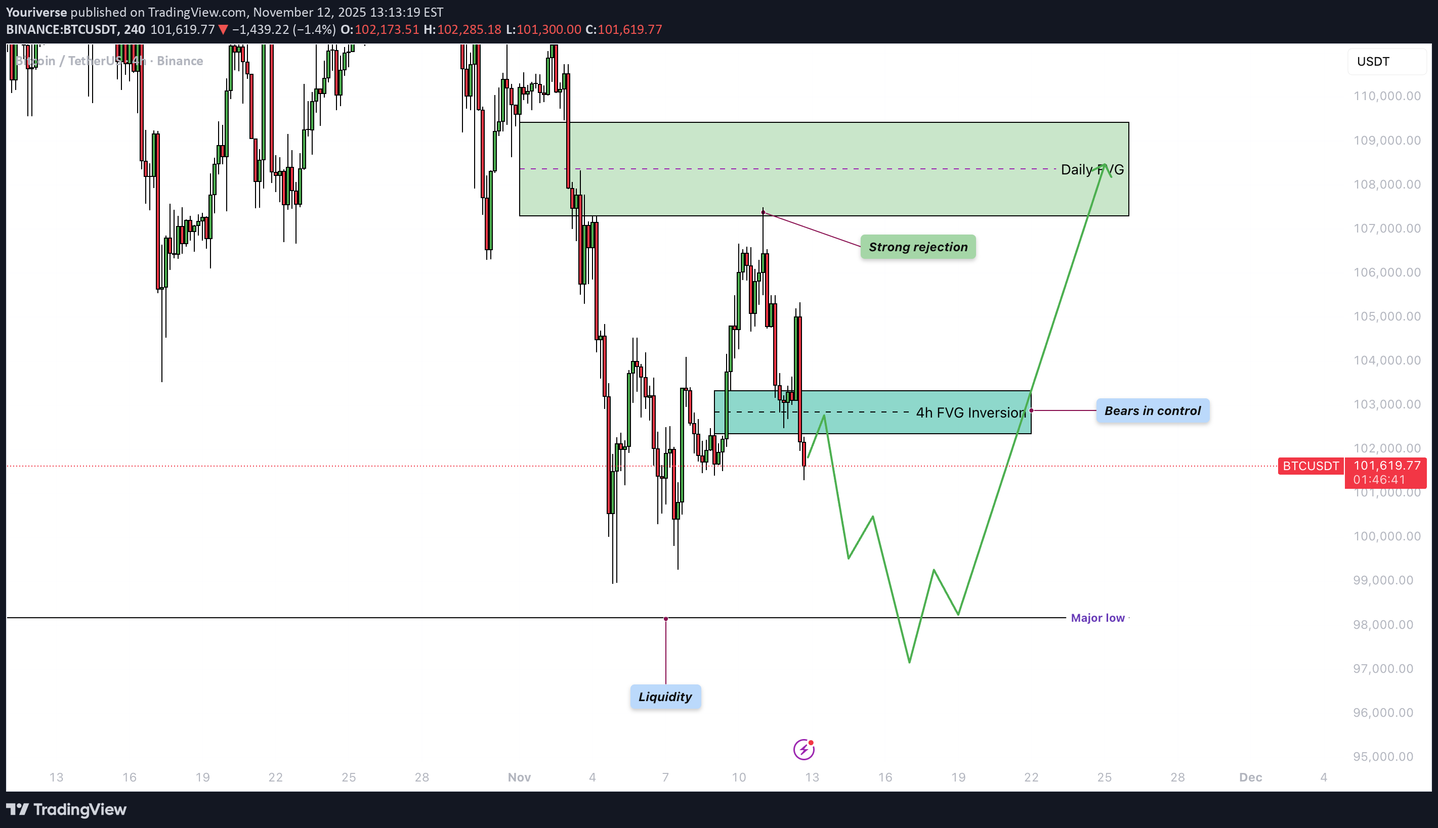
أظهر Bitcoin (BTC) هیکل سعر هبوطی واضح فی الأیام الأخیرة. بعد فترة من التحرکات الجانبیة movement ومحاولات التعافی، أصبح ضغط البیع هو المهیمن مرة أخرى، مما أدى إلى انخفاض حاد نحو مناطق السیولة الرئیسیة. 4h انعکاس FVG الصعودی فشل BTC للتو فی الحفاظ على مستوى FVG الصعودی على الرسم البیانی لأربع ساعات وأغلق تحته، والذی یعمل الآن کمقاومة (انعکاس). وهذا یفتح الطریق نحو مستویات أدنى، ویظل احتمال استمرار الانخفاض مرتفعًا. یکافح الثیران حالیًا لاستعادة الأرض. اکتساح السیولة خلال الجلسة الأخیرة، حدث اکتساح للسیولة، مع انخفاض السعر إلى ما دون أدنى مستویاته السابقة وإثارة العدید من أوامر وقف الخسارة وأوامر البیع. على الرغم من أن مثل هذا move یؤدی غالبًا إلى ارتداد فنی، إلا أن المعنویات العامة تظل هبوطیة. تستمر السیولة المتبقیة تحت المستوى المنخفض major بحوالی 98000 دولار فی خلق ضغوط بیع وقد تؤدی إلى مزید من الانخفاض. الاستنتاج وعلى الرغم من موجة السیولة الأخیرة، لا یوجد حتى الآن قاع مقنع فی الأفق، ولا تزال المخاطر الهبوطیة هی المهیمنة. وطالما یتم تداول مستوى BTC تحت انعکاس FVG على مدار 4 ساعات واستمرار الزخم الهبوطی، یظل السیناریو الأکثر ترجیحًا ضمن التوقعات الفنیة الحالیة هو مستوى move نحو 98000 دولار. ------------------------- شکرا لدعمکم. إذا استمتعت بهذا التحلیل، فتأکد من متابعتی حتى لا یفوتک التحلیل التالی. وإذا وجدته مفیدًا، فلا تتردد فی إسقاط إعجابک 👍 وترک تعلیق 💬، ویسعدنی سماع أفکارک!
Youriverse
هشدار بزرگ بیت کوین: آیا "تقاطع مرگ" بازار را نابود میکند؟
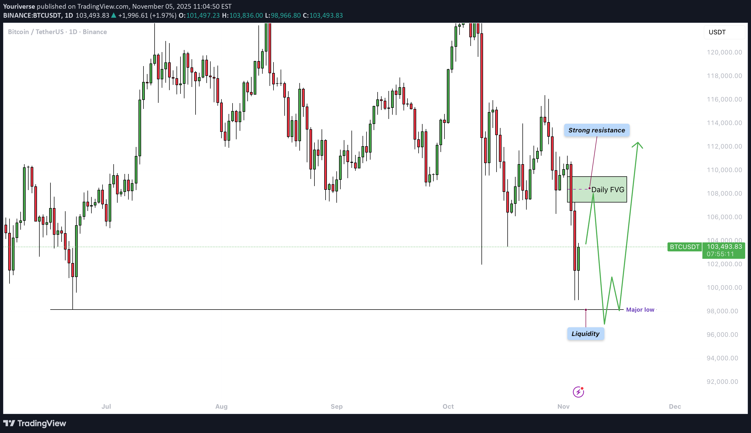
Bitcoin أظهر قوة move خلال الأسبوع الماضی، لیصل إلى الهدف الهابط المتوقع. تحوم حرکة السعر حالیًا حول المستویات الفنیة الرئیسیة التی تؤثر على معنویات السوق على الأطر الزمنیة الأعلى والأدنى. خلاصة الأسبوع الماضی فی الأسبوع الماضی، لوحظ أن BTC قام بعملیة اکتساح للسیولة، وعکس مؤشر FVG الیومی الصعودی، وشکل حرکة وهمیة، وکل ذلک یشیر إلى المزید من الاتجاه الهبوطی movement. تم تحدید الهدف أعلى بقلیل من 103000 دولار، وتم الوصول إلى هذا الهدف بشکل مقنع، مع انخفاض بنسبة 7-10٪ تقریبًا. لقد تحققت التوقعات بدقة، وأظهر السوق بوضوح أن المضاربین على الانخفاض ما زالوا مسیطرین. الإطار الزمنی الیومی على الإطار الزمنی الیومی، من الجدیر بالذکر أن القاع major البالغ 98000 دولار لم یتم تجاوزه بعد. وفی الوقت نفسه، یتم تداول BTC أسفل منطقة مقاومة قویة أعلى السعر الحالی مباشرةً. سیکون من الصعب اختراق هذه المنطقة ویمکن أن تخلق ضغطًا هبوطیًا، مما یزید من احتمالیة اختراق مستوى 98000 دولار. ومع ذلک، إذا تمکن BTC من استعادة مناطق المقاومة هذه، فقد تتحول المعنویات إلى توقعات أکثر صعودیة، ولکن فی الوقت الحالی، لا یزال المضاربون على الانخفاض هم المسیطرین. الإطار الزمنی 4 ساعات على الإطار الزمنی لمدة 4 ساعات، یوجد FVG لمدة 4 ساعات أعلى السعر الحالی مباشرةً. ومن الناحیة الفنیة، یعد هذا مجالًا منطقیًا لرفض محتمل. من المتوقع أن یرتفع BTC أولاً move نحو FVG قبل أن یواجه الرفض ثم ینخفض مرة أخرى نحو منطقة 98000 دولار. صلیب الموت قد یکون تقاطع الموت أقل من 9> خلال الأسابیع 1-2 القادمة، ویحدث عندما یتقاطع المتوسط المتحرک لـ 50 یومًا تحت المتوسط المتحرک لـ 200 یوم. هذه إشارة هبوطیة معروفة، ولکن تاریخیًا، غالبًا ما تظهر فی نهایة الاتجاه الهبوطی. فی هذه الدورة، رأینا بالفعل ثلاثة صلبان موت، جمیعها إما حددت القاع أو اقتربت من تحدیده. ومع ذلک، خلال عامی 2017 و2021، ظهرت تقاطعات الموت أیضًا فی نهایة الأسواق الصاعدة - یلیها انخفاض حاد، ثم ارتفاع مریح دفع الأسعار إلى ما فوق مستوى تقاطع الموت. لذلک، من المهم أن تظل متیقظًا لما إذا کان هذا یشیر إلى نهایة السوق الصاعدة أو بالأحرى هزة نهائیة قبل ارتفاع جدید. الاستنتاج BTC وصل إلى الهدف الهبوطی المتوقع ویتداول حالیًا تحت مستوى مقاومة قوی. من المحتمل أن BTC سیختبر أولاً FVG للأربع ساعات ثم move نحو منطقة 98,000 دولار. یمکن أن یؤدی تقاطع الموت القادم إلى زیادة الضغط، ولکن تاریخیًا، غالبًا ما تشیر مثل هذه الإشارات إلى نهایة المرحلة الهبوطیة. وستکون الأسابیع المقبلة حاسمة فی تحدید ما إذا کان هذا تصحیحًا أعمق أم بدایة لموجة صعودیة جدیدة. ------------------------- شکرا لدعمکم. إذا استمتعت بهذا التحلیل، فتأکد من متابعتی حتى لا یفوتک التحلیل التالی. وإذا وجدته مفیدًا، فلا تتردد فی إسقاط إعجابک 👍 وترک تعلیق 💬، ویسعدنی سماع أفکارک!
Youriverse
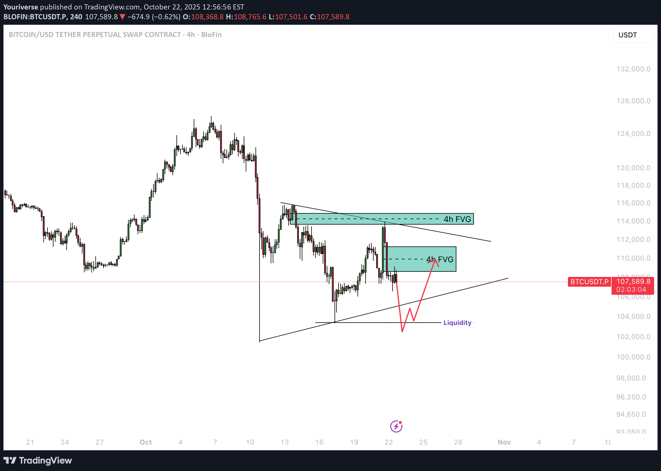
بیت کوین در دام افتاد: شکار نقدینگی و سقوط احتمالی تا ۱۰۳ هزار دلار!
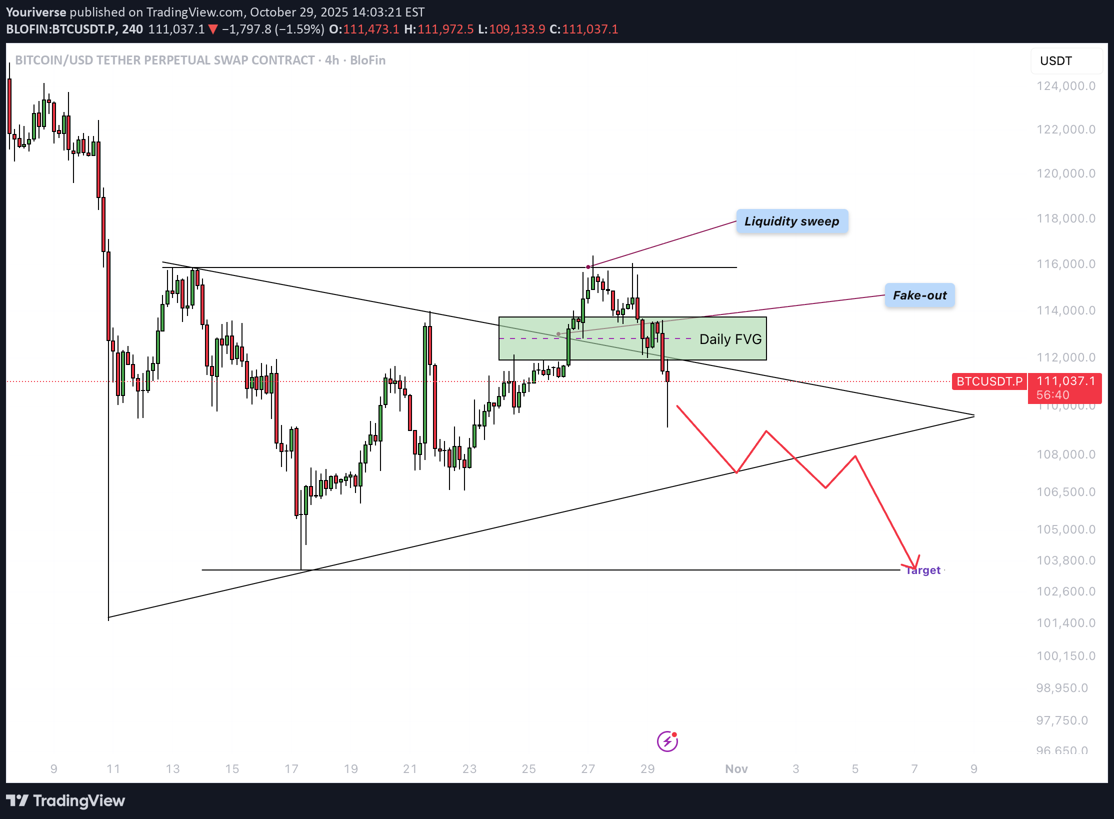
Bitcoin (BTC) یمر حالیًا بمرحلة حاسمة ضمن هیکل توحید أوسع. بعد حرکة صعودیة قویة، واجه السعر مقاومة کبیرة ویظهر علامات ضعف ضغط الشراء. على الرسم البیانی الیومی، من الواضح أن السعر قد دخل مرة أخرى إلى هیکل المثلث بعد اختراق قصیر فوق مستوى المقاومة. انتزاع السیولة حوالی 116000 دولار، یمکن ملاحظة اکتساح واضح للسیولة. فوق هذا المستوى، تم تجمیع العدید من أوامر الإیقاف وسیولة المراکز القصیرة. بعد أخذ هذه السیولة، انعکس السعر بشکل حاد نحو الأسفل - مما یشیر إلى أن کبار اللاعبین فی السوق من المحتمل أن یستخدموا هذا move لجنی الأرباح أو فتح صفقات بیع. التزییف من نمط المثلث تبین أن الاختراق فوق هیکل المثلث کان مزیفًا. وبدلاً من البقاء فوق خط الاتجاه للتأکید، انخفض السعر سریعًا داخل النموذج. وهذا یشیر إلى ضعف المشتری ویعزز السیناریو الهبوطی. غالبًا ما یؤدی التزییف فوق نمط التوطید إلى move فی الاتجاه المعاکس - نحو الحد السفلی للهیکل. یومیا FVG تقع الشمعة الحالیة ضمن فجوة القیمة العادلة الیومیة المهمة (FVG). إذا بقی الإغلاق الیومی کما هو، فإن هذا FVG الصاعد سوف یتحول إلى FVG هبوطی، مما یعنی أن المنطقة ستکون الآن act کمقاومة. یشیر هذا إلى أن الحرکة الهبوطیة تسیطر على السوق ومن المحتمل حدوث المزید من الحرکة الهبوطیة للسعر. الهدف بعد التزییف الصعودی الذی یجمع السیولة، یتحرک السعر غالبًا إلى الجانب الآخر من النموذج. وفی هذه الحالة، سیکون هذا هو الجانب السفلی من المثلث. وبالتالی فإن الانخفاض نحو 103000 دولار - 104000 دولار هو السیناریو الأکثر ترجیحًا. تتوافق هذه المنطقة مع الدعم الهیکلی السابق ویمکن أن تکون بمثابة منطقة مستهدفة منطقیة. الاستنتاج Bitcoin یظهر علامات واضحة على الإرهاق بالقرب من قمة النطاق. إن انتزاع السیولة والتزییف من المثلث یعزز النظرة الهبوطیة. مع انقلاب FVG الیومی وتلاشی الزخم الهبوطی، یبدو أن الانخفاض move نحو المنطقة 103000 دولار - 104000 دولار هو الخطوة التالیة الأکثر احتمالًا - ما لم یتمکن BTC بشکل غیر متوقع من الإغلاق فوق FVG. ------------------------- شکرا لدعمکم. إذا استمتعت بهذا التحلیل، فتأکد من متابعتی حتى لا یفوتک التحلیل التالی. وإذا وجدته مفیدًا، فلا تتردد فی إسقاط إعجابک 👍 وترک تعلیق 💬، ویسعدنی سماع أفکارک!
Youriverse
بیت کوین در آستانه سقوط؟ آیا خرسها قیمت را به ۱۰۴ هزار دلار میرسانند؟
مقدمة Bitcoin یمر حالیًا بمرحلة التوحید بعد الانخفاض الحاد الأخیر. لعدة أیام، کان السعر یشکل مثلثًا متماثلًا، مما یشیر إلى زیادة التوتر بین المشترین والبائعین. غالبًا ما یُنظر إلى هذه المرحلة على أنها فترة تحضیر لـ move أکبر. ومع ذلک، لا یزال هناک نقص فی الزخم الصعودی الواضح، مما یزید من خطر الاختراق الهبوطی. نمط المثلث یتحرک السعر ضمن نموذج المثلث، حیث تتناقص القمم وترتفع القیعان قلیلاً. ویشیر هذا إلى ضغط السیولة وانخفاض التقلبات. یعمل الحد العلوی للنموذج کمقاومة دینامیکیة، بینما یعمل الحد السفلی کدعم. بمجرد خروج السعر من هذا الهیکل، من المرجح أن یتم تحدید اتجاه major move التالی. فی الوقت الحالی، یبدو السعر محصورًا بین هذین المستویین الرئیسیین. السیولة فی الأعلى مع اختبار FVG على فریم 4 ساعات تم اختبار الجانب العلوی من الهیکل بالأمس، فوق فجوة القیمة العادلة الهبوطیة على مدى 4 ساعات (FVG). وفی تلک المنطقة، تم أیضًا العثور على السیولة من أعلى المستویات السابقة. کان رد فعل السعر برفض قوی وتراجع بسرعة. وأکد رد الفعل هذا أن البائعین ما زالوا یسیطرون وأن الطلب قد ضعف. تشیر الإشارة إلى أن السوق یکافح من أجل تجاوز مستوى 114000 دولار. 4 ساعات FVG هبوطی یقع FVG الهبوطی على مدى 4 ساعات بین حوالی 108,600 دولار و111,300 دولار. تعمل هذه المنطقة الآن کمنطقة مقاومة رئیسیة. فی کل مرة یلامس فیها السعر هذه المنطقة، یزداد ضغط البیع، مما یحد من المزید من الارتفاع movement. وطالما لم یتم اختراق هذه المنطقة بشکل مقنع مع حجم التداول، فإن الاتجاه قصیر المدى یظل هبوطیًا. الاختراق فوق هذا المستوى قد یفتح الباب أمام أهداف أعلى. منطقة السیولة فی القاع عند الطرف السفلی من المثلث، توجد منطقة سیولة واضحة تبلغ حوالی 103,500 دولار. هذا هو المکان الذی یوجد فیه وقف الخسائر من المراکز الطویلة وأوامر الشراء المحتملة من کبار اللاعبین، فی انتظار الحصول على السیولة. إذا تحرک السعر إلى هذه المنطقة، فقد یحدث فتیل قصیر للأسفل قبل حدوث ارتداد محتمل. لذلک، من المهم مراقبة هذا المستوى فی حالة الاختراق الهبوطی. خاتمة BTC لا یزال لا یظهر أی علامات للقوة. یشیر رفض FVG الهبوطی على مدى 4 ساعات فوق منطقة السیولة إلى نقص الاهتمام بالشراء. وطالما ظل السعر داخل المثلث ویتداول أقل من 113000 دولار، فإن احتمالیة الهبوط move تظل أعلى. فقط الاختراق المقنع فوق الحد العلوی یمکن أن یحسن معنویات السوق بشکل مؤقت. حتى ذلک الحین، یظل المضاربون على الانخفاض مسیطرین، مع الترکیز على الدعم حول منطقة السیولة المنخفضة. ------------------------- شکرا لدعمکم. إذا استمتعت بهذا التحلیل، فتأکد من متابعتی حتى لا یفوتک التحلیل التالی. وإذا وجدته مفیدًا، فلا تتردد فی إسقاط إعجابک 👍 وترک تعلیق 💬، ویسعدنی سماع أفکارک!
Youriverse
آیا اوج بیت کوین همین حالا رقم خورده است؟ تحلیل زمانبندی دورههای تاریخی
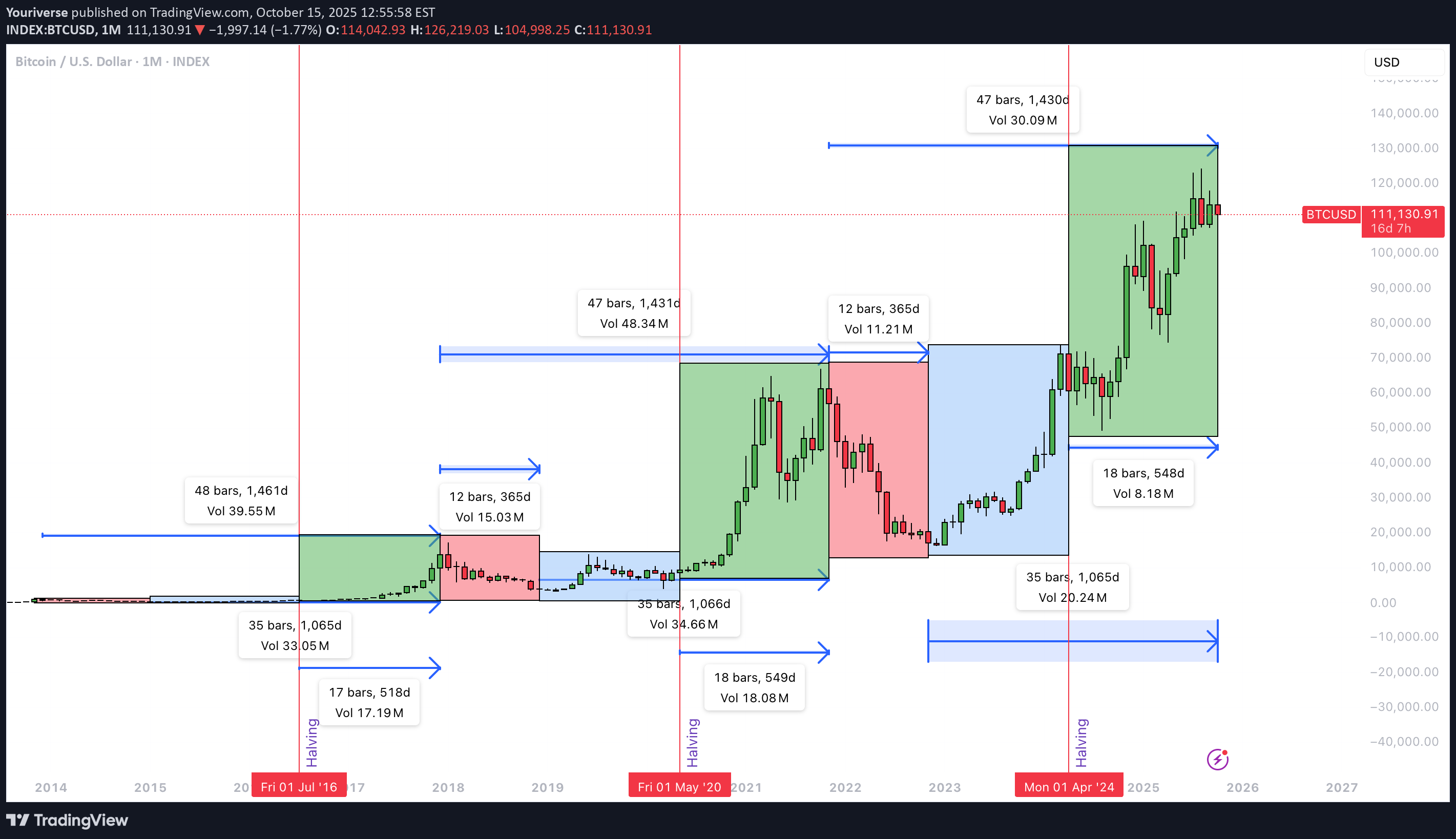
مقدمة یحلل هذا الرسم البیانی التوقیت الدوری للبیتکوین. الترکیز على الوقت ولیس السعر. وهو یفحص عدد الأیام بین اللحظات الهیکلیة مثل قمم الدورة، وقیعان الدورة، والنصف. ومن خلال مقارنة هذه الفترات، یمکننا أن نفهم الإیقاع والاتساق. یساعد هذا فی تحدید ما إذا کانت قمة الدورة الحالیة قد تکونت بالفعل فی أوائل شهر أکتوبر. دورة من الأعلى إلى دورة من الأسفل تمثل الفترة من قمة الدورة إلى قاع الدورة مرحلة الهبوط بعد ذروة السوق. وفی الدورتین السابقتین، استمرت هذه المرحلة حوالی 365 یومًا لکل منهما. یشیر هذا النمط إلى أن السوق یحتاج عادةً إلى عام للتعافی. وبعد ذلک تبدأ عادة مرحلة تراکم جدیدة. إذا استمر النمط، فإنه یوفر نافذة یمکن التنبؤ بها إلى حد ما للتصحیح. إنه یمثل الانتقال من النشوة إلى إعادة البناء. دورة من الأسفل إلى دورة الأعلى تحدد المرحلة من أسفل الدورة إلى قمة الدورة المسار الصعودی نفسه. وفی الدورتین الأخیرتین، استمرت هذه الفترة 1065 و1066 یومًا. وهذا أقل بقلیل من ثلاث سنوات. خلال هذا الوقت، ارتفع Bitcoin من التراکم deep إلى أعلى مستوى جدید على الإطلاق. واستنادًا إلى البیانات الحالیة، یشیر 1065 یومًا إلى أوائل شهر أکتوبر. وفی ذلک الشهر، تم الوصول إلى ATH جدید. وهذا یجعل المرحلة الحالیة متسقة مع الدورات الماضیة. إنه یدعم فکرة أن القمة قد تکون موجودة بالفعل. دورة من الأعلى إلى دورة الأعلى بلغت المدة الکاملة من الذروة إلى الذروة 1461 و1431 یومًا فی الدورات السابقة. وهذا یدل على إیقاع متکرر واضح. یتحرک السوق فی أنماط متسقة إلى حد ما لمدة أربع سنوات. ومقارنة ذلک بالدورة الحالیة تظهر امتدادا طفیفا. وإذا حدثت الذروة فی أوائل شهر أکتوبر، فإن هذه الدورة تکون أطول من السابقة. قد یشیر ذلک إلى سوق أکثر نضجًا. والنمو أبطأ ولکنه أقوى من الناحیة الهیکلیة. النصف إلى دورة الأعلى الوقت بین النصف وأعلى الدورة التالیة هو المفتاح. یؤثر النصف على کل من العرض ومعنویات السوق. وفی الدورات الماضیة، کان هذا الفاصل الزمنی 518 و548 یوما. نحن الآن بالضبط فی الیوم 548 منذ النصف الأخیر. وهذا یتوافق تمامًا مع التوقیت التاریخی. وهو یدعم فکرة الوصول إلى القمة فی أوائل أکتوبر. تتناسب اللحظة مع إیقاع النصف إلى الأعلى الذی لوحظ فی الدورات السابقة. خاتمة بناءً على تحلیل التوقیت هذا، فمن المحتمل جدًا أن تکون قمة الدورة قد تشکلت فی أوائل شهر أکتوبر. وتؤکد المدة من الأسفل إلى الأعلى البالغة 1065 یومًا والنصف إلى الأعلى البالغة 548 یومًا ذلک. کلاهما یتطابق مع الأنماط السابقة. الدورة الحالیة أطول قلیلاً من الدورات السابقة، مما یشیر إلى إیقاع أبطأ. إذا قام Bitcoin بتعیین ATH جدید لاحقًا، فسیتم وضع علامة على دورة ممتدة. التوقیت وحده لا یضمن اتجاه السعر فی المستقبل. ومن الممکن أن تعمل العوامل الکلیة، والتحولات السیاسیة، وأحداث السیولة، على تغییر الإیقاع. استخدم دورات التوقیت کسیاق، ولیس کتنبؤ. اجمعها مع هیکل الأسعار والإشارات الموجودة على السلسلة. حافظ على إدارة نشطة للمخاطر، نظرًا لأن الدورات الأطول غالبًا ما تؤدی إلى تقلبات أعلى وانحرافات أکبر عن المتوسطات التاریخیة.
إخلاء المسؤولية
أي محتوى ومواد مدرجة في موقع Sahmeto وقنوات الاتصال الرسمية هي عبارة عن تجميع للآراء والتحليلات الشخصية وغير ملزمة. لا تشكل أي توصية للشراء أو البيع أو الدخول أو الخروج من سوق الأوراق المالية وسوق العملات المشفرة. كما أن جميع الأخبار والتحليلات المدرجة في الموقع والقنوات هي مجرد معلومات منشورة من مصادر رسمية وغير رسمية محلية وأجنبية، ومن الواضح أن مستخدمي المحتوى المذكور مسؤولون عن متابعة وضمان أصالة ودقة المواد. لذلك، مع إخلاء المسؤولية، يُعلن أن المسؤولية عن أي اتخاذ قرار وإجراء وأي ربح وخسارة محتملة في سوق رأس المال وسوق العملات المشفرة تقع على عاتق المتداول.