
andre_007
@t_andre_007

What symbols does the trader recommend buying?
Purchase History
پیام های تریدر
Filter
andre_007
Selling opportunity in Bitcoin?

I don't know if the price will go up or down. But I think buying now in areas of multiple resistances is a bit risky. Any divergence in either the MFI or the RSI indicating buying exhaustion, I believe it is a good time to sell. As happened on July 28th.Stables coins dominance signaling a bear trap.MicroStrategy in resistance zone. Many consider this stock a proxy for Bitcoin. The correlation on the weekly chart is at a point where it tends to increase (periods from July to September). In addition, the price is at the top of a long rising channel, threatening to break above and then turn back down in a symmetrical triangle on the daily chart.USDT, USDC and DAI dominance index (together). We have a possible false breakout of the bearish trendline in dollar dominance. If this falsehood comes true, USD dominance falls, and so Bitcoin rises. On the other hand, if there is indeed a breakout above and dominance rises, BTC falls further.Wait for the next entry.Next target: 59kThe price needs to respect wave 1 to continue rising.Bullish divergenceVIX: people are scared...Partial target hit, operation cancelled.Will the party end early or will we still have an extension if the same bullish leg of wave 3 repeats?Bear divergence on Money Flow Index, also with rejected resistance in RSI. Targets: $ 62,875 $ 61,074 $ 57,229 $ 53,376 $ 48,725 Bear divergence on Money Flow Index, also with rejected resistance in RSI. Can be only a pullback to continue rising? I don't know.Pullback scenario:⏳ Waiting...The scenario in this chart is out of date.
andre_007
How to use Implied Volatility Index to analyze Bitcoin
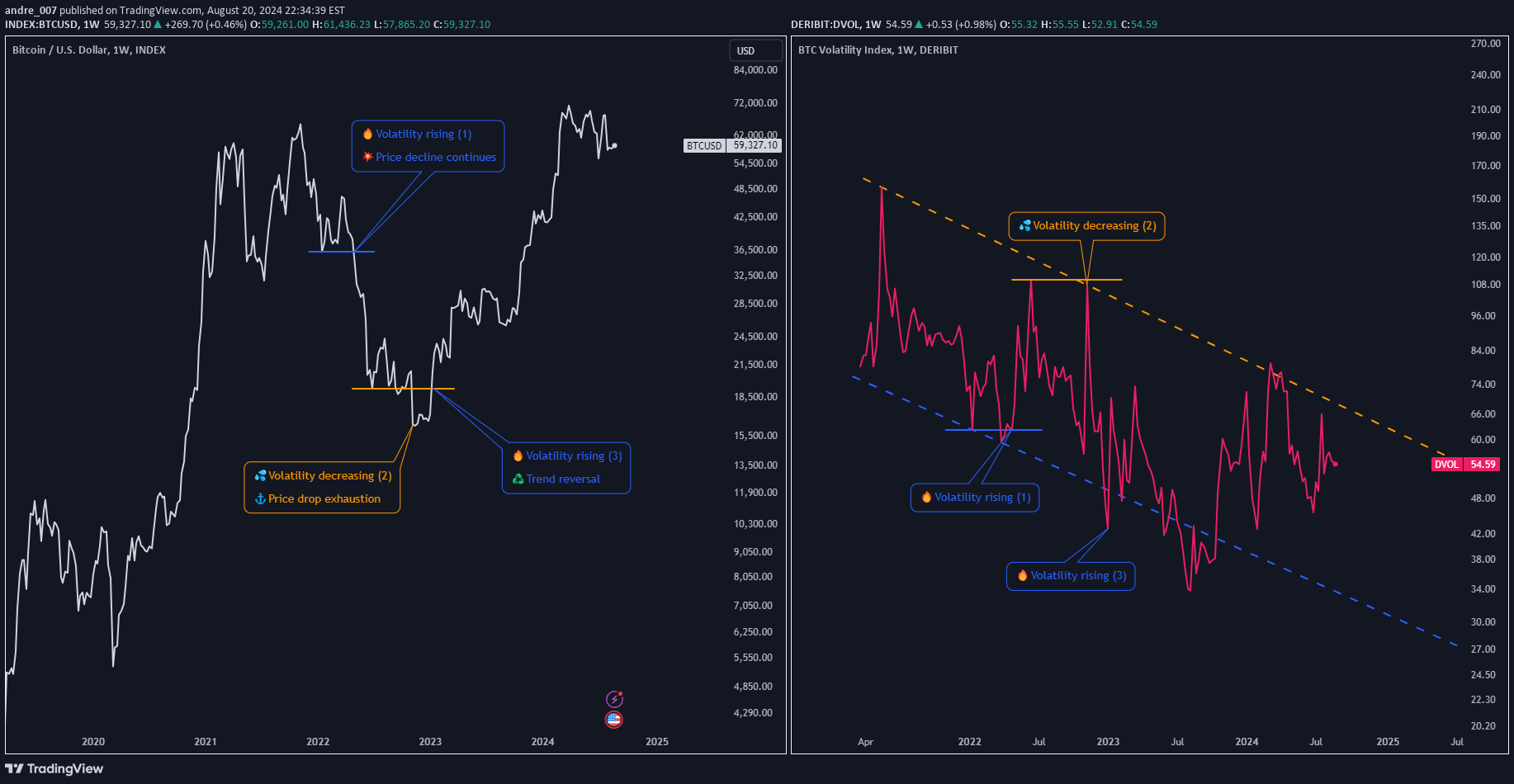
▮ Introduction Bitcoin is known for its price volatility. Analyzing the price chart alone is often not enough to make buy and sell decisions. Implied volatility indexes such as DERIBIT:DVOL and VOLMEX:BVIV can complement traditional technical analysis by providing insights into market sentiment and expectations. ▮ Understanding DVOL/BVIV DVOL and BVIV measure the expected implied volatility of Bitcoin over the next 30 days, derived from real-time call and put options. DVOL is calculated by Deribit, the world's largest Bitcoin and Ether options exchange. BVIV is calculated by Volmex Finance; the data is extracted from exchanges (currently Deribit and OKX), and then combined into a single set. * In addition to Bitcoin, it is possible to analyze Ethereum-specific instruments through the ticks DERIBIT:ETHDVOL and VOLMEX:EVIV, whose line of reasoning is the same. ▮ Interpreting the chart 🔶 High DVOL/BVIV values indicate that the market expects greater volatility in the next 30 days. This is usually associated with uncertainty, fear, or expected major events. 🔶 The index does not indicate the direction of the price, but rather whether volatility will increase or decrease. 🔶 Low values indicate an expectation of lower volatility and are usually associated with calmer and more optimistic markets. 🔶 To get an idea of the expected daily movement of Bitcoin, simply divide the DVOL value by 20. For example, a DVOL of 100 indicates an expected daily movement of 5%. 🔶 Divergences between the price of Bitcoin and DVOL/BVIV can signal inflection points. 🔶 Price rising with a drop in DVOL/BVIV may indicate exhaustion and a potential top. 🔶 Price falling with a drop in DVOL/BVIV may indicate exhaustion and a potential bottom. ▮ Example The price of BTC here is at the top in white. The DVOL and the RSI of DVOL are both in red. The reason I put the RSI here is that it is easier to analyze DVOL, since the values are in a fixed range, therefore easier to interpret. On March 25, 2022, the RSI shows a contracted value of 30, that is, low implied volatility. This foreshadows a period of calm that precedes a period of agitation. In this case, the “agitation” soon materializes in a period of price decline. When the RSI then reaches the upper limit range, at 83 (on May 12, 2022), a peak in volatility is characterized. Then, after that, it begins to decrease. This decrease in volatility in DVOL corroborates the moment of Bitcoin’s lateralization within the orange box. ▮ Conclusion Although DVOL and BVIV should not be used in isolation, they can be valuable tools for confirming price chart signals and anticipating major movements. Incorporating implied volatility analysis into your strategy, can improve the timing of entries/exits and help manage risk. ⚠️ But remember: Just because a strategy worked in the past does not mean it will work forever. Past profitability is no guarantee of future profitability. Do your own analysis and risk management.
andre_007
Optimizing Technical Analysis with Logarithmic Scales

▮ Introduction In the realm of technical analysis, making sense of market behavior is crucial for traders and investors. One foundational aspect is selecting the right scale to view price charts. This educational piece delves into the significance of logarithmic scaling and how it can enhance your technical analysis. ▮ Understanding Scales - Linear Scale This is a common graphing approach where each unit change on the vertical axis represents the same absolute value. - Logarithmic Scale Unlike the linear scale, the logarithmic scale adjusts intervals to represent percentage changes. Here, each step up/down the axis signifies a constant percentage increase/decrease. ▮ Why Use the Logarithmic Scale? The logarithmic scale offers a more insightful way to analyze price movements, especially when the price range varies significantly. By focusing on percentage changes rather than absolute values, long-term trends and patterns become more apparent, making it easier to make informed trading decisions. ▮ Comparative Examples Consider the Bitcoin price movement: - On a linear scale, a 343% increase from $3,124 to $13,870 looks smaller compared to the same percentage increase from $13,870 to $61,769. This disparity occurs because the linear scale emphasizes absolute changes. - On the logarithmic scale, both 343% increases appear proportional, giving a clearer representation. Additionally, in a falling price scenario, a linear graph might show a smaller box for an 84% drop compared to a 77% drop, simply because of absolute values' significance. The logarithmic scale corrects this, showing the true extent of percentage declines. ▮ Advantages and Disadvantages Advantages: - Fairer comparison of price movements. - Consistent representation of percentage changes. - More reliable support and resistance lines. Disadvantages: - Potential misalignment of alerts ( tradingview.com/chart/?solution=43000690942). - Drawing inclined lines might create distortions when switching scales: A possible solution is the use the "Object Tree" feature on TradingView to manage graphical elements distinctly for each scale. ▮ How to Apply Logarithmic Scale on TradingView Enabling the logarithmic scale on TradingView is straightforward: - Click on the letter "L" in the lower right corner of the graph (the column where prices are shown); - Another option is use of the keyboard shortcut, pressing ALT + L . ▮ Conclusion The logarithmic scale is an invaluable tool for technical analysis, providing a more accurate representation of percentage changes and simplifying long-term pattern recognition. While it has its limitations, thoughtful application alongside other analytical tools can greatly enhance your market insights.
andre_007
In times of uncertainty❓will we have a "Bitcoin Milkshake"🥤?

Introduction The objective of this study is to compare the appreciation of the world's main currencies, with Bitcoin as its main focus. For this, 34 currencies were selected, 31 of which were fiat currencies, 2 metals (gold and silver, which were previously used as currency and store of value), and Bitcoin. The selection was made based on the trading volume and representation of each currency on the world stage. The dollar was taken as the unit of measurement for comparison purposes. To compare the dollar itself against other currencies, the DXY index (Dollar Index), the WCU (World Currency Unit) and the XDR (Special Drawing Rights) were used. The DXY is an index that represents the strength of the dollar against a basket of currencies, with the weight of each currency being calculated based on bilateral trade with the USA. The currencies that make up the index are: Euro (EUR), Japanese yen (JPY), Pound sterling (GBP), Canadian dollar (CAD), Swedish krona (SEK) and Swiss franc (CHF). The WCU is a basket of currencies representing the 20 largest economies in the world, while the XDR is a basket of currencies representing the 5 largest economies in the world. Both baskets are calculated by the IMF (International Monetary Fund). WCU is made up of the following currencies: USD, EUR, JPY, GBP, CAD, AUD, MXN, KRW, CHF, CNY, BRL, RUB, INR, TRY, ZAR, HKD, SGD, SEK, NZD and SAR. The SDR is not a currency, but its value is based on a basket of five currencies: the US dollar, the euro, the Chinese renminbi, the Japanese yen, and the British pound sterling. Context The financial market is constantly influenced by economic, political and social factors. As the world goes through periods of uncertainty, investors are looking for assets that can protect their capital and guarantee solid returns. There is a phenomenon known as the "Milkshake Dollar Effect", which refers to the tendency for the US Dollar to appreciate in relation to other currencies in periods of liquidity crisis. The graph shows that in this period YTD (Year to Date) Bitcoin was the currency that appreciated the most in relation to the dollar. Despite this, the scenario we are going through is unprecedented, and there is no way to predict what will happen. What we can do is analyze what happened in the past and try to draw some conclusions. Bitcoin was created in 2009, and since then it has been a very volatile currency. In 2017, Bitcoin appreciated by 1,318% against the dollar, and in 2018, it depreciated by -73.5%. But aside from the price fluctuation part, Bitcoin's biggest advantage is that it is not controlled by any government or financial institution, and is therefore resistant to inflation and price manipulation imposed by politicians. Try making a money transfer to another country using the SWIFT system without paying absurd fees and without bureaucracy, and you will understand what I'm talking about. But now, in this geopolitically delicate period full of uncertainty, will we have a "Bitcoin Milkshake"🥤 effect? Currencies The following currency pairs (and some indices) have been inserted into the chart: 1. BTCUSD - Name: Bitcoin - Country: ? 2. GOLD (XAUUSD) - Name: Gold - Country: Various 3. SILVER (XAGUSD) - Name: Silver - Country: Various 4. DXY (index) - Name: Dollar Index - Country: FED (Federal Reserve) - United States 5. USDWCU - Name: US Dollar vs World Currency Unit - Country: WOCU - United Kingdom 6. USDXDR - Name: US Dollar vs XDR - Country: IMF (International Monetary Fund) - United States 7. EURUSD - Name: Euro - Country/region: Eurozone 8. GBPUSD - Name: British Pound - Country: United Kingdom 9. CHFUSD - Name: Swiss Franc - Country: Switzerland 10. JPYUSD - Name: Japanese Yen - Country: Japan 11. SEKUSD - Name: Swedish Krona - Country: Sweden 12. CADUSD - Name: Canadian Dollar - Country: Canada 13. NOKUSD - Name: Norwegian Krone - Country: Norway 14. PLNUSD - Name: Polish Zloty - Country: Poland 15. KRWUSD - Name: South Korean Won - Country: South Korea 16. NZDUSD - Name: New Zealand Dollar - Country: New Zealand 17. SGDUSD - Name: Singapore Dollar - Country: Singapore 18. TWDUSD - Name: Taiwan Dollar - Country: Taiwan 19. AUDUSD - Name: Australian Dollar - Country: Australia 20. INRUSD - Name: Indian Rupee - Country: India 21. CNHUSD - Name: Chinese Renminbi - Country: China 22. CNYUSD - Name: Chinese Yuan - Country: China 23. HKDUSD - Name: Hong Kong Dollar - Country: Hong Kong 24. MYRUSD - Name: Malaysian Ringgit - Country: Malaysia 25. ARSUSD - Name: Argentinian Peso - Country: Argentina 26. SARUSD - Name: Saudi Riyal - Country: Saudi Arabia 27. ILSUSD - Name: Israeli Shekel - Country: Israel 28. IDRUSD - Name: Indonesian Rupiah - Country: Indonesia 29. TRYUSD - Name: Turkish Lira - Country: Turkey 30. ZARUSD - Name: South African Rand - Country: South Africa 31. BRLUSD - Name: Brazilian Real - Country: Brazil 32. CLPUSD - Name: Chilean Peso - Country: Chile 33. UYUUSD - Name: Uruguayan Peso - Country: Uruguay 34. MXNUSD - Name: Mexican Peso - Country: Mexico 35. COPUSD - Name: Colombian Peso - Country: Colombia 36. RUBUSD - Name: Russian Ruble - Country: Russia
andre_007
Bullish divergence in ETHBTC 📉📈❓

🔍Here we are looking at the price indexed to 100. 🟢We have a descending rising wedge, with a bullish divergence: price falling, with the SMI (Stochastic Momentum Index) of the PVT (Price Volume Trend) rising. 🔴Could price revisit the 0.5 Fibo retracement in the final breather? It could, but I think it's unlikely. In any case, I traced this possibility using the white line. 🟢Furthermore, we have other divergences, if we consider the TOTALDEFI index:
andre_007
Bitcoin Cash at $300?

Bitcoin Cash at $300? After breaking out of a symmetrical triangle, the price pulled back offering a short stop entry opportunity. Target: $297 Stop: $278
andre_007
PolyDoge review (memecoin)

First of all, I think it's important to point out that I don't invest in meme-coins and I don't see any value in it. This is just an analysis with a more humorous and entertaining content, which I did in my free coffee time. I would never put my life savings in such a place... Asterisks aside, let's get to the analysis. A brief introduction PolyDoge is a memecoin token contained on the Polygon blockchain. It offers an ecosystem of NFTs, Dapps and airdrops. Source: Polydoge website Price analysis Price is above a diagonal support line. If I were to position myself on this, I would aim for a profit of at least 40% touching the diagonal resistance line. Looking at a lower timeframe, we could place a tighter stop or target: "There is no expensive stop, what exists is bad risk management".
andre_007
Bitcoin Price and Dominance

Hello traders. Sharing a Bitcoin analysis along with its dominance in the right panel. 🗓 Today (on 04/18) the price retraced to the exponential average of 21, in the 61.8% Fibonacci retracement. 💹 Continuing this bullish move, the next target by the Fibonacci projection would be at $ 31,387.00 Should there be a further correction, a possible entry point would be below the last low at $ up to $ 28,917.00, only after a confirmation of a bear trap. 🔎 Looking at the Bitcoin dominance chart on the right, we can see that the index is in an important region, testing the 200-period exponential moving average. That said, we can outline the following scenarios: 🚀 🔴 If the crypto market continues to rise, but BTC dominance drops and does not break through this resistance, it means that Bitcoin will be performing worse against altcoins; 🚀 🔵 If the crypto market continues to rise, and BTC dominance rises, breaking this average, it means that Bitcoin price will perform better than altcoins; 🐻 🔵 If the crypto market undergoes a correction, and BTC dominance rises, it means that altcoins will be falling more than Bitcoin; 🐻 🔴 If the crypto market undergoes a correction, and the dominance of BTC falls, it means that Bitcoin will be falling more than altcoins. I hope this helps.
andre_007
MicroStrategy Graph and Fundamental Analysis (MSTR)
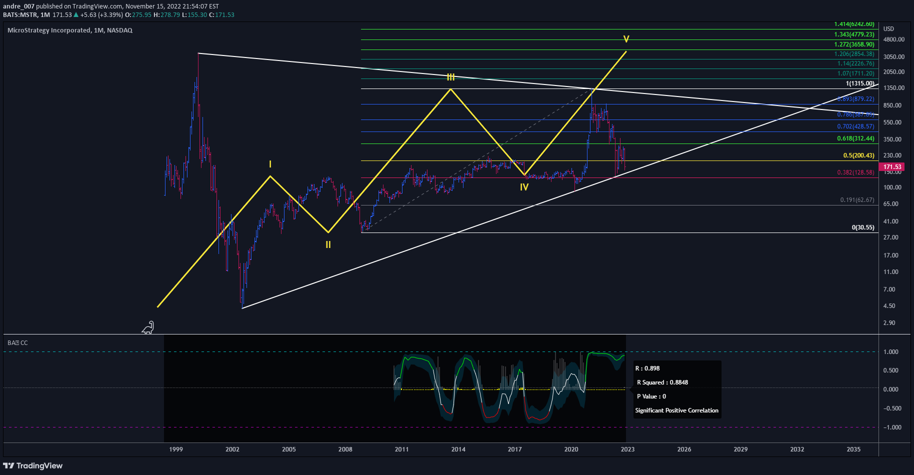
1. Graphic Analysis Since March 2020, the company has been showing a strong correlation with Bitcoin (as shown at the bottom). The price is "respecting" the white diagonal line in a big triangle 3 times. It remains to be seen whether this line will be restored or whether it will now take off for good. Perhaps the fundamentalist analysis below indicates a subtle change in operating results, to the point of enacting the bottom of this cycle. 2. Fundamental Analysis The result was announced on November 1st. 2.1. Income Statement 2.1.1. Revenues Sales increased by 2.69%, going from $122M to $125M. 2.1.2. Expenses Operating expenses have been flat since inception, ranging quarterly from $111 million to $122 million. 2.1.3. Net Income Net Income shows how much money a company earns after expenses. Since the year 2020, net income has had a negative performance. Despite sales increasing by 2.69%, this has not changed. The positive point is that in relation to the previous quarter, the negative profit deteriorated, going from -$ 1.06 Billion to -$ 27.08 M 2.1.4. Earnings Per Share (EPS) Earnings per Share is the amount of earnings per share of issued, ordinary shares. Analyzing since the 1st quarter of 2021, this indicator has remained negative, signaling that those who bought the company's shares suffered a loss, in line with Net Income . ------------------------------------------------------------ 2.2. Balance Sheet 2.2.1. Asset x Liability 2.2.2. Total Assets The total value of assets decreased by 2.13%, due to a reduction in current and non-current assets. 2.2.3. Total Debt Debts remain stable, in the range of $2.24 billion to $2.45 billion. 2.2.4. Net Debt Net Debt represents the amount of debt that would remain after a company had paid off as much debt as possible with its liquid assets. This value also remains stable. 2.2.5. Net worth It is what's left after subtracting total liabilities from total assets. Equity was positive until the first quarter of 2022. But in the last two quarters it was negative by -$200 million. ------------------------------------------------------------ 2.3. Cash flow 2.3.1. Cash From Operating Activities Cash From Operating Activities represents the amount of cash that a company gets from its ongoing, regular business activities, such as the production and sale of goods or the provision of services to its customers. Considering the period since 2021, Q2 2022 (the previous one) was the one in which there was a negative flow of -$18.37M. In the current quarter, positively, this negative flow has stopped, standing at $1.10 M. But still far from the last positive value of the first quarter of 2022 which was $ 46 M. 2.3.2. Cash From Investing Activities Cash From Investing Activities represents the amount of cash that a company brings in from its investing activities. It includes any cash inflows or outflows from the company's long-term investments. A negative value of Cash From Investing Activities can show poor performance, but it can also be a sign of increased investment activities. Spending on investments has been declining. From a peak of -$1B in Q1 2021, in the current quarter of 2022(3) the amount spent was -$6M. This signals a trend towards the end of investment activities. It may be due to the higher cost of money, and/or the lack of need for such an investment. 2.3.3. Cash From Financing Activities Cash From Financing Activities is the amount of cash that a company receives or pays to finance its activities. That is, the company invests this money in itself, specifically in the development of its business. A positive value may indicate an organization's intentions regarding expansion and growth. A negative value may be a sign of improvement in the company's liquidity if debts are paid off. A negative value can also provide information on the dividend policy of the organization. In the same way as investment activities, the value follows a downward trend, that is, the company continues to prioritize the consolidation of its activities, or prioritizing the settlement of its debts. 2.3.4. Free Cash Flow Free Cash Flow (FCF) represents the cash that a company generates as a result of its activities, excluding expenses on assets. Free Cash Flow is sometimes considered the hardest financial metric to fake because of its calculation and for that reason, it's a popular financial metric in the investor community. The current value remains positive at $769k, but far from the peak of $64M in Q1 2021. Last quarter the balance was negative at -$19M, so we could at least consider this reversal as something positive. 2.3.5. Price to cash flow Ratio It measures how much cash a company generates relative to its share price. Formula: Market Value/Cash Flow from main activities The indicator remains positive and peaked at 69.46 in this current quarter.Increasing fundamental analysis through charts because it is easier to see the x-ray, and even for me to remember faster:
andre_007
MicroStrategy testing Fibonacci
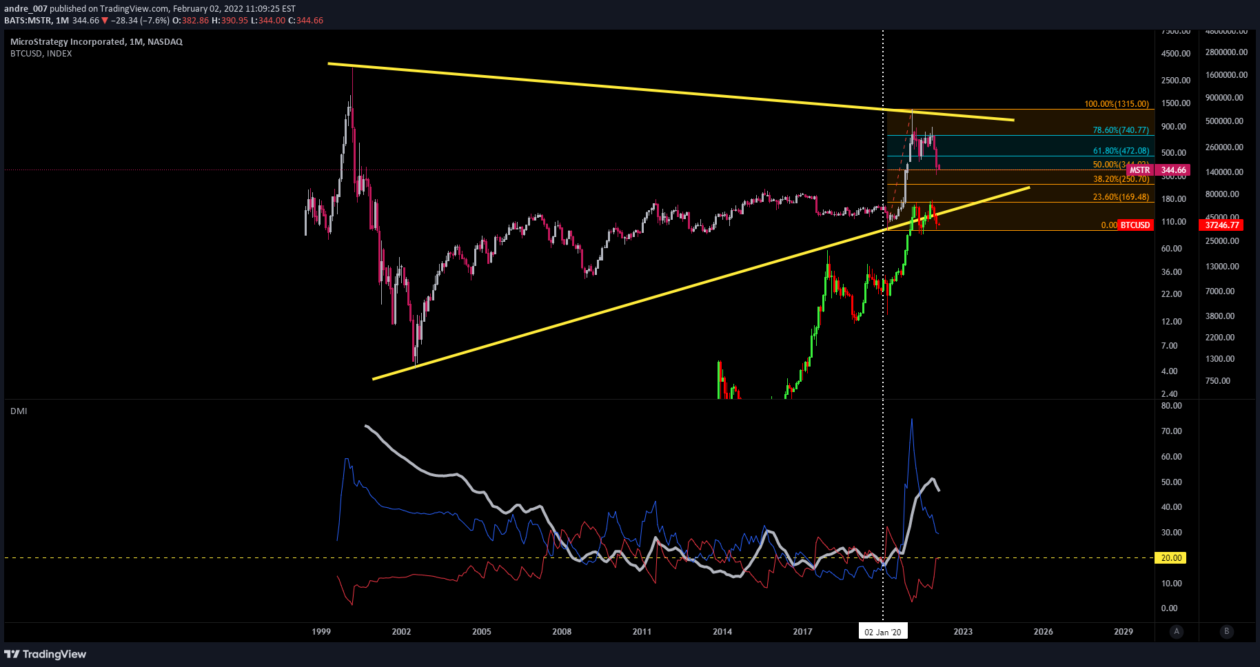
We can see a high correlation between the company and BTC since the pandemic. Looking at the monthly chart, the fact is that the price is now in an important Fibonacci region at 50%. On the 1-hour chart, on the ADX indicator, we can see a decrease in the selling force (red arrows), and an increase in the buying force (green arrows), forming a kind of symmetrical triangle, signaling a temporary indefiniteness. I'm waiting in the cabin to see what happens.
Disclaimer
Any content and materials included in Sahmeto's website and official communication channels are a compilation of personal opinions and analyses and are not binding. They do not constitute any recommendation for buying, selling, entering or exiting the stock market and cryptocurrency market. Also, all news and analyses included in the website and channels are merely republished information from official and unofficial domestic and foreign sources, and it is obvious that users of the said content are responsible for following up and ensuring the authenticity and accuracy of the materials. Therefore, while disclaiming responsibility, it is declared that the responsibility for any decision-making, action, and potential profit and loss in the capital market and cryptocurrency market lies with the trader.